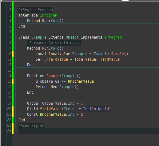
IDE colour scheme
Monkey Archive Forums/Digital Discussion/IDE colour scheme
| ||
| Hello all. Today in between battles with my code that doesn't want to work properly and the usual week end cleaning (why there's always so much stuff all over the place?) i tried to change the colour layout of the IDE (jungle in my case) and i was wondering what everybody else is using... Until now i have used the visual basic colour scheme, but i noticed my eyes start to really hurt after only a couple of hours,i think is the white background. What do you guys use to code? What kind of colours? Fonts? What do you find most confortable? |
| ||
| I tend to use the defaults, whatever colour they are! I guess I don't mind the colour too much. I am comfortable with white backgrounds, which seem to be the most popular these days. This may be down to the change from CRT to LCD screens. I can imagine the bright white being much more irritating on a CRT monitor. As for fonts, I like fixed width and long lines. |
| ||
| I use the same colors as the old Blitz3D which I think was inspired by ID softwares/epic games expensive game creatio thingy dark blue background light blue keywords white words green strings |
| ||
| here is mine.. Font is Consalas, I'm dyslexic so colour coding or syntax highlighting really helps me read my code, I tend to have a white background or an off shade of white so its not to bright. I'v seen a load of people using some crazy colours which I keep meaning to try out but at the moment this is what I am working with.  |
| ||
I use the 'Envy Code R' or 'Proggy' fonts and a custom color palette shown in this picture when I program. I usually program in a low lit room at night, so these colors work wonderfully for that atmosphere. I've been using this general color scheme for over 6-months now, although I did just happen to tweak it about a week ago. |
| ||
| Couple of weeks ago i have been in front of the monitor for quite a bit (more than my usual standard) and my eyes couldn't stand the screen anymore, and i think the culprit was the bright white background. Now i am trying to find a combination of colours that doesn't affect me that badly. I am starting to think that my monitor is also on the way to the door...it started to develop a low frequency noise every now and then.... I never understood how to calibrate monitors, all i ever did was to just the "auto" button at the front! I quite like the last 2 examples (Taiphoz and Goodlookingguy). |
| ||
| I used to use Proggy as well, but over the years iv tottaly forgotten about it, going to go get it again now tho. also going to check out that other font you mentioned. I tend to use consalas because its a lot like proggy its clear and very easily read in my opinion. |
| ||
| I used the defaults for years. I saw a similar thread where someone was using a dark background in Jungle. I switched a few months ago and I greatly prefer it to white and I can't imagine going back. My screen looks almost identical to GLG's screen. I have never changed fonts, I am going to try the proggy font. Edit: I tried proggy and it does not scale well at all. Code Envy and consolas are two of the best looking, IMHO. |
| ||
| Why cant windows render fonts as good as these examples ? http://hivelogic.com/articles/top-10-programming-fonts they all look so good, smooth and bold but windows butchers them. |
| ||
| I just scaled Code Envy up and down and it looks fantastic in Jungle. Proggy looked terrible though. |
| ||
| Yeah now I remember why I moved away from progy, guess I forgot about it for a reason, as for Code Envy something about it just didnt feel right on my monitor, or with my colours. so will be sticking with cons for now. |
| ||
| Envy Code R didn't feel right to me at first so I didn't use it. Then I came back some months later and tried it again. Forced myself to just keep using it and it then became one of my favorite fonts to use. It feels odd at first, but after using it a while it does help code readability. Although I will say that Consolas looks pretty good and I've used it a number of times before. On the topic of fonts, is it just me or is Adobe's Source Code Pro font awful? |
| ||
| I use this: http://joebergantine.com/projects/color-schemes/birds-of-paradise/ Converted to Jungle of course. |
| ||
| I have just made a theme that looks like the one above, with a bit more of coffee colours, its actually quite relaxing . The default jungle theme was starting to kill my eyes (i am sure my monitor is going). |
| ||
I'm using this one right now, I think it looks great with the dark color scheme of the IDE: |
   |