Does this look getting on for commercial quality?
Community Forums/Showcase/Does this look getting on for commercial quality?
| ||
| I've basically combined Dexsoft, Arteria and Svenart media and I think it looks really good. To me, considering this is Blitz3D, I think it looks really good. For me, without these guys making this stuff, I'd never be able to make a commercial product. Yeh, it has cost me hundreds and hundreds to purchase media (a lot of which I will not use), but this is Blitz3D and I think it looks good when you consider I have literally just 'plonked' the media into a scene - it's not like a lot of effort on my part has gone into making it look good - it is bog-standard DX7 with added shadows.    Note: all the media on show here is media that I have purchased and licenced. |
| ||
| Doesn't look too bad. Only complaint i have is the ground texture. It could be more varied, perhaps, multitextured with a colour texture, to add some variety. Not bad though :) I like the character models! |
| ||
| "swifty" made the ground texture - I have purely stuck in on a plane for test purposes. The point being that no effort has gone into making this look visually good. It makes me wonder how fantastic it could end up looking. This is an example of stuff that "sven" has done:   |
| ||
The meat looks great - the only thing that looks wrong is some of the wood textures are a bit naff - but I can sort that: |
| ||
| nice... Note: all the media on show here is media that I have purchased and licenced. say what? who are you and what did you do with puki? |
| ||
| looks very good |
| ||
| A bit monochromatic - perhaps lightening the ground just a tad (say 10%?), just to differentiate it from the walls. The ground texture in Sven's image helps bring up the stalls by being lighter and introducing an irregular curvy pattern. Suggest you steal his ground tile texture. |
| ||
| The 'sven' stuff looks great. The rest, I'm afraid... doesn't. The shadows don't even appear to line-up properly. In fact, there's a distinct lack of shadows on "things". The meat looks like it shouldn't be there. There should be some soft shadowing along the edge where the box of meat sits on the table. The ground looks good from that angle, mind you, but the stalls texture doesn't work. At least the girls' cleavage has a bit of definition to it, I suppose... If you can get the lighting + shadows to look more like 'svens' then you are mostly sorted. |
| ||
| I think it looks alright. Characters look good. You're missing a sky texture though I noticed. The top picture look a bit odd as from the shadows the sun appears to be located about 4 inches above the top of the picture. Nowhere on earth should shadows be three different directions at the same time. Other than those little things I think it looks good. Edit: You know I just noticed that the texture of the meat table is WAY scaled out compared to the meat, which looks quite detailed. But, this is something I wouldn't probably notice in a game, as I'm more concerned with actually playing the game then what the game looks like. Hell I'd play a game that has absolute rubbish graphics as long as it's fun to play. |
| ||
| Theres no ice under the meat so its probably bad by now... don't eat it ;) |
| ||
| Wow, loved the people. Very realistic design. |
| ||
| They're right, the shadows are wrong and WAY too dark. But all I really think is whether I want the fish or the meat and I can't decide... |
| ||
| Yeah, but Sven's stuff isn't realtime, is it. Puki - looking good. Don't be put off. Shine on ground is produced by what? Shadows produced by what? |
| ||
| yeah lighten the shadows, |
| ||
| It's a bit hard to say what "commercial quality" is from just pictures... I mean; I know that you're talking about a graphical standard, but it really depends on how you wish to sell it (well, I'd presume). I've seen stuff sell okay online without even half the graphical standard, but I guess they had pretty good gameplay... But if you mean big money modern commercial games... Well I don't think so (graphivcally speaking)... Though the modeling and textures are great, I'd say the engine would hold it back. (Hope that doesn't sound to rude, I'm half asleep and in the mood to type). Did you code the shadow functions yourself? If so, I'd advise adding a blur texture function inside the library... And falloff via vertex distance from the light source so the shadows don't just look so flat. I think a subtle bloom filter would sort of look nice over the work aswell... Not that I'm a big fan of the standard way bloom looks in blitz (I mean the over used low-res texture overlay), but if you could find a subtle way that doesn't scream "low res texture!", it could really help it along (in my opinion). Maybe modifying texture blur code to work with the bloom layer... not sure. Anywho, good luck, and I'd love to see a tech demo some time. |
| ||
| The only 'meat' you had me looking was the woman's cleavage =) |
| ||
| Mmm, well, I wasn't trying to show off any technical stuff - that's why I wrote that it was all bog-standard DX7. I've added a sun though, if it helps:   It's more a case of showing the media though, rather than eye-candy. The point being, I think the media looks great on its own. Wandering Knights is a classic example of a pretty much finished Blitz3D RPG:  But look at the media. You can add all the shadows/shaders, etc in the world to it and it won't look great. This is not a stab at "gosse", it is more a case of quality media can make a difference. This is some Ogre thing:  Well, many people would argue that his shadows are the right shade - but is his overall media-look better? As far as I am aware, dark shadows in bright light are very common: 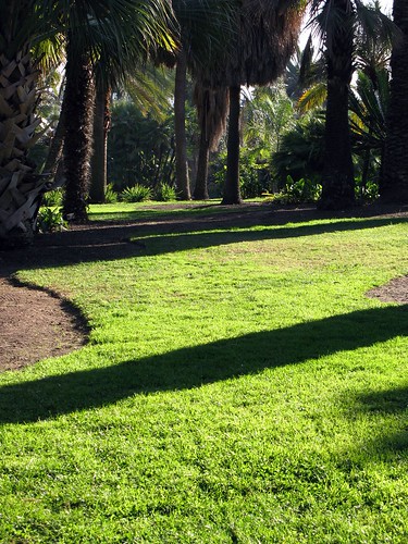  I'm just obsessed with the fact that quality media makes everything look so much better which is why I devoted years to extracting so much commercial media; however, the little media guys (of which there are few) are churning out good stuff - some of it is glitchy, but it can be as good as commercial game stuff. |
| ||
| the tree does look good in Ogre demo but there is questions of shadow where the robot is standing as there is no shadow! |
| ||
| Nah the media looks good. The only thing I didn't like was the very top picture. Look at the center wood stall, the brown one. The color to me looks just too bright to look realistic. It should be more of a washed out, weathery, grayer color of brown like the market stalls around it. |
| ||
| Some of the texturing on the models is below par and also some of the meshes have built-in shine - I haven't yet finished reprocessing them. I just grabbed a mixture of them and threw them into a scene. In fairness, I've combined media from several media artists (baring in mind that Dexsoft are resellers, so their media has multiple authors). I'm not too sure how the licensing works with the models - if I cannot retexture them externally, then I will have to go 'under the hood' and do it within Blitz3D. I am going to solider on and create a scene more like "sven's" rendered, static, scenes - not necessarily in 'effect-look' - we are talking Blitz3D here. "sven" is a 3D/render artist. I think it would look great to see it all moving real-time. |
| ||
| ' "sven's" rendered, static, scenes' - that was my point. That's what _he_ does. What we do, is realtime; a whole different ballgame. |
| ||
| Well, looking at the Ogre example... the trees don't fit with the grass. They look like photos of tree trunks. If you use photos, then all the textures need to have the same "look" about them. Otherwise it just looks all wrong. For example, your wooden meat boxes don't fit in with the ground. Or maybe it's a general problem with all the stuff made out of wood? But at the end of the day, it's all down to what "look" you want to have. Borderlands, for example, has that cartoony/drawn look throughout, so all the textures work very well together. But I think you will have a problem if you want to use a lot of photographic textures. They probably need much better shadowing to look right. Something like screen space ambient occlusion would probably help a lot. Oh, and much less shiny surfaces. |
| ||
| I think if you through in a sky box, added some specular bump-mapping, and take some shine off you would have a great scene. |
| ||
| thanks for the impressive design tutorial/sample, puki |
| ||
| ..considering it was B3D rendering, i can say that it looking very nice.. |
| ||
| This is a screenshot of "Sven's" own work in Blitz3D: Winjard Marketplace  This is a first screenshot of the demo, I´m currently working on with occide and lordhelm. Lightmapping was done with Gile, characters have been exported with Lee´s Lightwave exporter. Demo is now 70% finished. I say my circa 5% stands up well to his 70%: |
| ||
| I'd dial the shadows down a notch -- they look almost completely black on my monitor. |
| ||
| Yeh, actually, I think it is probably that they seem lighter on my monitor - I had the same thing with my FPS screen-shots whereby people complained it was too dark. |
| ||
| Well, your characters are obviously far superior to "sven's". His are quite blocky looking in your latest post. |
   |