They all look pretty good...
But if I can offer up some constructive critisiams...
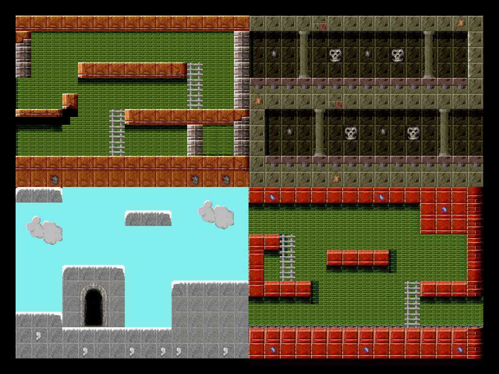
You might try to study some of the old SNES, Genesis games...altho they had a very limited palette of onscreen colors, they were able to use this to thier advantage...
Erm...what I'm trying to get at is to loosen up on some of the detailed realisam of the tiles and get a bit more impressionistic with them...work less with shades of color and more with contrast, and saturation...for example the green brick looking background on the first and fourth images...tone down the saturation and reduce the contrast (difference between the brightest highlights and darkest shadow areas) this would help "push" the tiles further into the background without need for the heavy black shadeing around the red/orange blocks in the foreground...
The image with the skulls looks best...but I would still reduce the contrast on the darker "background" tiles just a bit and increase the contrast on the pillers to help "pull them forward" a bit...and depending on the mood you are trying to set I would reduce the saturation and apply a light "wash tint" to the tiles (a slight yellowish/brown tint to give it some ageing...with a subtle blueish wash tint to give the background some coldness...a good general creepyness)
If you like I could modify the image to show you what I mean...
|