WoD & Space App
Community Forums/Showcase/WoD & Space App
| ||
 https://numbergamer8.itch.io/wod-rpg-assistant Ok I visited my cousin today he has a modern Mac and I think it was sierra, I found the problem the Mac didn't like empty lines when readline function is called. so just putting a dot on the line fixed it, I hope this fixes it let me know |
| ||
| Ive just updated the WoD version to correct the oblong effect, instead of 55x75 its 85x75 so should look better, I left the space version for now its no my main aim . https://numbergamer8.itch.io/wod-rpg-assistant |
| ||
| I have to admit Derren found the graphics file was to big, and Adams graphic Pushes has made me find out I was stretching my screen and didn't realise what other people was seeing, thankyou Adam for your repeated Patience to keep telling me it was wrong, I use a big TV as a monitor on 1024x768 because its very old, so the screen looked totally different to a normal users setup, So I just increased the width of the Map tiles to look better , THey look stretched on my seup now LOL |
| ||
| nope, still crashes on startup with readline error Looks ike you're starting to track down the error ;} |
| ||
| Once you did the readline. .. do you split the read string? Before accessing res[x] you should check if res.length > x. Bye Ron |
| ||
| Ive almost done a plain rogue like you wanted, one cell on screen , no file reading simple game play, I will upload later for you to look at. just needs art |
| ||
| another thought for you. make sure you are not reading data that isn't there (check eof and eol) that will cause program crashes. Also I always have checks to make sure the file itself exists as well |
| ||
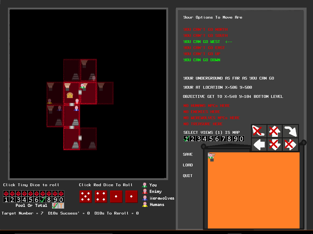
| The app has a set of tile and card files, you have to add your own art because I would not be allowed to distribute it, but I have a game full of WoD Art, you have tiles for the map, but you have tile2,png tiles3,png tiles4.png 300x250 pixel cards . that means 300 different tiles and cards can be at one location. pluss there are also NPCs and treasure, that can be there, the NPC have a tile to appear on the cards too. you then have the option as to how many random blank tiles, the tiles are also split into below , ground and above ground it all adds up to a mind boggling amount of things that can be. I have location info on the cards, eg - BAR, Car Park, SHOP, OFFICE, Casino . etc... so the locations can have multiple things in the area. the the actual map can have text, I have things like - Books, Police, Car, Boxing , Cinima, etc.. to showup on the Map |
| ||
| ok. ignoring the graphics lets look first at pixel and sizes. In general pixels are more or less square. So on a monitor, iPad, iphone (i checked) the dice in the above image are square and the rooms above are vertical rectangles - not square. Now NOTE. I said monitor, not TV (tv's are different beasts entirely). So... the first thing, would really be to ditch the TV and get a proper lcd monitor. Because without working on a proper device, you will get weird sizes. Particularly from a mc as it will correct it's output to exactly match square pixel where possible - that is the way it was designed to show them! The same goes for windows, and ios: pixel is square. In essence what you see should be exactly what you get - the reason for this is print media (books magazines, etc) They MUST be 1:1 so the screen shows exactly what it would look like in print. I worked in the print industry with a windows system and crt monitor that needed to have the display physically stretched to match the correct output. So, pixel = square. if you have a 200x200 red square on your screen, and it looks like a vertical or horizontal box, then your screen needs to be adjusted until the box looks square. NOT THE OTHER WAY AROUND 250x200 red box looks square on my screen - IT ISN'T - your screen need to be adjusted 200x200 red box should NEVER be anything but square |
| ||
| ok, now that's got that one out of the way. lets look at the graphics. - I'm going to make a game, it has lets say 100 locations all different, so I need 100 images/cards/graphics, etc NO What you need is a way to use a minimum of graphics and reuse them in different ways Lets take the above shot. We have a map on the left and some text on the right (you're underground, no humans here, etc) What you are doing is duplicating information. have one or the other. in this case it is visual - the map is the interesting bit. so dump the text. what you now have is a map - I know you are going to start saying, but underground has a different affect than being in a bathtub, etc. irrelevant. So now we really have a large map showing (10x10ish) rooms? Which really is a bit small to show different graphics. but lets' not go there. So each room can have: stairs up starts down you monster treasure exits so a room need space for a wall and a floor that has enough space for stairs, you, monster and treasure 2x2 is too small 3x3 is the minimum floor area with walls is 5x5 - note there are no graphics, just a design that would fit what's needed. we are not thinking about the room, we are thinking about the space a room needs. so what graphics do we actually need? a floor tile a wall tile a door tile stairs up stairs down treasure you monster so lets get some graphics (NOT MINE DON'T USE - these are an example) 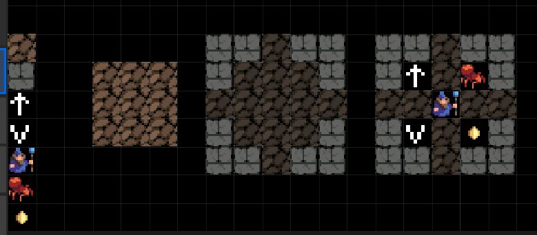 so, on the left we have our 7 base graphics - stairs have placeholders, we don't have a door, but don't need one at this stage either! A grid (squares) and moving to the right: the floor area (3x3) the floor with walls (5x5 room) and shown exits and lastly, a room with stairs, exits, me, a monster and treasure. NOTE, this is exactly the same as this:  the last thing I am going to say is about graphics and sizes. the above tiles are 16x16 pixels. by simply changing the colors we can have lots of different floor colors without drawing more graphics. You 'could' have a bigger room (7x7) with a big baddy in it. But the dats remains the same: room+monster+treasure+exits It's actually how games were built in yesteryear (atari, spectrum, etc) Now... There is one VERY BIG CHANGE. can you see it? The main character is begging to move (cursor keys maybe?). This would completely change everything as you would need to write a framework to do this. but you can possibly see what I mean about concepts and games? I am not saying one method is better than the other, or saying your graphics aren't good. What I am trying to do is give you a different view and to lessen the work you end up doing. ;p |
| ||
| its certainly more interesting, did you know the big screen bottom left can display a collection of everything in the location, or cards etc.. I have just been making a game, so a biit distracted, its a new way for me to display art, I learned this mind expansion from you  its not great, but as a wargamer its looking better as I go. https://numbergamer8.itch.io/airwar its a fully working game, has Line of sight, walls, A.I. terrain effects modifiers, 6 facing sides for each unit |
| ||
| Are all of these wargames so vibrant? I cannot imagine people look longer on that bright green surrounded by pure blue. Maybe play a bit with desaturating the colors. This will also allow for easier emphasization (result message boxes in red could become redbrownish then etc). Is your TV-screen in energy savings mode or has a dimmed backlight? This remkves saturation and might lead to a color choice you wouldn't do with a proper screen. Bye Ron |
| ||
| its old sckool , wargames, this is what they looked like :) but no reason why I cant do a new type of game |
| ||
| I like the hex display, especially the top bottom where it has the 'egg-box' look and the left right edges. It stops it from being 'squared' in. on the itchio site the last two images have different "chits"? one is square and the last one (the one above) the "chits" are rotated so are diamond. I like the presentation of the diamond. it matches the hex very well. Have you thought about rotating the contents so they are normal though?  |
| ||
| Why do your counters take up 7 hexes? |
| ||
| Good point. and one that had crossed my mind too. Here's a thought:  first - highlight an occupied hex next - use the point of the diamond to reference this hex Sort of like tabletop, where you have a base and the card or model sticking up from it? Variation on this would be to use a triangle (aligned to the hex grid) instead of a diamond, or a slightly smaller one looking at this in terms of graphics: you would need: 1 hex (in white) which would be coloured dark with an alpha of .6 (130) 1 diamond in white with the black border, or triangle or both the graphics themselves process for display would be: 1. show occupied hex in black with halfish alpha 2. show overlayed color diamond/triangle 3. show overlaid graphics lets assume you have 4 graphics and a diamond and triangle and the hex. using the color method you now have all graphics for a basic game, you have two types of display (diamond and triangle), four types of genres, and in all the colors you require. With virtually not a lot of work on your front and basic graphics to work on the gameplay ;) |
| ||
| out of interest the is a little white box on the right about a 5th the way up. is this a map overview by any chance with pixels as the players? I can suddenly see something in this. There is a spark here (for me anyway) As I said, you have some superb ideas :) |
| ||
| For highlighting a hextile you could play with Drawimage tile,x,y SetAlpha GetAlpha()*0.5 SetBlend LightBlend Drawimage tile,x,y SetAlpha GetAlpha()*2 SetBlend AlphaBlend Would save another image. With Shadeblend you could try the opposite effect. @ egg box I was not talking about the outlines but the colors. It looks really vibrant/bright instead of calm (which fits more to a game about thinking and strategy). So an muddy/earth/nature colored theme might fit better and looks less "toyish". But this is only a personal taste. Bye Ron |
| ||
| I toned down the background. And the units face in 6 directions, so graphics have to work with it, but I'm taking all suggestions in as I go.. its not great graphics yet but here is the wargame working . https://numbergamer8.itch.io/acw-war 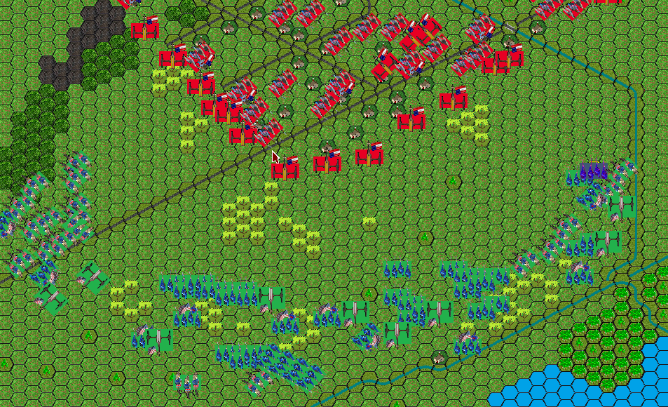 |
| ||
| Mainsworthy and Adam, I really like how your collaboration on your UI is developing for your wargames. using the point of the diamond to ref the hex is a great idea ;) |
| ||
| @Blitzplotter yes its great Adam is really effective @AdamStrange that is a minimap, but it is for big areas, I tend to only make small game while I'm developing it @Brucey I'm trying a new idea to have more map on screen, it feels better for me as a player to see more of the map in a smaller area |
| ||
| @AdamStrange the minimap, puts real hex tiles shrunk, and red and blue dots for units, so not really customisable |
| ||
| @ tone down Good thing. @ latest screenshot The green units are very hard to distinguish from the background. The red ones are hard to "deciphrr" too. Also red green blind people will see nothing on that screen. Potential solutions: - generic unit sprites with teamcolor portions/flags (like RTS games do it...but this needs prepared sprites with enough pixels drawn in team color then) - have a darker border on the unit rect to have it popout a bit more - replace green team color with something else - replace green background with something else (depends on location of the game) Bye Ron |
   |