West Town World Online
Community Forums/Graphic Chat/West Town World Online
| ||
| Now that I have completed my IsoTiler map maker and a basic game structure implemented, I have to concentrate on the GUI. Here is a screen of a proposed GUI for my game West Town World Online. Let me know what you think! 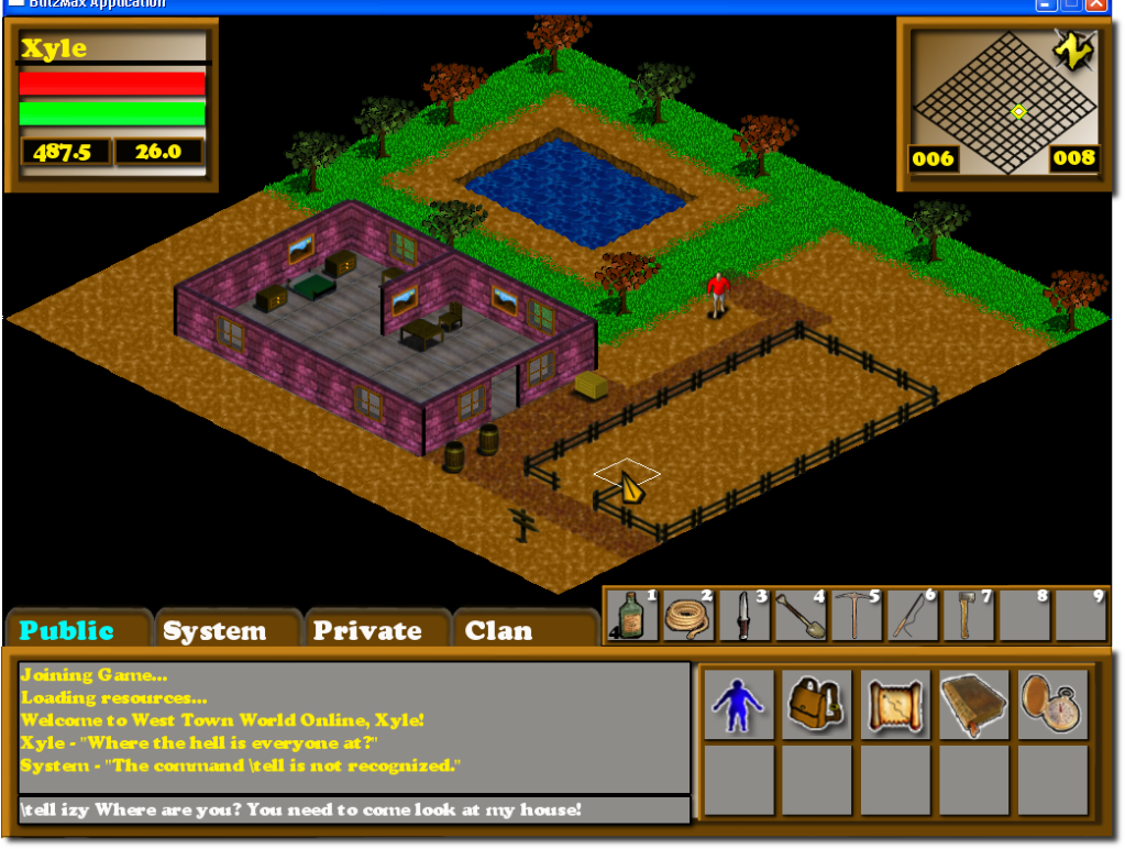 |
| ||
| When you say 'proposed gui', is that what it will actually look like? |
| ||
| Yes, this is the original GUI for the game, but already, 9+ hours later, there have been changes, lol. :) - I added a "All" tab to the chat area - I changed the player coordinates to just show integers, instead of floats. - I changed the mini-map area to hold the information panel on tiles or npcs and such so you will see the name and description of the item under the mouse. I will add a map window that will show when you click on the map icon in the game window bar at the bottom right. When I used the word proposed, I knew this thing would and will be going through many, many changes. But it should still hold the overall layout, color scheme, etc. |
| ||
| the colors and fonts are garish, use the 'color wheel' to select colors The building having purple walls is offputting too. |
| ||
| Looks nice. Colours are garish though - pink walls?? And font seems too modern for theme. |
| ||
| Yes, this is the original GUI for the game, but already, 9+ hours later, there have been changes, lol. :) Ok, in that case I think it looks pretty awful. I appreciate that it's early days but instead of repeatedly changing it and it being wrong, I'd recommend taking a look at the Eschalon games to see what you're competing with. The layout is probably OK but the colours are far too vivid and a game like this needs to be much more subdued. Its also a bit flat. How about a bit of texture? |
| ||
| Thanks for all the input. I will definitely try out some different color schemes and see about putting some texture overlays in the mix. I have already created a few different versions which allowed me to realize how easy it will be to implement a skinnable GUI. If a user doesn't like the default, they can choose their own or maybe even create their own. As for the "pink walls", I dont know where the pink came from but when I scaled down the images some color transformations took place. I plan on having quite a few different variations of walls, so as of right now, most everything is a place holder until I either create finished product for the tiles or hire someone to create them. Excellent feedback, I really appreciate the help! |
| ||
| I think the pink comes from the walls in the shot above to me they are either pink or purple which looks real odd, I would suggest looking at some wild west town images on google to get an idea on how it should look because IIRC brick wasnt that prevalent back then. Also the font is awful it looks like fisher price my first font and for a wild west game I would use a wild west font for it. Harsh maybe but if its not said now then you tend to make a HUGE mistake later when you get hundreds of posts on there about the GUI and it will be too much work to change it later. |
| ||
| Harsh? Not at all. I appreciate any input and info. Its funny you mentioned that about the brick wall. I did make brick wall tiles first and had them up, but I thought about the same thing. There were a few, well I could find 2 that were built in the 1800's, hehehe. The pink walls are wood siding, they just picked up a pinkish hue in the tranformation. I will definitely be fixing that. The font is Cooper Black BT. I kind of liked it for a website I made and it stuck. I have tried using some western based fonts, but the ones I located were a bit unlegible in some situations. I will revisit this one though. Thanks again for the info! |
   |