Would this make a decent Ebook cover?
Community Forums/Graphic Chat/Would this make a decent Ebook cover?
| ||
| Hey everyone, That story I've been working on is at long last finished, and pending review by a couple of friends for any grammar errors, will very shortly be for sale on www.amazon.com Anyways. here's the cover I'm planning to use for it. Any feedback you have as to how I could improve it, which I'm sure it's in need of, would be awesome. 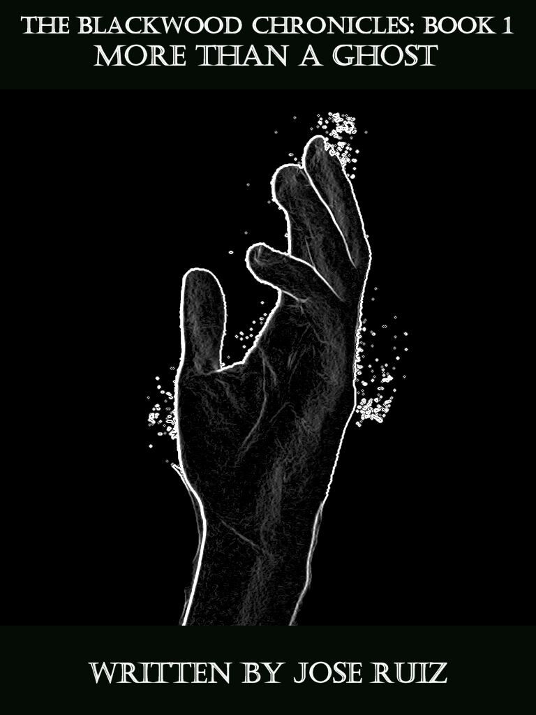 This is a ghost story\mystery, but here's a preview of the first two chapters from the story itself, in case you need to know a bit more than that for your advice on the front cover. http://www.mediafire.com/?k8dooavstfiz7dv Cheers! |
| ||
| Jose, you need honest feedback if you want to improve. If you want to build a reputation as a writer, you shouldn't be "publishing" your learning stuff. I have drawers full of short stories and novel chapters that I will never self-publish or seek to be published by others. Quite frankly, they do not deserve to be read by the public. This does not mean that my unpublished works are worthless; on the contrary, when twinned with objective criticism, each one acted as a personal step towards greater fiction writing proficiency. Don't self-publish this ebook. Really. It does nothing to improve either your skill or your reputation as a writer. Outside of family and, perhaps, friends, very few people will buy it after seeing your cover art and reading your preview. The cover is unappealing - the black and white is stark and cold, the artwork, typeface, and overall composition is uninteresting and unappealing. The overall impression I get from it is "quickly cobbled together at home by an amateur who doesn't know much about cover composition, art, typography, or advertising". I downloaded the preview and didn't manage to get past the first few sentences because: (a) they were full of inappropriately used commas. (b) the story, setting, and characters seemed cliched. (c) the writing style was flat and uninteresting. (d) there was no immediate "hook". I won't be reading on. If I saw a book with this cover, I wouldn't buy it. If a read an extract from a book with this quality of opening chapter, I wouldn't read it. But, but, BUT... I know how strong the desire to self-publish a work that is otherwise unpublishable can be so, if you choose to disregard everything that I have so far written, please heed my last bit of advice: use a pen-name, a writing alias. Save your real name for work that deserves it. |
| ||
| Hello Jose, I am not a writer or a publisher just an avid reader. The cover art looks good, a bit amateurish, but it is fitting. I've seen alot worse on very popular, published books. Its tough to do all the work yourself, my opinion from trying to make games. Your writing is good and take pride in what you have accomplished. Personally, I'm not into ghost or supernatural books, but from what I've read you've done a good job. There may be some grammatical errors, but when your totally concentrating on the story, your eyes wont catch everything, especially when your not grammatically educated like me, lol. Of course I say go for it and see what happens. I know how exciting it is to finish something and want to see what kind of reception it'll get. Theres no way I could stuff something in a drawer. Of course alway pay attention to peoples criticisms, they will help lead you to become a better writer, programmer, artist or whatever your attempting. Some of the criticism may be harsh, but always keep the points in mind that they may show you, it'll benefit you in the long run. And of course, have fun, always! |
| ||
| Don't self-publish this ebook. Really. It does nothing to improve either your skill or your reputation as a writer. Outside of family and, perhaps, friends, very few people will buy it after seeing your cover art and reading your preview. On the contrary, I believe that it will help improve my skills tremendously. I had no clue how to sell a computer game when I made Ping Pong Battle, yet I went for it anyways and learned a lot about the process, so that I'll do a lot better now the second time around. Same goes for this. Even if it doesn't sell too well, I'll learn how to do a better job of it next time by getting my feet in the water :) Although I suspect it will sell pretty well, because you are the first person to give me negative feedback on the preview (Which I do greatly appreciate, since it's nice to hear things from a different perspective). Same goes for the cover, since your the first person who's told me it isn't much good, although that's why I posted this here in the first place. Maybe I'll have a whole barrage of blitzers tell me its crap, your just the first. I get from it is "quickly cobbled together at home by an amateur who doesn't know much about cover composition, art, typography, or advertising". You've got my bang to rights on that one. I am simply put, no artist :) I downloaded the preview and didn't manage to get past the first few sentences because: (a) they were full of inappropriately used commas. Easy enough for me to remove. (b) the story, setting, and characters seemed cliched. Erm, how can you tell if you only read the first few sentences? (c) the writing style was flat and uninteresting. Same as above. You only read a few sentences, which doesn't seem like enough to know what kind of style I have. (d) there was no immediate "hook". There is on page 3, when the ghost attacks. I had to build up to it though, which I see no problem with. Save your real name for work that deserves it. I'm publishing this in a few days time, using my real name, because I am immensely proud of what I've achieved. Whether or not it sells well, I am still very proud of it :) Now I know I was slightly harsh in my response for once, but that is because I believe as pointed out above that some of what you say is unwarranted. You didn't read the story! A few sentences won't do much... However I'll take your feedback on the cover image to heart, since I believe you brought up some good points. I still like it, and so do a bunch of other fella's I've shown it to, but I'll keep in mind what you said and await further feedback. @Xyle The cover art looks good, a bit amateurish, but it is fitting. I agree 100%. Tis a bit noobish, but works and is the best I can do. There may be some grammatical errors, but when your totally concentrating on the story, your eyes wont catch everything, especially when your not grammatically educated like me, lol. I also agree with this one. Although most of my reviewers have brought up a few grammar issues, by and large as long as it's 'decent' I think no one will really care... But it's good to be on the safe side anyways, so I'm clearing up as many of them as I can. Of course I say go for it and see what happens. In a few days, after I get a little more feedback and a few folks to look over my grammar, I'll be sending it to amazon. Of course alway pay attention to peoples criticisms, I try, and usually take criticism pretty well. Cheers, and keep the feedback coming! Last edited 2011 |
| ||
| Jose (if you'd rather me refer to you as WERDNA than please let me know), I really do wish you the best of luck with this. However, I'd like to address a few points that you made in response to my initial post: You say that the grammatical mistakes are easy enough to remove. If this is the case, why didn't you remove them from the preview? It seems to me that if the problems are present and noticeable from the very fist sentence onwards, you might want to brush up on your craft (because there is a "nuts and bolts" craft to writing, it isn't all style and creativity) before you think about publishing. Regarding your argument that I didn't read far enough into the story to get a feel for your writing style or to get to the hook that you claim is on page three: First impressions count; potential customers will, whether you like it or not, make an almost instantaneous value judgement based on the first thing they read. Our free time is valuable to us and your work is competing with countless other forms of entertainment that we might choose to enjoy. If you are dismissive of people who make quick judgements based on the first few sentences of your work then you are dismissing almost all of your potential readership. Your argument seems to be along the lines of "the start might be unengaging but if you just keep reading..." Well, no. It doesn't work like that. Why should I invest more of my valuable free time in reading on when I can pick up another story that works from the get go? Why shouldn't I watch a movie instead? Or go out? Or listen to music? Or do any one of countless things that I might enjoy more than I enjoyed your opening sentences? Your first few sentences, paragraphs, and chapters should be able to answer this. Think of your opening sentence (and paragraph) as a hook, a lure. You want use this literary moment to get your story hooks into your potential readers and say "Look, you've gotta read this. It's worth your time. It's worth your money. I'm not gonna let you go, no matter how much you wriggle!" Work on your craft, Jose. You should know this stuff. Read a few "how to write fiction" books. Join that Critters website that I suggested in a previous thread. How do I know that your work is cliched? I don't. The story might be mind-bogglingly original but I'll never know because at the beginning you heap on the genre cliches. Why should I trust that your story will get better? Why would I bet my hard-earned money that it will? I'm sorry if my original post seemed too brutal. I'm sure that it bruised your feelings. The general reading public, professional publishers, and critics are no less mean, and often significantly more so than I am. Believe it or not, I genuinely want to help you, Jose. I want to read a fantastic future story from you; something amazing, something that I can't put down until I've lapped up every word. You've got it in you to do this. And if you can amaze and captivate me then you can amaze and captivate an audience, because I'm just one of many people who likes reading good fiction. Last edited 2011 |
| ||
| I'll leave any (detailed) criticism of the work to others (I read the first three pages and didn't want to read any more; Kaitlin Blackwood is a jerk and Alfred Rulinggold is one of the more insipid storytellers I've come across in recent times), but if you have 'Written by Jose Ruiz' on the front cover (and 'Written by' is surely redundant?), shouldn't it say 'by Jose Ruiz' in the preview too, and not 'by Francisco Ruiz', no matter what your outside-of-the-book personal name preference? I'm with JustLuke insofar as saving up your 'real name' for when you're ready to use it to establish a reputation. Publish this work by all means, and learn everything you need to know about the process, but given a writer's 'brand' is his name you might want to save yours up until you're a little more... practised, shall we say. Failing that, you could always use a nom de plume later, I suppose. Best of luck. Last edited 2011 |
| ||
| These two chapters are full of grammatical and punctuation errors. I would highly suggest that you get someone else to proof read this book before sending it off. I began jotting down a list of all the grammatical errors but the list quickly became quite long. There are words missing in sentences, words capitalized that shouldn't be, and commas all over the place that needn't be there. As a reader I expect to see near mastery of a language in a written book or magazine article. Never use the word 'and' to start a sentence. In regards to the book cover, I'm not sure if it makes sense to me. If that is assumed to be the ghost's hand, it is the opposite of the way the ghost is described in the book. It's described as a vagely human-shaped light. To me that hand looks human. It also doesn't look like a light. It definately does not look like a barely human shaped blob. |
| ||
| Ok, obviously I was a bit too defensive in my reply to JustLuke. Probably because this book is so important to me. Jose (if you'd rather me refer to you as WERDNA than please let me know) Call me Jose, Werdna, Walnut, Francisco, or my newest nickname, Jalape�o. just whichever one works for you ;) If this is the case, why didn't you remove them from the preview? A more than valid point. I'd better take all the bugs out of the preview and upload a new one. First impressions count; Agreed, although do to the fact that the book is written from Alfred's perspective, it's kind of hard to jump into an exciting situation to get the 'hook' going. However if I perhaps add an explanation of his from the first draft of the story,about modern day spellcasters and the fact that magic is amongst us, it might peak peoples interest. Or then again, bore them to death ;) Join that Critters website that I suggested in a previous thread. Already joined. Awesome site, although I still have yet to post my preview there... but I'll never know, because at the beginning you heap on the genre cliches. Ok, I can see what you mean now. Not sure if I see the cliches myself, but if you could point em out that would be fantastic, so I know what I'm looking for and can maybe change it a bit. I'm sorry if my original post seemed too brutal. Np, they were all valid points as clarified in your second post. Believe it or not, I genuinely want to help you, Jose. Oh I fully believe it, simply due to how lengthy your posts are. So many thanks :D @LineOf7's Kaitlin Blackwood is a jerk and Alfred Rulinggold is one of the more insipid storytellers I've come across in recent times That one is more down to personal preference. I wanted to go a tad out of the box with the 'hero' of this story, and make her an unpleasant and rude person, but a good person at heart, with a reason for being rude and unpleasant. Several of my reviewers like the way that she acts, although I'm sure others won't, so it all comes down to the individual person on this one :) And as to Alfred, I'll await more feedback on whether he's a boring storyteller or not. 'by Jose Ruiz' in the preview too, and not 'by Francisco Ruiz', Thanks for pointing that out, lol. Forgot that I used my first name in the preview. I'm using my real name on this one, no matter what. I would highly suggest that you get someone else to proof read this book before sending it off. I'm getting a bundle of people to proof read for me, and pick out as many grammatical errors as they can find. In regards to the book cover, I'm not sure if it makes sense to me. If that is assumed to be the ghost's hand, it is the opposite of the way the ghost is described in the book. It's described as a vagely human-shaped light. To me that hand looks human. It also doesn't look like a light. It definately does not look like a barely human shaped blob. A good point. If it is the hand of the ghost ;) It also could be the hand of a necromancer with magic(or fire) flowing around it, or the hand of a drowning person with bubbles around it, which could make a rather nifty metaphor. Really, I'm leaving it up to the readers interpretation. Thanks for the feedback, and keep it coming! |
| ||
| Fixed the grammar errors in the preview, along with the fact that a neighborhood named 'Fallbrook' does not exist in New York City ;) Sometimes it pays to do a bit of research, lol. So here's the download link for the new preview. http://www.mediafire.com/?gt6nefb08slvd7g Also on your comment that I need a 'hook' to get the reader interested, are you talking about something along these lines? (This is from one of my short stories) Elmo the fish swam sedately through the air. He had nothing but contempt for those fish who didn't have the guts to fly like him, and confined themselves to the horrid water. For Elmo was a hydrophobe, and despised all things aquatic. That's why he had taken the natural psychic abilities of the common flounder, and used it to the max, allowing him to surf through the skies on wings of pure mental force. Cheers! |
| ||
| ose, you need honest feedback if you want to improve. If you want to build a reputation as a writer, you shouldn't be "publishing" your learning stuff. On the contrary, i say self publish every bit and lap up the critique (same goes for games or movies). Writers can write under many aliases and movie game makers can change their "team" name so this is not a problem. I have drawers full of short stories and novel chapters that I will never self-publish or seek to be published by others. Quite frankly, they do not deserve to be read by the public. This does not mean that my unpublished works are worthless; on the contrary, when twinned with objective criticism, each one acted as a personal step towards greater fiction writing proficiency. Don't self-publish this ebook. Really. It does nothing to improve either your skill or your reputation as a writer. Outside of family and, perhaps, friends, very few people will buy it after seeing your cover art and reading your preview. My advice is do not use your real name though, save that for a future masterpiece, perhaps something like "Joseph Ruse" or "Jaimez Rose" could be be your first experimental alias something that mimics your real name but gives you the freedom to experiment, insult intelligences, offend, bring joy and perhaps even make a bit of cash ;) PS: Hand is ok, i quite like it... (and have seen much worse on bookshop shelves!) I hate the font though... and get rid of that "written by" and just leave the name. Last edited 2011 |
| ||
| @Dan Still planning to publish this, as soon as my editor(My younger sister) checks the grammar, so hopefully it will be up in a few more days. My advice is do not use your real name though, I am beginning to hear this advice quite a bit now, so I think I'd be foolish to disregard it, as much as I'd prefer to use my real name. So I shall consider changing my pen-name. Glad you like the hand. I figure it's 'good enough'. Even if not great, it's better than I could have hoped for and I lack the cash to hire someone to make a better one. So it'll do, although I can always make modifications. Which brings us to the font. Any suggestions as to a font(or fonts?) that I should use instead? And as to the 'written by' I can easily swap that out for just my name, since you're not the first to bring up that issue :) Cheers folks, and keep the feedback coming! |
| ||
| Hmm, perhaps use a bigger and more stood-out font for the title; it's the most important part of the cover. Since your books will form a series, it's understandable that you'll repeat this name "The Blackwood Chronicles" a lot, so you might as well make them well-established and have their own flavor (even if this means using a different font from the rest of the cover text). It's like the Harry Potter books - the logotype always remains the same, but the subtitle changes. You get extra points if you vectorize the text and distort\customize the look beyond what you get when simply typing it with the selected font (like the lighting formed by the 'P' in Harry Potter). It's that kind of attention you need to have - communicating character in other ways than just literally. Last edited 2011 |
| ||
| Like your idea Kryzon! Today I'll work on adjusting the front cover and uploading a new version. The hand I'll keep the same because I'm happy enough with that as it is, but I'll enlarge and change the text, adding a little flare of my own to make it unique, and I'll ditch the 'Written by' and just use my name. Or, as already suggested a name :) Cheers! |
| ||
Book Cover version 2.0!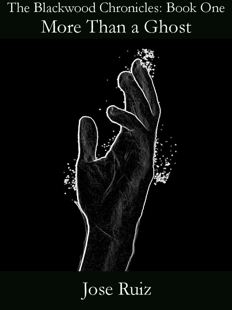 The font change was definitely a good move :) Even if you think it still needs work, is this at least better than it was? |
| ||
| That font is much better, less intimidating. Now the only thing I would try to improve is the formatting. I don't know how you'll feel about this. I think the priority in sizes should be this: title over chapter.  It escapes me the nomenclature used for these different parts of cover text, but they are indeed distinct and should be treated with different weights. In the second picture it seems the chapter is more important than the title (you can see in other books that there aren't other cases like this because the title is the most important part, it's the "brand"). |
| ||
| I like your suggestion quite a bit Kryzon! I'll do something along those lines, and once I have the font and format down, I'll see about adding my own twist to it as you suggested. Thanks, I'll be posting again shortly with the new version :) |
| ||
Attempt #3!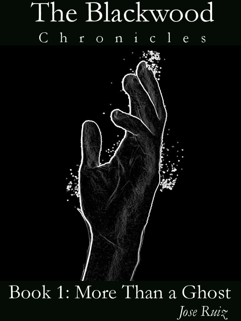 I think the formatting helped tremendously ;) |
| ||
| You may want to keep a little more whitespace around the edges -- Depending on the exact aspect ratio of the reader, some of it may end up getting cropped on some devices. |
| ||
| Yeah, more whitespace is a good idea. I can see the text getting alarmingly close to the edge. Other than the whitespace issue(Which I'll fix shortly), does it look ok? |
| ||
Fixed :D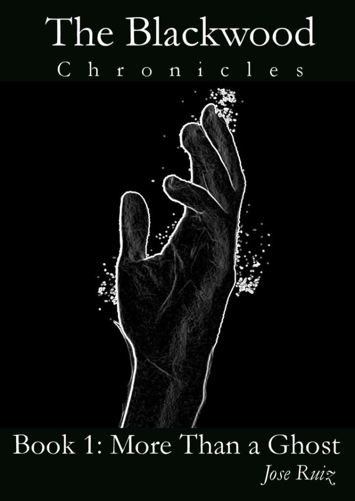 Anything else I should change, or do you think this is 'good enough'? (Because I'm quite happy with 'good enough', just so I can finally publish the darn thing, lol) |
| ||
| ..why your new nickname is Jalape�o ?? :) Just curious because i think i use to eat some sort of chilli or paprika with that name and it was damn spicy :) , i have almost spit out my guts.. :) |
| ||
| ..why your new nickname is Jalape�o ?? :) lol, it was a buddy who came up with that one, since my name is Mexican. He kept saying my name with an exaggerated accent, and then started adding more to it. Eventually just deciding to shorten it to Jalape�o. That's what he calls me now, when he's not calling me Werdna ;) |
| ||
| looks MUCH better :) not sure about the "book 1:" Perhaps just a small "Book 1" under chronicles without colon, center justified and double spaced. Last edited 2011 |
| ||
| A tad iffy, I'm pretty happy with it how it is. However I'll give your suggestion a shot anyways, and see how I like it compared to this one :) As to the story itself, there has been a bit of a delay... After my little sister(Who's my editor), read over it, fixing several minor details such as erratic commas, she found a few major issues with the plot! So I have set forth to do yet another draft of the story, to fix these problems, and just further polish the whole story. It'll take a bit longer, but in the long run be worth it. Cheers! |
| ||
| Looking better Werdna, but I would have the word chronicles all in uppercase like in Kryzon's example. With the "book 1", maybe have a look at the Dean Koontz's Frankenstein covers for examples. http://en.wikipedia.org/wiki/File:Prodigal_Son.jpg |
| ||
| thanks therevills, I'll check it out :) And I'll also see how 'Chronicles' looks in uppercase. |
| ||
Also see how in Kryzon the C and the S lines up with the main title, looks a lot better on the eye ;)T h e Blac W o o d C H R O N I C L E S |
| ||
| Slight delay on updating the book cover, due to the fact that I got an awesome idea for draft #3 ;) I've been needing a hook of some kind for the beginning, since it admittedly starts off a bit bland, so here's the NEW chapter 1. The old chapter 1(Modified a little) will probably become chapter 2 or 3. So without further ado, here it is (Be warned this is a very rough draft of the idea. I need to jazz it up a bit, and make it slightly less cliche, but I think this will work nicely as a 'hook') We crept silently through the graveyard, stopping every few feet to listen for the moans. All was silent except for the spatter of rain drops. We walked further through the overgrown grass, headed for the crypt where they�d told us it lived. Or unlived I suppose since our prey was of the undead persuasion. Let us just say �haunted� to avoid confusion. Kate reached it first, motioning for me to stay back and keep an eye out for an ambush. I didn�t like letting her go in alone, but she had a point. This zombie was supposed to be pretty clever, and setting up an ambush was just the kind of thing it might do� She pushed the crypt door open carefully, one hand glowing with flame to give her light, and walked inside. Kate�s footsteps died away a few minutes later and she was lost to my sight. I sent up a silent prayer to the Good Lord to keep an eye on her. Kate might not believe in God, but I certainly did, and would feel a lot happier if I knew he was on our side. The downpour increased in fury, threatening to flood the whole graveyard, so I crouched behind a nearby headstone for what shelter it would offer. I�m not sure how long I waited back there, certainly at ten minutes, but it was then that I heard it. Amidst the pouring of the rain had been a distinctly different note, something that sounded out of place. I listened hard and heard it again. The steady flip-flop of footsteps. Carefully, so as not to be spotted, I raised my head to look in the direction I�d heard the noise coming from and saw a humanoid figure shambling towards the crypt. Behind it was another, and behind that, another, and another, and another, and another. There were a whole line of zombies headed for the crypt. And Kate had no idea� Leaping up from my hiding place, I ran towards the entrance, nearly slipping on the wet grass. �Kate!� I screamed out, but I doubt she heard me above the rain. A few of the zombies turned to look at me, but most of them continued their single-minded advance towards the crypt. Running and leaping over headstones, I made it within a few yards of the crypt entrance, before my path was blocked by three of them. They didn�t look much like the zombies you see in movies. These weren�t covered in blood, and didn�t have glowing eyes and fangs, and didn�t look like patchwork humans with several bits missing. Basically, they were just dead bodies. Slightly decomposed in places, and one of them was missing his eyes, but by and large, they just looked like secondhand human beings. One of them lunged at me, but I easily stepped aside. The movies at least had that part right. These guys were slow. Their only real threat lay in their numbers, and probable durability. Grinning, I dived past the other two and ran down the crypt steps, shouting out Kate�s name as I went. And of course, there's a bit more to this. This is just a preview to see if it works as a 'hook'. (And I have yet to write the rest, lol). Last edited 2011 |
| ||
| Werdna- I didn't comment on the first beginning, because I'm not an author, but I do read quite a lot & I enjoy the horror genre, and I have to say I much prefer the new draft. I felt way more creeps than before- (though I do have a weakness for zombies!) and would probably read on. It almost hints at a 'living dead' type of underlying humor which gives horror nice twist, and doesn't have to diminish the goose bumps if done well. I have worked in graphic design for >10 years though, and re. the cover, I agree with a previous post that I've seen way worse- but like the story, I'd say don't get too hung up on working over the same image or idea, sometimes it's hard to scrap something you've invested time into, but you can always come back to it, well worth trying different things. Like the change in the beginning, I think the hand could have a lot more impact if it were, say, missing some flesh? coming out of the ground? reaching for something/somebody? (parody of the iconic Jaws cover springs to mind?) As it is, it almost suggests to me a touchy-feely 'Ghost' type romance story, rather than a good ol' flat out horror story? |
| ||
| Good comments Slomas! Glad you like the new beginning a lot better. I'm also going to rework some other portions of the plot to jazz it up a bit ;) As to your suggestions on the hand, I'm sure I could improve it. However, I want to avoid your missing flesh option. I'd like to 'try' to keep this book rated 'T' for teen :) There is no swearing in the story(other than saying something like Kate cursed, or Kate swore). And there is a bit of blood, but it's not too out of hand. So the hand coming out of the ground idea might work out. I'll see what I can do. Right now I'm mainly going to focus on the story itself, so it might be a few days till I have a new version of the hand. Cheers! |
| ||
| Just a quick update. I've been working on improving the beginning, which is getting quite epic for just a small mini-adventure and now includes; hordes of zombies. A necromancer thing, and a demon :) Plus I've extended the old ending of the book, to add a rather hilarious scene that ties in with the new opening adventure. Now I just need to modify the rest of the book to make it a bit more exciting and interesting, and then I'm finally ready to publish the darn thing. Cheers. |
| ||
| Another quick update. I haven't had a chance to do much writing lately, due to having been ill for over a week, but I'm finally getting back to it and have added an evil cult, that ties in the opening of the story with the rest of it, and accounts for a few previous plot holes. The final story will probably be around 35,000 words in length, perhaps longer since I need to add some new scenes involving this cult, who are known as 'The Sons of Thanatos'. Hopefully I'll have a preview of some sort to upload 'soon'. Cheers! |
| ||
| Very interesting thread. I too found your new 'hook' beginning very enticing too, even in this rough unfinished version. The book cover is good, but honestly it's not quite pulling me in. It does have a little bit of mystery about though, I'll give you that. :) As for the title I would offer up this format: MORE THAN A GHOST - big, bold and capitalised. The Blackwood Chronicles - at least half the size as the title font. Underneath the title. Then if you want, a centralise '- Book 1 -' underneath it, although I'd suggest not, as you never know if you'll want to continue the series. The 'Chronicles' part of the title suggests it's a series anyway. But continue the good work, I hope it does well for you and you learn loads from it. I'll watch out for the film/TV rights being sold :) Last edited 2011 |
| ||
| Thanks for the tips Jon_E_5 :) I'm glad everyone is finding the new 'hook' interesting. I'm currently working on the 4th draft of the story, and it will likely be near novel length when finished, do to adding a lot of new stuff and totally reworking the villains. Currently in the draft, I'm almost back to where the old version started, since I added several thousand words worth of mini-adventure in the beginning, that introduces Kate, Alfred, and the new villains. The ghost itself, won't actually show up till maybe 10,000 words or so into the plot :D ;Edit I'll see about uploading the new beginning adventure today, starting in the graveyard, and ending where the old version began. Cheers! Last edited 2011 |
| ||
| New preview, with the new opening chapters. The draft itself is 18,000 words in, with 32,000 (approximately) to go. After that, all that remains is clearing up any grammar mistakes. Either download the .pdf here, http://www.mediafire.com/?lamqjaonxfme366 or check it out on my blog. http://joseruizwriting.blogspot.com/2011/06/more-than-ghost-preview.html Cheers! |
| ||
| LOL - "All characters in this book are fictional. Any resemblance to real people is purely intentional." |
| ||
| yep :) Thought I'd be a little bit original when it came to that part. |
| ||
| You do know why this (the correct wording: This is a work of fiction and any resemblance between the characters and persons living or dead is purely coincidental.) is put in films and books etc, dont you? Last edited 2011 |
| ||
| Yes, to avoid getting the life sued out of you. However, I like it how it is, so am leaving it that way ;) |
| ||
| As long as you know ;) |
   |