What do you think of my NEW logo?
Community Forums/Graphic Chat/What do you think of my NEW logo?
| ||
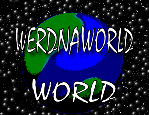
| Hey everyone! A friend of mine recently brought my attention to a second game company called Lighthouse Games, located on facebook. So I contacted the guy, and he certainly seemed nice enough, but was not comfortable with there being two of us. Thus, I must rename my 'company'. And, as awesome as the logo that Pongo made for me is, I'm thinking I might want to change the 'company' theme. Since if I keep the lighthouse theme, I'll have to be very careful about what name I pick, and most of the names I would want would include the words 'Lighthouse', and 'Games'. So, I decided to come out with a few Alternate logo's in case I decide not to go for the Lighthouse Theme. Here's the first 3 logo's for WERDNA WORLD :) This is the first one I did.  Here's the Second.  And here is my favorite, which I actually went to a fair amount of trouble to create, being that I had to make an actual 3D model for it. 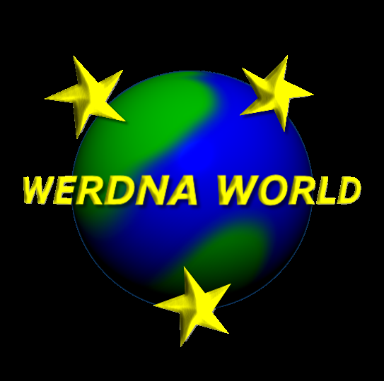 Tell me what you think, and don't worry about being too harsh with your critique, because thats what I prefer ;) Cheers! |
| ||
| I like #2 best. Too many stars in #1. I do not like the globe in #3 and I do not like the effects on the stars in #3. If you decide not to use the globe in 1/2, LMK and I would buy it from you. |
| ||
| A friend of mine recently brought my attention to a second Is it a registered trademark? If not you're not obliged to do anything. You could even register it yourself and get HIM to make the change.game company called Lighthouse Games, located on facebook. So I contacted the guy, and he certainly seemed nice enough, but was not comfortable with there being two of us. Thus, I must rename my 'company'. Tell me what you think, and don't worry about being too harsh They're pretty bad, for various reasons.with your critique, because thats what I prefer ;) In all cases, you've got coloured text over a coloured graphic = bad. I'm not overly keen on the globe graphic. The font is bad in the first one, and the stars are 'detached' from the logo. In the last two, the stars are what can only be described as 'wonky'. A handy trick when designing logos is that they must look as good in black/white as they do in colour (as the Lighthouse Games one would). |
| ||
| why not wrap the 'werdna world' around the globe and incorporate the stars also ie *werdna*world* but circular might look crap but nice to try out variatons. |
| ||
| @GaryV I might be willing to sell it the globe ;) E-mail me your offer :D @Gfk Is it a registered trademark? If not you're not obliged to do anything. You could even register it yourself and get HIM to make the change. I don't know if he has it registered not, it's a pretty small company that makes downloadable games for the Xbox 360, although seems a lot more professional than me. Chances are, it's already registered. And if not, I won't register mine because I'm a hopelessly nice guy ;) They're pretty bad, for various reasons. I know the first 2 aren't all that great, but I really like the 3rd one :( Ecch, I can see this post turning out like my previous attempt at a logo. Oh well, off to work on a few revised versions, taking your feedback into account to try and improve upon it :) |
| ||
| Interesting Idea Ruz, I'll go ahead and give it a whirl ;) |
| ||
| The 3rd one isn't bad, but change the font. It's boring. |
| ||
| Ecch, I can see this post turning out like my previous attempt at a logo. To be fair, you're still making all the same mistakes people pointed out in that thread. We're not talking mistakes of technique or skill, but mistakes of approach. Countless people in that thread told you that logos are not done in paint programs with filters and thousands of shades, they're done in illustration programs with simple shapes and three or four colors. That's how you ended up with the logo that you have on your mug. Yet I look at these logos and I can spot the Photoshop bevel filters applied to just about anything that stood still, dozens of shades of the yellow, dozens of shades of the green/blue join, hand-painted continents on the globe, all the things which were pointed out as being the reason your previous logos weren't very good. Now I've been very impressed with the way you've taken criticism, over logos and writing. You're always very polite, you don't argue, you listen, you try to understand the reason things are wrong. You're just missing that last step of actually learning from it. There are a lot of things wrong with these logos, and we can point them out, but all the time you're trying to do them this way, I'm not sure it's going to benefit you much. Take some time to dissect your LightHouse Games logo and discern why it's a good logo. Look at all the things you do, and try to find equivalents on the logo. When you don't find equivalents, think about why there are no equivalents and think about why they were done differently. |
| ||
| WERDNA, is this other organisation located in the same country as yourself? Facebook is international so if they are located somewhere else, they have no legal right to tell you to rename your "company". A business must be registered in all countries that it operates. If it isnt, then just register it yourself and carry on using your name. As far as trademarking, you never normally trademark a company logo as its already associated with that company, and there is no need. Plus is a very expensive and long winded procedure. Products are the things you normally trademark. Because its not directly "legally" linked with your company but you still dont want people using the name. There will be a way of finding if this guy has registered the company name for your location, try your local companies office. They should have a search feature on their website. If no name comes up, dont worry about it and carry on with Lighthouse Games. Because you are fully within your rights to do so. |
| ||
| We're not talking mistakes of technique or skill... Well, I was. But instead, I'll just say that Gabriel's comments are spot on. To add to what he said though, a game/web logo doesn't need to be a vector logo suited to print work, but it's good to understand why people generally do that. As mentioned in previous threads, start reading basic graphics tutorials. Lots of them. Your technical skills are waaay below par, and I'm not just talking about fonts. Also as mentioned, it's okay to make poor graphics and enjoy yourself doing whatever, but if you want to get better- get better. Learn first, then do. |
| ||
| ..your logos looks similar to EU logo..maybe you should rethink stars and globe actually? |
| ||
| To be fair, you're still making all the same mistakes people pointed out in that thread. We're not talking mistakes of technique or skill, but mistakes of approach. Countless people in that thread told you that logos are not done in paint programs with filters and thousands of shades, they're done in illustration programs with simple shapes and three or four colors. That's how you ended up with the logo that you have on your mug. Yet I look at these logos and I can spot the Photoshop bevel filters applied to just about anything that stood still, dozens of shades of the yellow, dozens of shades of the green/blue join, hand-painted continents on the globe, all the things which were pointed out as being the reason your previous logos weren't very good. Now I've been very impressed with the way you've taken criticism, over logos and writing. You're always very polite, you don't argue, you listen, you try to understand the reason things are wrong. You're just missing that last step of actually learning from it. There are a lot of things wrong with these logos, and we can point them out, but all the time you're trying to do them this way, I'm not sure it's going to benefit you much. Take some time to dissect your LightHouse Games logo and discern why it's a good logo. Look at all the things you do, and try to find equivalents on the logo. When you don't find equivalents, think about why there are no equivalents and think about why they were done differently. Hmm. You certainly have a good point. There seems to be something fundamental that I'm missing, because I'm just not getting it like I should be. I don't know if it's the fact that I'm just so used to using my paint program that its difficult for me to do something simple with shapes and only a few colors, or what it might be. But I think I definitely need to read a few tutorials before posting anything new. Thanks for your help! @ICECAP Thats something I must investigate! Although I may want to change the name to WERDNA WORLD anyways ;) @Reactor Your technical skills are waaay below par, and I'm not just talking about fonts. Another reason I must hunt down some tutorials :) @Naughty Alien Very interesting! Thanks everyone! |
| ||
| Logo design is definitely a special skill, and even great artists may not be any good at it. Gabriel's analysis above does seem to summarize it all, though. the point of a logo is that is needs to be instantly recognizable, which pretty much means fairly simple shapes and sharp lines. Here's another good read regarding designing good logo's that I happened to come across recently: http://www.istockphoto.com/article_view.php?ID=721 IT has some 'good' and 'bad' examples, with good explanations of why. |
| ||
| Thanks xlsior! I'm checking it out now ;) |
| ||
| I say you stick with lighthouse games. The logo looks great and you already have a coffee mug. The likelihood of you having any name issues with the other guy are slim to none. |
| ||
| A good point TaskMaster! Although I would like a backup logo in case things don't work out ;) Plus its a challenge for me now, to finally create a decent logo! Using previous advice, and the site xlsior pointed me to, I have a new version of the WERDNA WORLD logo, both in color, and in black and white. Tell me what you think!   |
| ||
| To be honest they still look very amateur what I would do is do particle effects etc and text in blitz3d and do a screen grab and who knows you might come up with something that looks nice :) |
| ||
What about playing with the layout to be a bit more dramatic, like this? It doesn't look like your using a vector art package, have you tried inkscape? http://www.inkscape.org/index.php?lang=en |
| ||
Very quickly done in Inkscape:  |
| ||
 My idea. Made quickly could be improved |
| ||
| All of those are a lot better than mine, lol! And I'm not using a vector art package, all I'm using is Paint Shop Pro 9, which only has limited vector tools. That might be part of the problem, is that I'm not using the right tool. I know I have Ink Scape floating around somewhere, so I'll go ahead and give that a shot. Would Gimp work well also? Thanks! |
| ||
| Werdna, Gimp isnt vector based, so no it wouldnt work - stick with Inkscape ;) |
| ||
| That might be part of the problem, is that I'm not using the right tool. Before you pick a program, learn about design first. Seriously, the problem here is twofold- a lack of technical skill, but also a lack of design understanding. It's something that needs to be learned about, practised, and studied. It takes time. Lots of time. I'm talking ten+ years amount of time. It might be a challenge for you to get it right today, but to succeed at this challenge you need to give yourself time to actually learn. Using previous advice, and the site xlsior pointed me to, I have a new version of the WERDNA WORLD logo, both in colour, and in black and white. Just a word of advice- take people's advice with a HUGE grain of salt. Very few people on this forum know what they're talking about when it comes to design. Every time you make threads about this kind of thing, I spend most of my time shaking my head at some of the terrible advice that's given. And yes, by saying that I am saying that some of that is from xlsior. Find the people who run design websites and have tons of people following what they're doing. Learn from the best in the world. That's what the web is good for. And what about my advice? It's not specific to making a better logo. It's just a general observation, related to the process of self teaching. Right now half of the advice (or even more) you're taking on board is just confusing the issue and leading you down a garden path. |
| ||
| It's something that needs to be learned about, practised, and studied. It takes time. Lots of time. I'm talking ten+ years amount of time. Whilst I don't disagree with you, that doesn't exactly help him out *now* (or in the next 'ten+ years'), does it? Apart from the (perfectly valid) 'teach a man how to fish' advice, and the warning about how many (most?) suggestions are total balls, what would you suggest he does now? Get someone else (with ten+ years experience) to make a logo for him? Just give up? I'm curious because I may well find myself in a similar position someday. |
| ||
| I'd get someone else to make the logo for him, because it's obvious from past examples and now these too that Werdna has no sense for what looks good and his judgment is probably clouded by the idea that simply making the things himself makes them good. I don't mean any offense to Werdna either, it's just that he has no art skills and really doesn't know what he's doing, so it's either learn or work on improving overall. He isn't presently capable of doing anything to improve these, as far as I'm concerned, and his attention would be better focused elsewhere (on coding or something). |
| ||
| LineOf7s, I'm trying not to repeat myself too much in this thread. I mentioned a few things back in a previous discussion with WERDNA. If he needs a logo today, for serious business, he should hire someone (as I think he already has done) to make one. Logo artists are a special breed, and just a lot better at making superb ones than your average artist who isn't focused on them. That's not to say a good artist can't make a decent logo, but if you want the best, you hire a specialist. So, the three options are- - Keep your logo really simple, and get an artist's opinion before rolling ahead with it. A logo can be as simple as plain text with a well-chosen font (I saw a multi-million dollar company in Japan with one like that recently- plain blue, nothing special). Make sure it's applied properly, and in the right format. If you don't know how to do basic anti-aliasing (hint hint WERDNA) learn how to do the basics. - Hire a recommended artist. By that I mean, leave programmer world and ask a professional game/print expert if the quality of the artist's work is as good as they say. Alternatively, look at popular modern design examples on sites like Smashingmagazine.com Your logo may not blow people away, but at least it'll look decent and not hurt the rest of what you're attaching it to. There's an obvious cost involved, but it shouldn't break the bank. - Hire a pro logo designer. That'll be the tricky one to find. They can be found on google (search for logo design), although most of those guys will design a logo without your website as reference. The best method is just to keep your eyes and ears open for top-level artists (look on graphic websites and ask around) who are reliable and willing to work with you. The cost might be high. But, you can start now by taking note of the experts when they appear. Send them an email and ask about pricing. When you need them, you have their contact. ...that doesn't exactly help him out *now* (or in the next 'ten+ years'), does it? In a way it does (or it should!). It's saying, "Hey, slow down. Give it time. It's not a matter of adding A, then B and then C to your to-do list software, and then ticking them off after your first go. The basic way to think about this is- great artists are great because of much practice, study, etc. It's not an overnight thing. If you need to go from zero to hero in a hurry, you hire someone. I recently needed a voice actor for a video. So, I had a shot at recording my voice. I sounded like an idiot, so I hired someone. All I can say is, I'm glad I kept my eyes open for a top-shelf professional. I hope that helps. |
| ||
| What about... Don't try and make one logo, using a vector based art package why not generate 20 logo concepts sticking to the rules that you can only use a few of colours and the idea is to keep it simple. And think about what you want Wedna World to represent to people first! Put them up in a grid and people can vote on the ones they like best, then taking those do another 20 logo's based on those ones, after a few generations of this you should have a decent looking logo! You can always use the power of Evolution! |
| ||
| I have liked some of Werdna's sprites and images. But, I think sheep farmers are not necessarily the best logo artists. Werdna, save up some bucks and hire somebody. If you can't afford it, you could probably put up a PayPal donation page and I am sure several here would contribute a buck or two. |
| ||
| Thanks Reactor. :o) |
| ||
| - Keep your logo really simple, and get an artist's opinion before rolling ahead with it. A logo can be as simple as plain text with a well-chosen font (I saw a multi-million dollar company in Japan with one like that recently- plain blue, nothing special). Make sure it's applied properly, and in the right format. If you don't know how to do basic anti-aliasing (hint hint WERDNA) learn how to do the basics. I see no reason why this method won't suffice for your purposes. It will be clean, crisp, simple and professional. Many major companies do this, like take Lenovo for example: Seeing as you are just starting off, begin with a logo like this. As your website/business progresses, you may need to evolve your logo. But worry about that when the time comes; making the games should be the greater focus. |
| ||
what about something like this? maybe not the best but hey i only spent about 5 min in gimp, and i wanted to keep it simple and not to flashy and overbearing. on a side note i like therevills 1st pic. |
| ||
| I like Arowx's |
| ||
| Arowx's is cool indeed... what soft did you use? @WERDNA: If you want to make your own logo, get away from your computer now. Shut it off, go! Go to a table with a lamp or in a comfortably lighted room, grab a blank sheet of paper and basic drawing tools and sketch the logo and possible variations until you are comfortable with one or more, before attempting to use a computer at all for this. When, and only when you get a sketch that looks good on paper, you can go to your computer and digitalize it (either by scanning or simply by eye, to vectorize it). Don't make "attempts" using the computer. Only go to it when you are very inspired with something you sketched previously and with focus. It's easy to lose yourself when working in the computer with something you don't have much experience, especially when you didn't have an out-of-the-box, calm look at first. |
| ||
| @Reactor superb advice Reactor! I think the main problem, is that I was just as Kryzon says, 'attempting' to us a computer for it all. I have no experience with logo design, and thought my minimal experience in game graphics would allow me to easily crank out a decent logo. I think Nillium summed things up best with this. I don't mean any offense to Werdna either, it's just that he has no art skills and really doesn't know what he's doing, That about says it all :) Not sure I want to devote a couple of years to getting really good at this, since coding is more what I'm interested in, and I am horrified by the thought of *gasp* picking up a pencil??? And learning to sketch out my logos before I try to draw them in the computer ;) I think hiring a proper artist is probably the best move, I like the paypal donation idea! However that doesn't mean I'll give up! I will still attempt to make a few logos, more for fun than anything else, and I'll try sketching them out before hand. and I like this idea, Put them up in a grid and people can vote on the ones they like best, then taking those do another 20 logo's based on those ones, after a few generations of this you should have a decent looking logo! And as to this, But, I think sheep farmers are not necessarily the best logo artists. Possibly true, but my sister is a sheep farmer to, and an A+ Acrylic painter who sells her artwork at a local art center :) Well thanks everyone, for all of your help and advice. |
| ||
| Check out thaaks' thread: http://www.blitzmonkeys.com/index.php?topic=369.0 He went with a company on eBay to design a logo. |
| ||
| opps... double post... |
| ||
| You'd be better off at places like this. 99designs.com crowdspring.com You set the price, and artists bid for the work by submitting designs. You choose the one you like the best (maybe get advice on the choosing part, if your idea of quality art is a geocities website design) and then pay the money. Simple. However that doesn't mean I'll give up! I will still attempt to make a few logos, more for fun than anything else... That sounds great- don't give up. No one can do everything. Programming is an art, so if that's your primary focus and all you do, there's no shame in that all. (in fact, many artists gone developers need them badly). Drawing is therapeutic, so it's a good thing to do as a side activity, even if you're not doing it to win a price. |
| ||
| I like the sound of having the artists bid for the job! That could be quite fun :) Any idea how much that might cost, or does it differ widely from job to job? Because my budget is a tad low ;) Thanks Reactor\Therevills! |
| ||
| Averages are usually found on the sites, and you can look at the public projects to get ideas of how much it'll cost, and what kinds of guys will put forward work. |
| ||
| Thanks! |
| ||
| I'd like to add that I like Werdna's graphics. You know there's something timeless about a really ugly ms paint job that makes me go awww its like an ugly duckling but for some reason, i like it, its not pretentous or anything. Werdna, why not just keep on at it, but remember to keep it as simple and readable as possible. Lighthouse games logo is very nice so even though your first werdna world graphics were ugly, keep on going... there is nothing quite like putting your own mark on your work :) |
| ||
| I'd like to add that I like Werdna's graphics. You know there's something timeless about a really ugly ms paint job that makes me go awww its like an ugly duckling but for some reason, i like it, its not pretentous or anything. Werdna, why not just keep on at it, but remember to keep it as simple and readable as possible. Lighthouse games logo is very nice so even though your first werdna world graphics were ugly, keep on going... there is nothing quite like putting your own mark on your work :) LOL! Nearly feel out of my chair laughing at that one ;) I'm glad that you like my graphics, and I will keep at it logo wise. Cheers Rob! |
| ||
| Possibly true, but my sister is a sheep farmer to, and an A+ Acrylic painter Perhaps she could do your logo? who sells her artwork at a local art center :) |
| ||
| Strangely, I never considered that. Maybe I should ask here ;) |
| ||
New logo!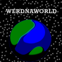 Tell me what you think :) |
| ||
| why not have a closeup of the back of a floppy disc.... with the circle sort of being your world. |
| ||
| I like the one on the mug, the best... |
| ||
| A couple of things about logo design; Should be reproduceable in B&W Should be reproduceable at small sizes - so small, script fonts are often not a good choice In other words, if your logo can stand being printed at small size then photocopied several times and still be clear and recognisable, then you're on the right track. |
| ||
| @Rob cummings. Very clever idea, certainly something I must consider ;) @Brucey I know, I know, lol. I will likely never be able to rival Pongo's awesome logo :) However, I do want a back up logo of some kind, just in case things don't work out with the guy on facebook(I sent him a message, asking him what country he's in). @MadJack I know it should be reproduceable in black and white, and preferably vector so that it can be easily scaled. However I want my logo to be fairly detailed, chances are it won't be being scaled to fit on lunch boxes anytime soon and will only be used as an intro to my games, and my profile picture ;) I can always change it later, to make it easier to modify. Is this one at least decent? Thanks for the advice! |
| ||
| Werdna fair enuff. Can you curve the text to fit the upper curve of the globe? |
| ||
| Yeah. let me give that a shot :) |
| ||
| The text is a little bit zonky, I can clean that up later, but is something like this what you had in mind? 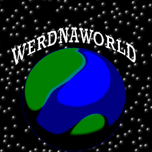 |
| ||
Or is this a bit better?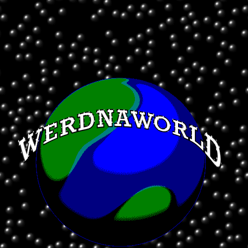 |
| ||
| Hmm - thing is the graphic should have one immediate focus i.e. one element the eye is first of all drawn to. At present the text is fighting the planet for first attention as they're both eyecatching. An option would be that the text should be bigger than the planet, slightly curved, no outline, the planet in front of, centred, and slightly below the text (with only a slight overlap but not enough to make the text unreadable), and the planet scaled down about 50% smaller. |
| ||
| I'll try your suggested option, or a variant of :) That actually sounds pretty good, and you definitely have a point that they're both fighting for attention. Thanks! |
| ||
| Werdna yeah - if you want to go the other way - have the planet foremost, then you could have the globe at the size it is now and then reduce 'Werdna World' to two lines fitting below the globe. e.g. <planet> WERDNA WORLD Again making sure that the text is not overpowering/fighting with the planet |
| ||
| it doesn't have to be planet earth. get some luxury planet image generators.... with halo etc |
| ||
| aye think of it as planet werdna ;) |
| ||
| Excellent suggestion, thanks so much for your help MadJack. I really appreciate it :) Well the new version of 'planet WERDNA' will be slightly delayed. I was going to upload a new version of Ping Pong Battle today, and just work on the logo while it was uploading, but alas, I have a memory leak it appears, so I'll be busy today trying to solve that ;( |
| ||
Hey WERDNA! Just because I could, I made a version of your logo for yuh. Tell me if you like it. If you want the original file with all the layers, just ask. |
| ||
| Very awesome :) When I have a chance, I'll try making another logo based along the lines of yours! |
| ||
 |
| ||
| LOL!! Funniest post I've seen in awhile :) |
| ||
Maybe you could turn the O into a planet like in this example: |
| ||
| hey, cool idea! I 'think' I'll stick with the idea I've been working on, but I'll keep yours in mind ;) |
| ||
 Awesome new logo, based on the idea of GIB3D's. Tell me what you think, |
| ||
| Looks better. Why is the word "World" twice now? Also why are the stars now so big? Why have you got stars for a logo? One other thing, how does it look with a transparent background? |
| ||
| oops, LOL. Didn't noticed I had the word 'World' in twice, LOL! I'll work on fixing that up :) And I can size down the stars. Plus I'll give the transparent background a chance and see how that looks. Thanks therevills! New version coming soon ;) |
| ||
| "WERDNAWORLD WORLD" pleases me a lot, but they say my taste is very bad. |
| ||
| It still saddens me that they changed the best tv channel name ever: "tv tv". |
| ||
| LOL |
| ||
| Its looking pretty good. I don't claim to have any special talents in graphic design, but from the eyes of an everyday consumer, I'd say get rid of the background all together. Logos don't usually have backgrounds. Great progress though! |
| ||
i kind of like this one :D ahem* is it just me or is it just supposed to be andrew backwards? |
| ||
| That one would be good as a splash screen, but not as a general logo... |
| ||
| i thought they all were splash screens |
| ||
| By looking at most of these, you would wouldnt you... ;) Actually that might be a good question to ask Werdna.... Are you after a logo or a splash screen? |
| ||
| I'm mainly just looking for a splash screen for my games. Just something that lets you know what 'company' made the game ;) So it being resizeable isn't really an issue. Leon Drakes looks epic. Awesome splash screen ;) (Although for some reason, it looks a little like its made out of cheese or dough...) @Leon Drake Yes WERDNA is Andrew backwards, although thats not my name. WERDNA was the boss character from one of my favorite games ;) I'd say get rid of the background all together. I like the backgrounds :( I will 'likely' keep it in my logo\splash screen. Here's my new one by the way. 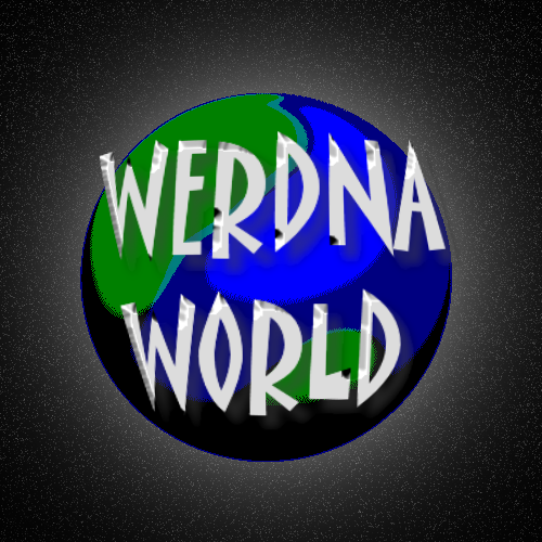 And another without the spherical text. 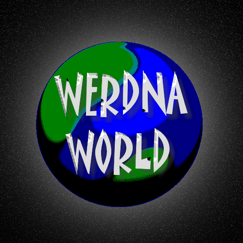 |
| ||
that last one was a 3ds max render. here is a photoshop only version |
| ||
| Even for a splash screen I think the distracting background should go. Just keep the earth and the text. |
| ||
| The photo shop version might even be a bit better than the other ;) Both are pretty darn epic, lol. |
| ||
Here's one I've just thrown together for you. It is 512x512 so you can use it as a texture if you want. If you want it with alpha channel, just ask. Or use it for your own ideas :) |
| ||
| I like that one Robert! It has a very plastic feeling to it and it works without a background that just doesn't fit in a logo. A logo has to stand for itself. |
| ||
| If you need an actual logo in addition to a splash screen image, then I recommend the free logo maker software - AAA Logo 2004 Freeware. It might be worth checking out their paid version too. LINK: http://www.aaa-logo.com/freelogo.php Here's a quickie logo I did with it:-  |
| ||
| wow, I'm amazed at the quality of the logo's\splash screens you guys are posting! I think I'll try giving a splash screen more along the line of Leon Drakes a try, and see how that works out. I think you do definitely have a point Sauer, that logo's are best with no background like the one Robert Cummings did. While splash screens, are probably better WITH a background, more like Leon Drakes :) I'm also amazed, that, just like with the lighthouse games logo post, I'm getting offers for free logos... That what I really like about this site, is everyone is so darn nice, lol. For now I'll stick with logos\splash screens of my own design, simply because I have fun making them, and its good practice for me :) Sooner or later though, when I am really in need of one and if mine aren't high enough quality(And I know they have a long way to go ;), I would be very very happy to use one of yours if you guys don't mind. They're all awesome, lol. |
| ||
| Well you are getting better Wedna, just look at the first ones you posted in this thread and the last one to see how far you have come already :) With the last ones you posted, did you reduce the number of colours on the world, as you can see the dithering quite a bit? |
| ||
| Well thanks therevills! I certainly hope I'm getting better. Yeah, I think I reduced them from 16 million colors, to 16 :) Do you think the dither is a bad, or a good thing? |
| ||
| I think you should not use dither but nice clean lines. Bill's got a good idea too. |
| ||
| Oh yeah. I meant to thank him for the link in my last post, lol. Thanks Bill :) I'll check it out! |
| ||
| I already know you want to do it your way, I actually think its better if you make your own art and sound with your game. Its just a matter of personal pride and it makes you happy. And if your happy, maybe some of your players will be happy too :) |
| ||
| I don't know which program you are using but in my early picture manipulation days i enjoyed Paint.NET a lot. Imo it's not so confusing as gimp and you can get to wonderful results with it. Just wanted to let you know (there are also a lot of tutorials on their forums). |
| ||
| That precisely how I feel Robert Cummings ;) I really, really want to make my own logo. @Espada I use Paint Shop Pro 9 for nearly everything, because I've used it for years and am very very comfortable with it. Although I also use Gimp a little bit. I'll check out Paint.NET though, and see how I lik the looks of it. Thanks folks! |
| ||
| Lol...just realised your name is Andrew, Backwards. |
   |