Xilvan Design Animated Logo v1.0 is online
Community Forums/Graphic Chat/Xilvan Design Animated Logo v1.0 is online
| ||
| Today, I've made a new Animated Logo for my Xilvan Design Game Studio... Its basically a new Xilvan Design Logo with Special effects and particles... Lets see it now:  The video has been updated... we hope you will enjoy the fact that the particle is fixed and work very well... Enjoy ! |
| ||
| The particles need to fade out when they near the end of their life. It's pretty boring, actually. Maybe more particles? |
| ||
| Pretty nice logo. The particles do need sorting out, though. |
| ||
| Nice one but the voice is somewhat scary. BTW you should do something with your sig, when I click your homepage link: This account has been suspended due to billing issues. |
| ||
| I like it, but on your logo, the only thing legible is "Design". "Xilvan" is unreadable. You want people to be able to easily read your company's name and not have to "guess" at what it says. |
| ||
| Is pretty much like altmost 3-4 years I use the same Logo in my games... Nobody told me it was unreadable... Anyway I'm working very hard to finish the game before September. It will have several temples, palace and forests and would mainly get better tree for the Playing Card World. I'll try to model them with 3Dstudio max and I'll add the leaves with my own sprite lib for pngs, trees will look more evolven than in Lights of Dreams and look more realistic. I keep making my best to get a polished result on my 0.60th version of the Candy World III : Heart of Heaven... Yes, its no longer Candy World : Heart of Heaven Tome III... I think it need to be learned. Thanks for reading and sorry for my bad english ! |
| ||
| That was my first thought too, I can barely read it. If I didn't already know it said Xylvan, I'd probably never guess that. |
| ||
| It's unreadable indeed, maybe because the 'a' and 'n' are idenitcal. You should try putting a small hole in the A, and add a little stripe to the left side of the N. It does look great though. |
| ||
| Nobody told me it was unreadable... Its definitely been mentioned before in some of your other threads, you just tend to tune out the things you don't like to hear. But they're right -- it is hard to read. A good logo should be recognizable / readable at a glance. the 'candy world' logo is anything but. At a glance it looks like random smears of paint, not actual lettering. I do like the particle effect in your initial splash screen, though. |
| ||
| That logo makes designers cry. |
| ||
| I'll have to agree with Reactor. Instead of trying to create letters from scratch, start with an already made font and modify it to your needs. I think the animation involved is pretty simple (in the bad way...), and since you have 3DS Max, there is no excuse software-wise. For instance, try to put a jingle for it, and synchronize the build-up animation of the logo to that soundtrack. Use some logos from professionals as reference: http://www.youtube.com/watch?v=1op-YW4TRZU (This one is so hot) http://www.youtube.com/watch?v=0jpWe6UjU2Q http://www.youtube.com/watch?v=6dRoItLRK1o http://www.youtube.com/watch?v=_zMWj56slKw&feature=related - watch the Related Videos for many more. PS: I'm not telling this to Xylvan as I'm afraid he'll ignore my post. Just saying to whoever's listening. |
| ||
Here is the new Noopy's Home made in 3DStudio Max 9 :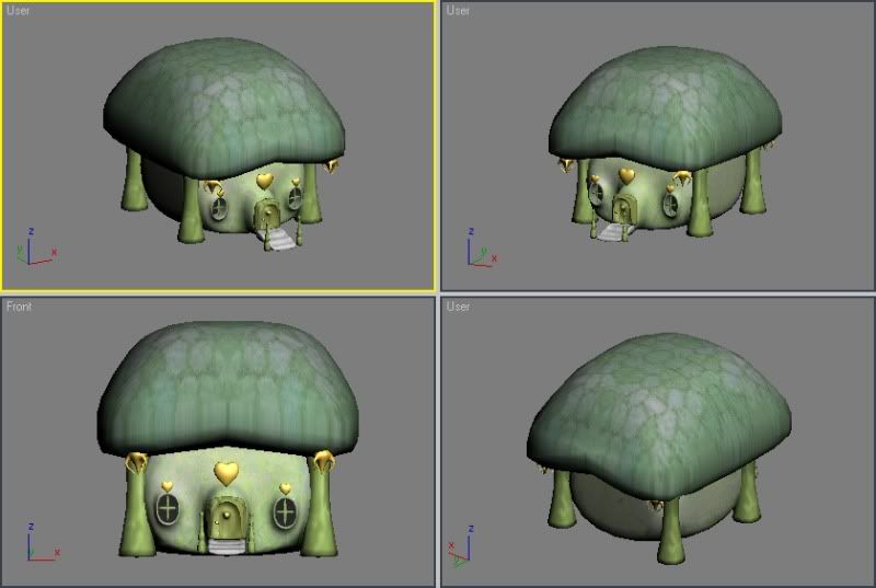 Quick look at how it looks in the game:  |
| ||
| Aren't you gonna comment on the feedback you got? |
| ||
| Wait. What happened to discussing the logo? |
| ||
| While fancy looking, the logo is not readable which kind of defeats the point. |
| ||
| ..what Intel logo doing on your company splash screen? Really curious..? |
| ||
| I really like the house. |
| ||
| Xylvan develops a page fault every time someone suggests his work is anything less than total perfection. The Sylvanian families' mushroom marshmellow tree house is not half bad, but maybe if we diss it he'll flip back to the topic of the logo? |
| ||
| Umm... adding some particles on top of what you were doing before isn't really `animating` it, to me, although you do have some zoom in and out, which is fairly basic. What about animating the individual parts of the logo? |
| ||
| Is pretty much like altmost 3-4 years I use the same Logo in my games... Judging by the responses to your countless other threads over the years, perhaps people just felt that there were more important issues to address than whether you could read the logo or not. Nobody told me it was unreadable... |
| ||
| What about animating the individual parts of the logo? I'd focus on getting a readable logo first before spending time trying to polish the existing one... |
| ||
| Nowaday, my two games named Candy World III : Heart of Heaven and Candy World Adventure II : The Lillians Festival is being published in their demo form by Download.com. Download.com release date: Candy World III : Heart of Heaven Today April 9th 2010 Candy World Adventure II : The Lillians Festival Soon, April 16th 2010 I'm still working on both, i'm realising it is long and hasardeous to make such games. Anyway, nothing is impossible, maybe I'll change my vision in some weeks and really gets in the two projects. My logo is simply the best I did in the past years... It looks more appealing for people. |
| ||
| Whats the point? I suppose you didn't ask for feedback, so fair enough. |
| ||
| It looks more appealing for people. What do you mean by appealing? How do you know it's more appealing to people? did you do a research? asked a friend? |
| ||
| Hi Xylvan I do wish you took what people have said on the logo, you are redefining your games so why not redefine your logo as that is crucial. To be honest not much need to change, but if you see your logo  Look at the end to which I highlighted, do you honestly see a N there, as that is exactly like an A which will confuse people, so just make that change. You put the logo in the showcase and people are trying to help you Hope you take everyone advise and just alter it a little Kind Regards |
| ||
| Xylvan: The logo is ok. The game must be now worth to play. At first you must make the game. GAME! GAME! GAME! |
| ||
| I must agree with ShadowTurtle. The logo is low priority compared to making the game fun . Your current logo does look cool, but I simply can't read the Xylvan bit :( |
| ||
| The logo needs to be...readable. btw, I think your skills are improving. Just remember, gameplay is king. |
| ||
| n not N The logo is like a rebus. It gives letters that make you think of some other letter. X I think you can read it i too l too V why not A ? you dont n -> Oh ! Then I need to explain my artistic vision more next time. It is true that the abstract shapes of the logo may give confusion. |
| ||
| You will need some (plain) text below your logo where it appears in the game to explain the vision; something along of lines "This says Xylvan". |
| ||
| LOL Then I need to explain my artistic vision more next time. It is true that the abstract shapes of the logo may give confusion. Do you understand what the point of a logo is? |
| ||
| Actually, it's supposed to say "Xilvan" not "Xylvan". Of course, you'd be hard-pressed to know any of this if you didn't already know. :o) |
| ||
| I've read forum threads by Xivan here before. I'm with everyone else here who says he needs to focus more on gameplay rather than graphics (to be brutally honest, Xivan, graphics just arent your strong point... sorry) Aside from that, I'm not sure what more to say than good luck with your games. Keep working at it and LISTEN to those whom are trying to help you. :) It'll pay off in the end if you do! |
| ||
I think I dont need that kind of reply... I always get bad notes when I post images on the front page of blitzbasic.com. The most annoying is that they vote 1/10 or 3/10 just for not letting me getting the best score.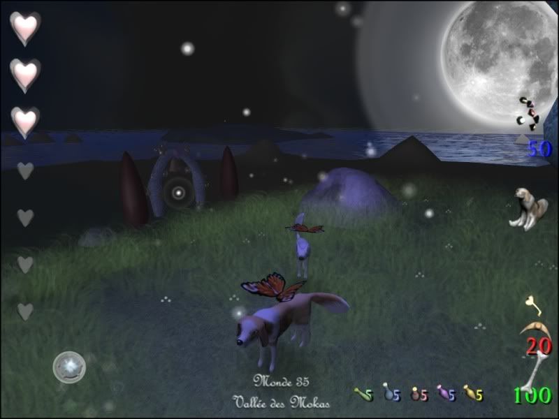 |
| ||
| Why is the dog on the right dragging its bum on the floor? And more to the point, whats a screenshot doing in the middle of a thread about a logo? I think I dont need that kind of reply You'd rather people just tell you everything's great when its not? I'm all for putting in effort, but there really is no point in asking people what they think, then demanding that they have to like your game when they tell you they don't like it.Oh, and btw - your logo says 'Jilvaa', if anything. |
| ||
| The most annoying is that they vote 1/10 or 3/10 just for not letting me getting the best score. It's not a popularity contest. People rate your images down because more often than not they look bad. Why would someone rate a bad looking image 10/10? If anything people on this forum are extra nice. Most people I know would throw a rock through their monitor in an attempt to kill any of your images dead. Be thankful. |
| ||
| The most annoying is that they vote 1/10 or 3/10 just for not letting me getting the best score. Now you are starting to sound like Josh. For the record, I am usually fair with any of your screenshots because I like your artwork. IMHO, any screenshot you have posted (including the one above) blows away anything Josh has ever posted. |
| ||
| IMHO, any screenshot you have posted (including the one above) blows away anything Josh has ever posted. Should've gone to Specsavers. |
| ||
| your current logo looks like it says Xilvaa Design. What font is that? Custom? Nice particles but I think it would be more attractive if they had a longer fading time and moved a little slower. |
| ||
| How many different versions of each game are you going to release? It seems like every few months a new version comes out. Updated Version 16.4.83.1c is now out! Come on, give a tease, but don't ruin a game by releasing 47 unfinished versions. People will not download an updated game because 2 variables have changed, or because there is a new level. Step 1: Finish a game. Step 2: Then release it. Step 3: Don't mix the steps up. |
| ||
| Wow a new house model, go and release a new game! :p |
| ||
| Looks like Klingon if you ask me.. but don't worry - logo's aren't the easiest thing to design - for anyone. But don't stop trying to make a new one just because "this is the best one you made in the past few years."... I'd completely blank it out and start from scratch, head in a new direction, or maybe take up sowing or archery... As for the mushroom hut, it looks decent for the theme of this game I suppose. Probably could use some light-mapping or baked-in ambience shadowing.. over all it seems to fit the theme of the game rather nicely. |
| ||
| SabataRH: Long time no see :) |
| ||
| To be fair, the grass textures in that last screenshot looks pretty cool. :) Sorry if my last comment offended you, but I was just stating an opinion. |
| ||
| Hey Ed:) How's Elite going? To be honest, I admire a person that's staked out a project this long.. Very few indys do. While I can't say I've enjoyed the demos I will say that the effort is very positive.. I predict this Xylvan will release a very popular series of games one day. As far as him not replying to posts, it could very well be a language translation thing.. but maybe not. I agree with AvestheFox, the grass looks very cool. Keep rolling Xylvan!! |
| ||
| Thanks ! In the next few days, I'll be working on Candy World Adventure or Candy World III... or both... I think i can finish the 2D version soon and planish a third installation of Candy World Adventure III : The New Horizons... It will be for 2011... The game will be using the same new engine as Candy World Adventure II : The Lillians Festival and maybe it will enhance the way to show graphics... It will be modest and fun... In the next few day, images of Candy World Adventure II and Candy World III will be added to my blog. I hope you will enjoy ! You all should continue to make good games... |
| ||
| Xylvan, I have yet to try any of your games, but I must say, your progress has started to get my interest! Keep it up! ;) |
| ||
| Recently, version 0.70 of Candy World III : Heart of Heaven went on the net... -Letters will soon appear all smooth and clear... But it is really hard task to accomplish... It will require lots of adjustment for my sprite library. -A Lillian appears when you remove the Spader's swits -Three new animals(Male and Female Caribou and red-orange fox) 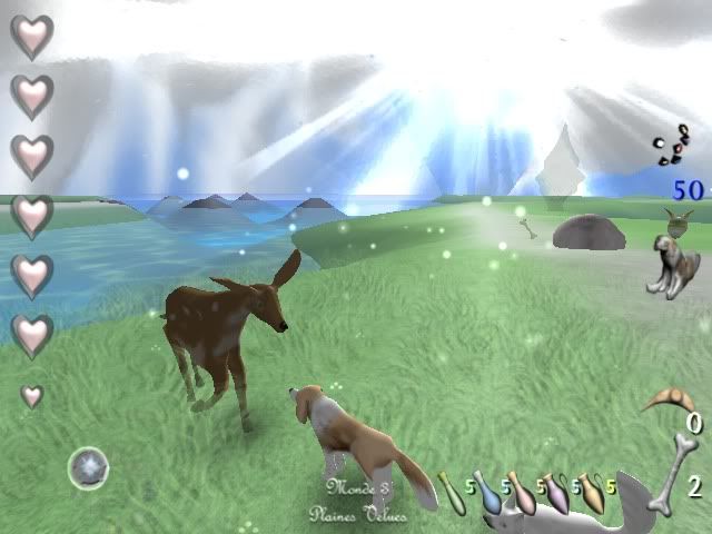 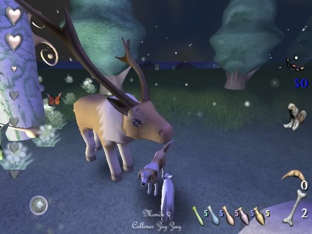 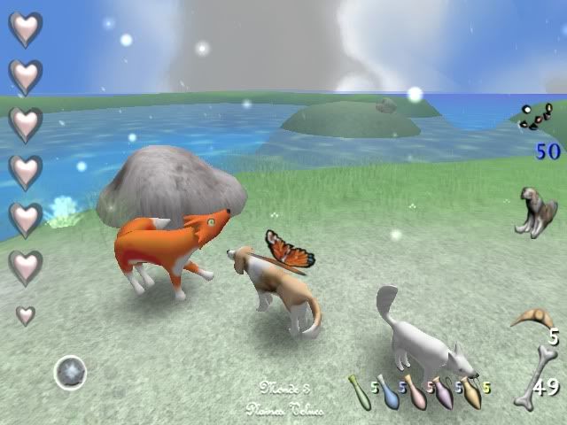 Those three animals can be visited in the third world of Candy World II... Hairy plain. -Whole new Heart's Dreams key is available to admire in the game 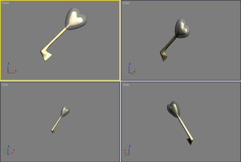 Heart's Dreams Key The key will be used to open the dream door... Who leads to Playing card world... Dream World is a parallel place of Candy World with many palaces inhabited by the four Queens. I will continue in the trying to reach my goal to make a whole new Candy World III game. Try to keep going with your project... Good luck ! |
| ||
| Those latest animal models looks pretty good! :O You're getting better Xylvan! |
| ||
| Sabata!! What up man!? What are you up to these days? SabataRH brought online multiplayer to Darkbasic back in the day. Reading and writing to a temp .txt file. Genius!! |
| ||
| Those new animals look good - maybe try re-modelling the other character? |
| ||
| By the beguining of the development of Candy World III, I've remodelled entirely many of my Candy World characters... Candy, Toopy(Noopy), Maory, Goldy, Lainball and Marble got finalised before November 2009... I've added frogs to agrement the first world of the game. I've completely remodelled the dolphins, I've added male and female caribou and a fox... I've restarted working on Lights of Dreams for some moment. Most things and problems has been fixed: -Wings are now better -Trees are now better too -Sky looks no longer all white and brilliant I hope this news will help you in your projects... |
| ||
| people listen if he's not selling this game let him make it as happy as he likes. |
| ||
| That logo IS unreadable. Your artwork in itself both 2d and the 3D models are very nice and really well done, but concering the logo itelf, it doesn't seem to be anything otrher than abstract shapes to me. Which again, is fine so long as it's not INTENDED TO BE READ AS Xilvan, Xylvan or whatever. Even now you've been toldon this thread a few times, but aren't willing to change it (presumably because it's your "artistic vision") in which case, that's up to you, but don't ask for feedback or post on the gallery for ratings if you aren't willing to accept criticism. It's not people making attacks, they're trying to offer advice top improve things. People are people, a cross section of peoples' opinions is as good here as anywheere else, perhaps moreso considering the relevance of these forums to computer games. You should consider yourself fortuante to have this outlet here where feedback can bee obtained before releasing to the public at large and potentially making a trememndous faux pas. |
| ||
| After some reflexion, I decided to make a nicier version of my logos. See it yourself: In other hand, Toopy sets part in the logo as expected. Lets see:  To let suspens in the oncoming of the next version of Candy World, I have nothing to add yet. See you next time, the 9 August 2010 ! |
| ||
| It looks the same, to me. |
| ||
| You *really* need to listen to people. The logo design fails because the name is unreadable, that is the form of the logo does not work, you can't tell what it is meant to say, so adding some new colours or leaves etc will not fix it. Make it readable, then add some flourishes to it, adding stuff to a bad logo, makes a worse logo. |
| ||
| I think I'll revise the logo soon, I promise it ! Recently, I've made some changes in my games, letting the following video. It includes 3 of my games. Candy World Adventure II : The Lillians Festival Candy World III : Heart pf Heaven Lights of Dreams II : Waves of the River -Trailer II Global Xilvan Design- Yes, a second Lights of Dreams games, made by Xilvan Design. We are interested making it in blitz3D or Leadwerks. Most of the coding for this game are already there. Only the making of storylines, missions and challenge will be made. Also it will maybe be online. Since LODO need some tweening and optimising to arrive to the final result : Lights of Dreams II : Waves of the River ! Stay tuned ! |
| ||
| @Xylvan, whilst your logo is visually appealling, it is still a little to abstract. Why not join the 2 globes/speheres by a small link to at least turn the first letter into an X, this way your are not departing to far from your visually appealing logo - but would go some way to making it, as others have suggested a logo. I like your little mushroom looking house. |
| ||
| I've remastered the logo to make it look better. I hope you will find it correct this time. I didnt negligate to make the "a" and the "n" the way people asked me Still some work to do in it In the next few months my game will be at versions 1.01. But it dont mean its really done... I got many ideas recently and most of the old ideas are back. I have to wait before revealing it. |
| ||
| Xylvan, your logo looks much improved and very readable now! Great work! :) |
| ||
| I agree, it looks great! |
| ||
| On the other side, I've been working everyday on my games, from Lights of Dreams II to the two games of the Candy World Serie(Candy World Adventure II and Candy World III) The tasks are altmost done for both of them. I think I'll also make a Candy Racing Cup game from 2010 to ulterior date. It will basically be a racing game like Mario Kart, and It will look like Candy World and Lights of Dreams Blended together. In the next few days, we will get closer to completion in other games, but I think the following games is a possibility: Planning for 2011-2012 Candy World Adventure III : A New Horizon Candy World IV : A New Horizon Lights of Dreams II : Tides of Soul Candy Racing Cup -More to come- Enjoy ! |
| ||
| That logo is much better now, without the unreadable letters. It looks very good. Nice to see you taking the constructive critique on board! ;) |
| ||
| I'm actually curious about how your going to make your Candy series into a Mario Kart themed racer... are you planning on making the animals anthromorphic (animals with human features) so they can use karts or will they race around tracks by naturally running on all fours? |
   |