New Ping Pong Battle Title Screen.
Community Forums/Graphic Chat/New Ping Pong Battle Title Screen.
| ||
| Hey everyone! I'm working on redoing the Title Screen, Character Select Screen, and Options Screen for Ping Pong Battle, since the old ones suck, and are completely out of place with the new look of the game. Here is the old Title Screen. 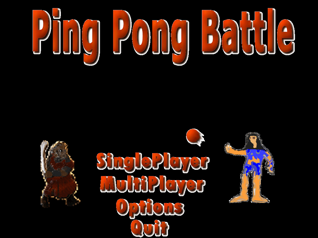 And two versions of the new one! 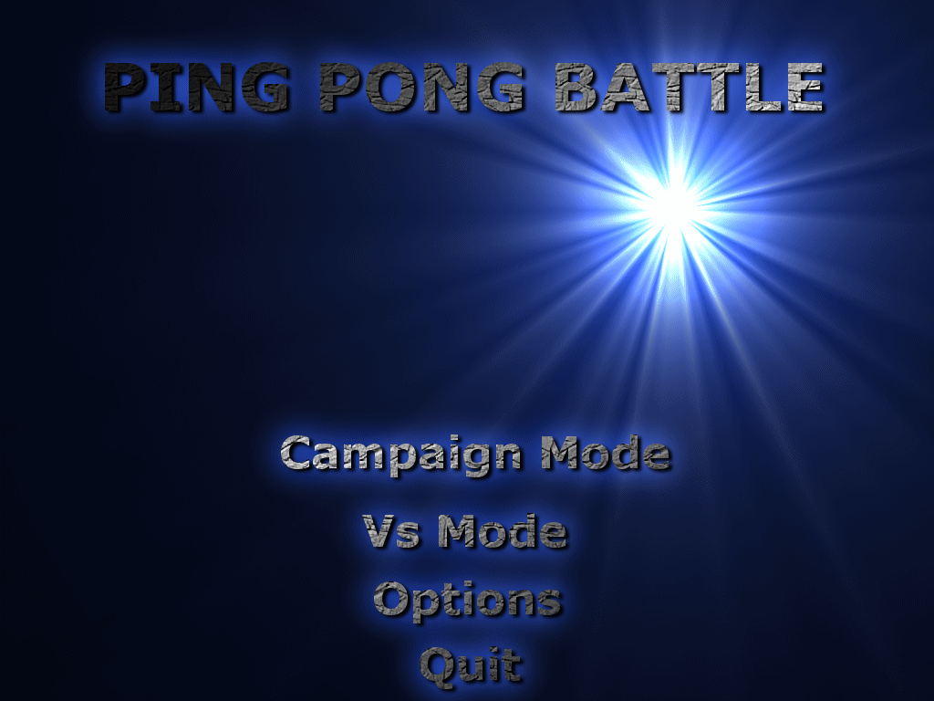 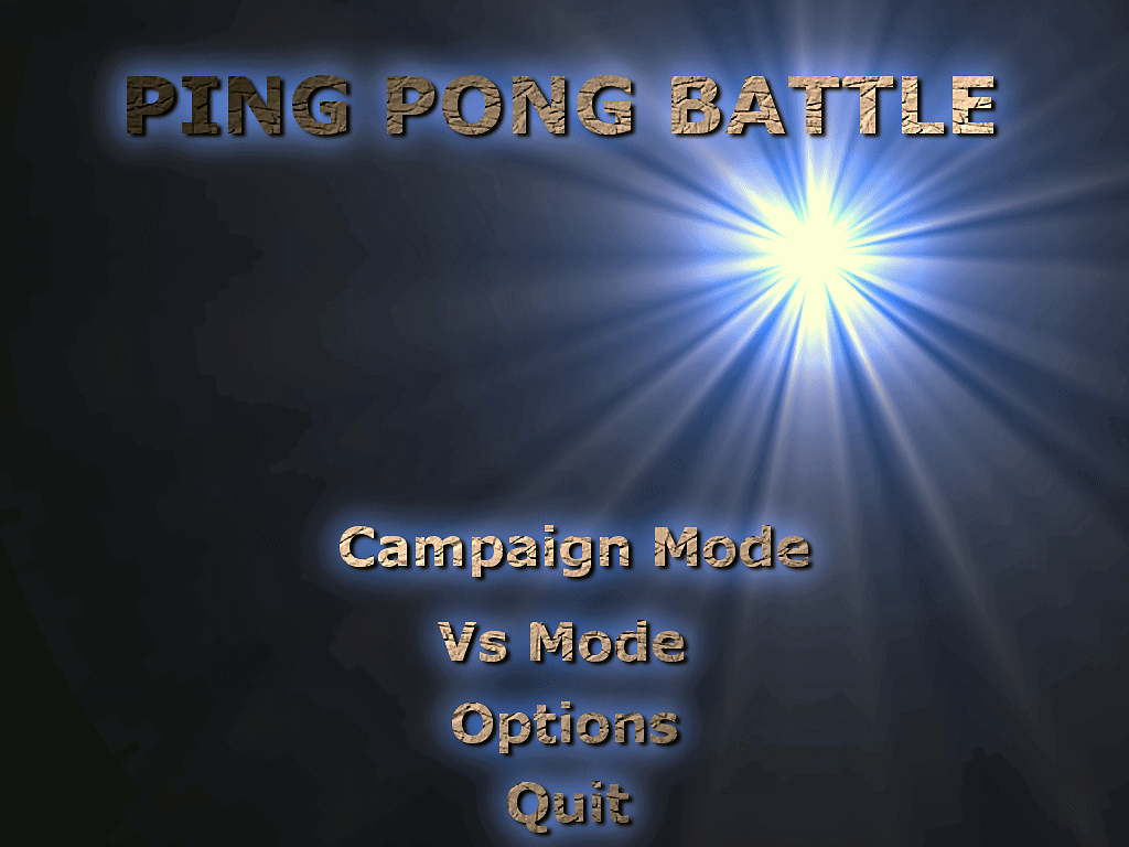 Tell me what you think :) |
| ||
| I's lose the textured finish for the writing tbh. It might not look so bad, if the characters had an outline, as it would stop them toughing the black background. And probably lose the (eliptical) gradient on the options at least. If your going to do gradients, you'd probably be better applying them seperatly for each option. I consider myself to be pretty good at designing individual elements, but when it comes to finding colours, or something to fill an empty space, i really do struggle, BUT, i think you need something else there. It looks... too plain. I think it's the name that doesn't stand out enough in general. Sorry if all that sounds harsh, but i'm trying to give you what i think :) Oh and i am still working on those characters! Just very busy the last couple of days... :( |
| ||
| Sorry if all that sounds harsh, Not at all! Thats the kind of feedback I prefer :) I can definitely lose the textured finish for the writing. And the gradients around the various options. And I agree with you that I need more. Some of the characters or something, and probably a Ping Pong Ball so the title screen looks like Ping Pong. Should I just ditch this idea all together and go for something else? And ty for the characters! Look forward to seeing the new guys :) Oh, and since I'm going to try selling this when its done, I'll cut you in for a bit of the profit since the characters are the most important bit of the game ;) |
   |