What do you think of my new logo?
Community Forums/Graphic Chat/What do you think of my new logo?
| ||
| Hey everyone! I believe that I am finally getting to the point where I can try to sell some of my games, and thus, I have decided 2 things. First of all, the mighty WERDNA nonsense shall end completely. No one will take me serious if I act like a noob :) Second of all, I decided that I need a company name, and a logo to go with it. So I thought for awhile about what to name my company(Other than WERDNAWORLD), and I was inspired by a lame light house puzzle from bits and pieces that happened to be sitting on my desk. So after coming up with a nice little concept to go around it, my new company name is Light House Games, and I even came up with a nifty little catch phrase to go on the logo. Tell me what you think and if there is anything you think I should change!  ;EDIT (Thanks to my bro's good advice, I just checked on google to make sure I wasn't stealing the name of another company, lol. After looking on google, I realized that there was one called LightHouse interactive, but they filed bankruptcy in march. Even if they didn't, my name and logo is different enough so I could get away with it :) WERDNA |
| ||
| I am pretty sure that Lighthouse games is already taken. |
| ||
| Just edited my first post. It was almost taken ^_^ |
| ||
| Lighthouse is one word not two so IMHO your capitalization looks Wrong. |
| ||
| ...Unless by "Light House" you really mean to describe a mighty lighter-than-air house that floats in the air dragging the Earth along with it, thus the strange tilt of its axis. |
| ||
| I can fix the capitalization. Is there anything else that you think I should change? As to picklesworth, do you mean to say that my lighthouse is tilting? Should I fix the perspective? |
| ||
| Oh no, I'm talking about the tilt of the Earth's axis :) (Don't worry, my awesome ideas are beyond ALL mortals; you are not alone). |
| ||
| LOL! |
| ||
| Walnut Games sounds better with a logo of a Walnut with eyes and a mouth. |
| ||
| Apart from the 'Walnut' part was all my idea - I invented it. |
| ||
| What about wingnut games? |
| ||
| Yes as suggested the capitalisation ought to be "Lighthouse Games" To be honest, I think that having the entire 'tagline' in capitals would help too "A Beacon Of Inspiration". It's nice and simple clear and distinct which is what logos should be, but with the black background and grey tones, it does overall give a dull impression aesthetically. A possible suggestion may be to add a dash of colour (perhaps a pale yellow) and build on the "beacon" principle by actually having some form of light actually spreading out from the lighthouse ... ? Hope that's constructive! |
| ||
| I'm not sure what kind of games you're planning to produce under your new name, but to me your logo is kinda boring. Not to be mean or anything, but the grayscale plus the pretty plain font doesn't seem very impressive or memorable or symbolic. |
| ||
| I have to agree with IH and say that it is very dull.. blender? it looks like a blender quick render (no rhyme intended). but maybe if it was more colorful and full of light blasting out of the lighthouse, it would be a bit more catchy.. I can try to model a quick logo for you if you want me to but it would take some time. maybe 2 days? |
| ||
| Personally I think you could do a lot with WerdnaWorld, it's catchy and has that crazy, fun, carnival ring to it which is an idea you'd want to convey with your games. If you do choose to go with your new theme, lighten it up a little bit. You want to leave your options open in case you change your company, and brightness conveys optimism. I took the dark theme route, but if I were to try to sell games I would definitely have a lighter, more comfortable theme. If you're thinking of web design, perhaps I can help you design a new site. I'm considering starting up a business doing web design, and I need some more portfolio samples (dungeonsoffear.com is hardly worth showing off to potential clients). I'd happily design a small site for you for little to no cost. Just finished coding my new site today, haven't proofread it entirely, and I don't have a domain name for it yet either, but if you'd like to take a look of what I can do here is my new site. Good luck! |
| ||
| Personally I think you could do a lot with WerdnaWorld The Wizardry folks might get mad ;c) |
| ||
Just for kicks:- Dabz |
| ||
| Call it Peppermill Games. Cos that doesn't look like a lighthouse. |
| ||
| Yeah, i agree. The colour choice isn't great either. The lighthouse looks like a weak 3d model. I think when you use 3d models for logos, it needs to look like a 2d asset, or it doesn't really work. It can't look like a render from a modeller. Alos, the whiteness around the text really pretty bad, and the font choice (Is that courier?). Sorry to sound harsh, i'm giving my honest opinion. I find it really hard to do logo's, as they really need to stand out and show good artwork, or be very simple and clean. Like dabhands. |
| ||
| No sugarcoating, so brace yourself: 1) Logo is the wrong shape if you going with the lighthouse motif, the lighthouse should be tall. 2) Monochrome logo is dull and boring, might as well not be there, as nobody will notice it. 3) Don't use dull boring fonts Times New Roman, Courier or Arial. 4) I think "A Beacon of Inspiration" sounds incredibly pompous, let other people describe you as exciting or inspirational, self-praise is no recommendation. 5) The lighthouse should look as much like a lighthouse as possible, add more details. 6) Why no beam of light shining from the lighthouse on your company name? 7) Do you really need a company name and logo? Have you registered a company ? Are you going to file the legal and tax documents? Pretending to be a company when it's just little old you isn't very helpful, there's nothing wrong with being just little old you. 8) "LightHouse" is not the conventional spelling of "Lighthouse" makes it look like a mistake. Darkheart |
| ||
| Well, I think it's really great. I especially like the lamppost. |
| ||
| Did you just pluck the theme of "lighthouse" out of thin air or does it have some meaning to you?.. For example, do you live in a lighthouse? Try thinking of a name that actualy means something to you and then maybe the final picture won't look as dull. For example I have a hamster called rocky. I could call it Rockin Ham Productions "Taking a bite out of your imagination, one hamster at a time..." Im sure the imagery for that would be interesting! |
| ||
| I am not to fond either, it is too plain. It needs spicing up. Also, i agree it looks a bit streetlampy. If you need some more drama, try sticking something like this in the background (then make your own of course :) Lighthouses can be a thing of beauty and/or dramatic, you should explore those avenues:     |
| ||
| Wow. now THATS the kind of feedback I was hoping for! I showed it to my sister yesterday, and she also said it looked like a lamp post, lol. Also the Lighthouse idea has no special meaning to me, I just like the name ^_^ Listed below are the fixes I'll make today, and I'll post the new version in a few hours. 1 Make it look more like a Lighthouse. 2 Fix the spelling 3 definitely brighten it up. I've got some really nice photos I've taken of sunsets and stuff that I can perhaps stick behind it. 4 I did use the new courier font, so I can change that to something more interesting. 5 No I haven't registered a company, and have no intention of bothering with it until I actually start selling something. 6 I can add the beam of light with paintshop 7 I like my 'Beacon Of Inspiration' :( Maybe it sounds a little pompous, but I'm not specifying what kind of inspiriation it is. It could be, "Hey, this noob did some ok games. If he can do games like this with blitz, I can do something way better with C++! I'm inspired!" And finally, Dabz, I love the WERDNA WORLD Logo ^_^! My worry though is that WERDNA WORLD just sounds a little too cartoony. Also then I'm stuck being 'that goofy WERDNA character' and there is always the off chance that Sir-Tech will decide to sue me for using the name of their WERDNA character. My WERDNA is even a wizard! My goal as a game designer, is to create games that are family friendly (NO GORE\Language) that are FUN, and that are low cost.(Price tag being only around 3$ per download) The logo was made in Silo3D and then I put it into a small blitz3D program where I textured it, then I took a snapshot, put that in paintshop, and added the text, outline, and a small amount of shine. I'll fix it up as stated above, and thanks for all of your help everyone! WERDNA |
| ||
| Just throwin this in there.... Light(saber)House. |
| ||
| I like the improvements you made there, very subtle but good. |
| ||
| lol For me, if you are claiming to be inspirational, then your logo needs to be inspirational. It needs to describe you and your company not with the words it uses but with the colors, the shapes, the textures, the mood it evokes, the symbols it represents and the meaning it draws upon. Somehow I think you need to ditch the gray lamppost. If you're going to show a lighthouse it HAS to be sitting on a rock and it HAS to be shining out a strong beam of light in one or two directions very noticeably. At the moment it looks like a garden landscape light. I think you also definitely need some color. I'm not sure how I feel about your slogan. I think the Light House Games is good. Instead of the slightly self-proclaimed beacon of inspiration, what about something like "inspired gaming" or "fun and inspiration" or "illuminated games" etc. |
| ||
| Rockin Ham Productions "Taking a bite out of your imagination, one hamster at a time..." Im sure the imagery for that would be interesting! And Freddie Starr isn't much in demand these days, so he'd be cheap. |
| ||
| Errr. Markcw I made no improvements, lol. I'm working on making improvements now, but thats the old logo. I agree with EVERYTHING you have to say Imaginary Human. Very well put! And I think the slogan does need to go :( I like it, but I need something a tad less self congratulatory. I'll work on some sort of new slogan, and the new lighthouse, and post it up as soon as I'm done. Thanks again for all of your feedback everyone! WERDNA ;This is the OLD logo below. NOT the new one. |
| ||
| Oky doke. My new logo is ready. Tell me what you think!  WERDNA (If you don't like certain things about it, I can easily change them. If you don't like the logo itself, then its back to the drawing board, lol) |
| ||
| That's different, but imho, no better. The 3D lighthouse, the font, and the background just don't work. A logo should be simple, using only a handful of colours, be instantly recognisable and have nice, clean lines. http://images.google.co.uk/images?imgtype=clipart&as_st=y&hl=en&um=1&sa=1&q=lighthouse+logo&btnG=Search+Images&aq=f&oq= |
| ||
| Ok, I'll wait until I suck in a bit more feedback so I know what to change for the next one, lol. I get the feeling this is going to take awhile to get this right ^_^ Thanks for the link by the way, although all the ones listed are a bit cartoony\overly simplistic looking and not really what I'm going for though :( |
| ||
| Add more detail to the Lighthouse. Make it so detailed that you could walk into it if it were in a FPS game. And fix the words, they look choppy with bits of blue in them. |
| ||
| Add more detail to the Lighthouse. Logos are about identity, not detail. You just plonk a photo of a lighthouse up there and call it a logo, and that's instantly forgettable. |
| ||
| I'll work on setting up a more detailed one. I think I'll do it all in 3D so its more cohesive. And yeah I'll fix the words, lol. Just need to find a good font. Thanks again everyone, I will hopefully have the next version done by tonight. WERDNA |
| ||
| Are you any good at 2d art? I think going for fully 3d will look bad tbh... |
| ||
| I'll work on setting up a more detailed one. Thats the worrying thing... Logo's aren't meant to be detailed, they are supposed to be simplistic by design. Go berserk and you may end up with a logo that doesn't look remotely like a logo. My 2 cents Dabz |
| ||
| The point which GFK and Dabz are trying to make is that a logo is usually vector art, just a few shapes and a few colors and nothing vaguely detailed or photographic. For example, here's a lighthouse logo, and the lighthouse itself isn't actually drawn. It's suggested by the empty space. hxxp://www.lighthousecs.com/images/lighthouse_logo.png Here's one which goes for a bit more detail hxxp://www.earpdc.org/menus/imagesearpdc/SHIP%20Lighthouse%20logo.jpg And finally here's one a little closer to your original color scheme. Personally I find it quite drab, but it still illustrates the point they're making about a simple design from a few clean vector shapes. hxxp://www.lighthousemusicworks.com/images/lighthouse_logo.jpg change xx to tt to see the pictures. I didn't want to flood the thread with big images. |
| ||
| Walnut: GFK, Dabz and Gabriel (along with others) are really giving you some good advice. Please take it into consideration. |
| ||
| Oh, sorry I wasn't taking your advice :( I guess I was just stuck on the idea of a 3D lighthouse and didn't want to listen to anyone else because it would mean that I would have to redo it. Lol, I'm thinking a bit clearer now that I've had time to reflect, and your right that it wouldn't look as good. I suck at 3D modelling ^_^ On the other hand though, I happen to actually be quite good at 2D artwork when I put some time and effort into it, and will definitely try doing a fully 2D logo. I can even still add the shine with paintshop pro effects! Thanks for your help everyone, and for your sincere and honest opinions. I'll start work on the new 2D logo tommorow, and will try to make it fairly simple and not too complex. Thanks again, WERDNA |
| ||
| I agree the new logo needs some work. It isn't much better than the old one. I'm not sure why you added a weird texture to the lettering when the letters are so thin, it makes them seem broken up and hard to read, especially conflicting with a bright background, it's hard to read. And that lighthouse thing - it still is not a lighthouse. Now it's a floating ... thing. Go for simple, symbolic and easy to read. |
| ||
| ..i wouldnt suggest to use such logo especially having in mind existance of publisher such as Lighthouse interactive..looks like bankrupt but web site still active with very similar logo..Im sure you can think about something else.. http://www.lighthouse-interactive.com/ |
| ||
Flaming Walnut. |
| ||
| Flaming Walnut. Krakatoa? |
| ||
| Oh, sorry I thought you enhanced the font. The new lighthouse is much better. I like the way it's pretending to be the sun. |
| ||
| I'm the one who (quickly) knocked together that logo. Apologies for any confusion. Side note to WALNUT: my point, I guess, is that bright, simple and quirky beats black, grey, and serious every time. My above effort is rubbish, I know, but in better, more artistic hands, these basic rules can be used to create memorable logos. I'm no expert but it seems to me that you need to rethink your approach and make something that screams "Fun!" instead of "Gloom!" Also, if you're going to use a lighthouse theme, keep every component of the logo consistent. For example, returning to my own shoddy effort, you'll see that even the logo frame is consistent with the theme, resembling the view from a ship's porthole window. |
| ||
| My advice- stop trying to design the logo. Not everyone is a graphic designer, not every graphic designer is good, and not every good graphic designer is skilled at making logos. No one will take me serious if I act like a noob :) Very true, and no one will take you seriously if they can see you're a digital art noob as well. Just my two cents! Take it or leave it ;) |
| ||
| I sort of agree with Reactor. I think its great that you are excited enough about coding and creating software that you want to get a logo that shows what you want to be, but unless you are very good at making logos you may never capture what you want to represent to the public and do more damage than good. I have to say that the logos you have shown for the lighthouse, look very amatuer. I cant ellaborate because im not an artist either, but as a viewer I can tell they werent done professionally. I hope this helps, its not intended as a troll. |
| ||
| As an artist I can elaborate, but it'd take a long time :) The best thing to do, if you're looking to sell games and inspire people, is to hire professionals. Bioshock cost me $5 recently. Even though your eventual games might be $3, people expect quality these days. Heck, even free flash games are packed with professional quality art. The point is- if you're not an expert in an area, there's no shame in asking/hiring someone to fill in a need for excellence. Quality indie game devs do it all the time, because they know it makes a huge difference. |
| ||
| Ok, thanks for all the advice! The problem I think for the first 2 logos, was that I was suffering from Battery Man syndrome. I spent months on that game, never stopping to think if it was actually any good.(Which it wasn't :) I am pretty good at 2D art, I guess just not at doing logos, lol. I'll try one more time to do a happy simple logo, and if that doesn't work, I'll pay someone else to do it, lol. Thanks again everyone! WERDNA |
| ||
| just luke wow me likes aside from the boat and the beacon beam that logo would be great as a vintage iron on tshirt logo between 7" and 12" (for when someone nicks it for an lp) edit: the cloud background one makes it look like its part of the intro reel to a televangelist "please send your money to god via my bank account" |
| ||
| I like Luke's too. Though I would choose other colors and get rid of the black circle. |
| ||
| the black circle frames it without it the other circles (love the pink sky btw) would eventually have to crop to a square/rectangle or a web bacground colour that matches |
| ||
| Just think the black circle has a depressive influence on the logo. Maybe it's just me. I'm living in a pink world... :O) |
| ||
| Here is my (hopefully) final logo. I think its still a little bit off, but I want to know if I'm at least heading in the right direction, or if its still too complicated. Should I make it more like JustLukes?(Which is awesome by the way :) 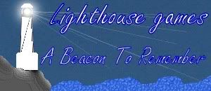 Thanks again everyone, WERDNA (I do agree that the second one looks televangilist like, lol) |
| ||
| o_O |
| ||
| I would assume that means it still sucks? |
| ||
| The font is still off. Nothing flows together.. all of the sections seem to have a bit of self-preference. |
| ||
| ..i cant say is it sucks or not, but to me its look like you will spend more time on creating your logo than actual game.. |
| ||
| LOL! I just might spend that much time on it ^_^ At least its getting a little bit better, since feedback isn't quite as bad as it was for the other two. I'll try to do one more along the style of just lukes to see how it looks. Thanks again everyone, WERDNA |
| ||
| If I were you, I'd follow Reactor's advice and hire someone who can take your concept and use it to create something professional. Your logo represents not only your identity but also your ability. Even when created with lots of love, enthusiasm and effort, an amaturish logo will reflect badly on you, your "company", and any work associated with it. Please don't take that badly. Not everyone is an artist - I'm certainly not! - and it is sometimes best to swallow one's pride and leave the art to people with more skill, talent and experience in that area. Keep up the art as a hobby, if you feel so inclined; you're bound to improve once you've learning the fundamentals and gained more experience and practice. Who knows, one day you might become quite accomplished. But in the meanwhile, hire someone with the skills to do your logo justice now. |
| ||
This is sort of what I'd expect the logo to look like in general terms. Bear in mind that this is only an example, you shouldn't take this as being what an end result would be quality-wise. The above is, quality-wise, bad, trash, etc. and only meant to serve as an idea of what direction I think would work best. Anyhow, you probably want something simple that illustrates your logo, preferably in a manner that's symbolic of what your goal is (symbology in logos is usually just <censored> though), is best. Details are bad, your logos so far are bad, etc. Especially your font choice. If you're limited to generic fonts, choose something that isn't terribly ugly and abused by not-so-tech-inclined middle-age housewives printing fliers for their baby shower/book burning/scrapbooking club. |
| ||
| Here is my (hopefully) final logo. I think its still a little bit off, but I The latest one is awful. Even the tag line has got worse.want to know if I'm at least heading in the right direction, or if its still too complicated. "A beacon of inspiration" was coherent, at least. "A beacon to remember" - why would somebody want to remember a beacon? It doesn't make any sense. The lighthouse looks like a basic 3d model with z-order fighting issues - otherwise what are the black lines all over it? The cliff/rocks below it, and [what I assume to be] the sea are almost laughable - its just a texturefilled blob and doesn't even look like water. I've probably shot you down enough over this, but there's one more thing. The font needs to be bold and readable, not all horrible and swirly and glowing. Please listen to JustLuke/Nilium. |
| ||
| Here is my (hopefully) final logo Heh... Maybe my monitor is broken... but I can hardly read the text. The font needs to be bold and readable, not all horrible and swirly and glowing. I dunno... maybe he's onto something new with this whole - "what does that actually say" - thing? :-) |
| ||
| but I can hardly read the text. There is text there? |
| ||
| ROFL! I litterally nearly feel out of my chair when I read some of your comments. If I achieve nothing else with this post other than getting a good laugh out of it, it will have been worth it :D But on to more serious things. If I were you, I'd follow Reactor's advice and hire someone who can take your concept and use it to create something professional. Yes hiring someone would be the best thing, EXCEPT that I don't have a lot of cash right now, and have come to see this as sort of a challenge. I like to be as diverse in my computer abilities as possible, and would really like to be able to make my own logo. No my art abilities art the best, or even particularly good in this case, but I would really like to be able to create my own logo. (Although I won't put it on my site or in my games until I get some positive feedback about it :) I've probably shot you down enough over this, Not at all GFK, please don't take pity on me at any time! Everything that all of you have to say will only help improve my logo, and it is best if your as harsh as possible. I dunno... maybe he's onto something new with this whole - "what does that actually say" - thing? LOL, you might have a point. People would stare at my logo for awhile just trying to figure out what it says. @Nillium Thats definitely more what I need to go for. Although far from great as you yourself said, that actually looks like a logo. I can perhaps try something along the same lines, except with color. Thanks once again everyone for putting up with me, lol. This must be driving some of you nuts by now. WERDNA |
| ||
| I think you have a raw talent for art WERDNA and if I were you I wouldn't take critics too seriously. Most of the criticism here comes from people who have no real talent of their own and who are only criticising your work out of jealousy. If it were me I would just color in Nilium's logo and be done with it. Looks fine to me. |
| ||
| Most of the criticism here comes from people who have no real talent of their own and who are only criticising your work out of jealousy. I haven't seen any criticism in this thread that either shows jealousy, or is hateful and non constructive. Which people were you talking about, specifically? |
| ||
| Some points to follow next time you do your logo. Tick them off when you have them down. I think the main problem your having is choice of colours. Keep all your colours the same saturation and you'll have more luck. You can't really get away with dull colours, and bright vivid colours next to each other. It just doesn't go as well. Another point is the textured look doesn't really sit well in logo's. Noel's (Nillums) is perfect for demonstrating that. Very simple shapes, and even simplier colour scheme. Compared to yours, which has a circular gradient that fades. That creates too many different colours and patterns. Then you have a textured rock area, full of very small different coloured areas. Noels has simple shapes, of two colours, none of which is particulary small. So: Limit yourself to a few colours Choose a more blocky font i reckon Use simplier shapes Avoid using fading gradients (as this increase the different number of colours. I think if you follow them, a logo will probably come alot easier to you. |
| ||
| If it were me I would just color in Nilium's logo and be done with it. Looks fine to me. And on that note, I'm removing the image. It was intended as an example, not to be stolen. |
| ||
| LOL, you might have a point. People would stare at my logo for awhile just trying to figure out what it says. More likely they'd just skim over it, and tune it out / ignore it, which is the opposite of what a logo should accomplish (i.e. be instantly recognizable) |
| ||
| Ok, I've made a new logo taking your guys advice. I've included 2 versions as well. 1 without the shine, and the other with the shine. Tell me what you think, 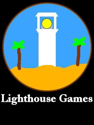 WERDNA |
| ||
| WTF! Nillium replaced his sample logo, with...... something. @.@ |
| ||
| The shine isn't that great, and I think the font needs rounded edges and a border. In my opinion you should not have the lighthouse facing the user. I would put it on a cliff, looking out to the sea (as they pretty much always are). [basically Nilium's version] EDIT: Nillium replaced his sample logo, with...... something http://www.blitzbasic.com/Community/posts.php?topic=84826#959342 |
| ||
| Ok I can ditch the shine and fix the font. Do you think the graphical style though is at least better than it was? |
| ||
| Do you think the graphical style though is at least better than it was? Uhh, not really. The last setup was good, but the lighthouse should be on the top of the cliff (not below it). |
| ||
| I think you're making progress, a little slowly, but in the right direction all the same. I'm no expert, and no graphic designer, but as a consumer/advertisee I can offer my opinion of what kind iof thing would attract my eye or adversely, put me off when seeing a logo. First, a couple of general points: 1) The Logo DOES NOT HAVE TO BE INTRICATE, some of the most successful or well known or largest organisations in the world have simplistic logos. The simplicity helps for them to be easily remembered and recognised as well as preventing confusion with others' similar logos. Examples: Micorsoft, Apple, McDonald's, The Red Cross, Hewlett Packard, Atari, LucasArts 2) STICK WITH ONE STYLE Mixing 2D and 3D images/text serves only to make the whole thing appear like a collage, rather than a singular unit. Also take into account thee typeface and Image and the general concept. For example, gothic script suggests antiquity and traditionalism, a standard font such as Tiems or Bookman indicates professionalism but rather plain and bureaucratic, whereas something sans-serif and rounded enforces modernisation, futurism and even revolutionary. Also, consider the appearance of the image(s) you use with respect to this. 3) PRIMARY COLOURS Make good use of primary colours, they are clear, distinct, bright and colourful and will catch the eye. 4) TAGLINE Keep the Tagline short, snappy, and informative. This should be poignant and give a concise summary of what you (can) offer.  |
| ||
| The one JustLuke did is great. For the ones you did on your own, this one is the best so far, and I can actually read the text: The version with the "beam" looks horrid. Most of the criticism here comes from people who have no real talent of their own and who are only criticising your work out of jealousy. The irony is markcw is saying this. |
| ||
| Most of the criticism here comes from people who have no real talent of their own and who are only criticising your work out of jealousy. I didn't address this in my initial response to your post, but what you've said is just plain stupid. Just because someone can't make a logo themselves does not mean their opinion and criticism is any less valid. Do you think all restaurant critics can create the dishes they rate 5 stars? Probably not, but they have an idea of how to comment on them and what to say in regards to their taste. Just the same, people can look at a sculpture and say whether or not they think it looks good.I don't think anyone is going to be jealous of WERDNA's work here. I mean no offense to him, but the logos are terrible, nobody is going to be jealous of this stuff. The reason anyone comes to this thread is because he's making an effort to improve the work he's doing and listening to criticism instead of blasting off about how people are jealous of something that looks like a GameFAQs signature image. He has improved in this time, and I think he'll continue to improve as well. The irony is markcw is saying this. I have very little reason to trust anything he says after the prior post where he suggests outright stealing something I made and just coloring it in. Given that he's not very trustworthy and probably more prone to saying stupid things than even I am, however, I don't think there's any reason anyone else should take his advice, so here's the example logo again. I'll leave the spongebob picture up there 'cause I think it's cool. |
| ||
| WERDNA: Take a close look at Nilium's logo. There are a few interesting lessons that you can learn from it and use to improve your own logo. 1. Do you see how clean and crisp his lines are? Nothing is fuzzy or indistinct. As a result, the logo is very easy on the eye. 2. Notice how he uses "simple" detailing to create the illusion of depth, texture and substance. Take a close look at his lighthouse: do you see how those five stripes of white (a) make the structure appear not only solid but also cylindrical and (b) help to evoke the "feel" of a lighthouse without the use of surplus, muddying details? Nilium strikes a fine balance between simplicity and detail, adding just enough to the scene to get the point across without complicating things. What do you need to include in your logo to get the point across? A lighthouse? The sea? The lighthouse beam? What can you do without? Palm trees? Seagulls? Clouds? Boats (I personally like a little boat)? 3. Pay attention to the composition. Where is our eye drawn. When I look at the logo, my eye is led from the rocks to the cliff face, then to the lighthouse, and finally out to sea, following the beam of light. It's amazing how clever composition can make even the simplest of logos interesting My logo attempt is inferior to Nilium's for a number of reasons, and it is also stylistically/aesthetically different, but there are a few fundamental rules that we have both used (in my case, quite badly!) to compose our examples. |
| ||
| I don't think anyone is going to be jealous of WERDNA's work here And the understatement-of-the-year award goes to.... NILIUM! Please come forward and claim your prize:  Seriously though, Werdna: the images you've been posting so far simply aren't logos. They are scribbles that happen to mention your company name. Nilium and JustLuke, on the other hand, slapped together some fairly nice looking ones: Nice, clear, easy-to-recognize, easy-to-read, and uncluttered. That is what you should look for in a logo. some other food for thought:          Those are logo's. Really: less is more. |
| ||
Actually, that's not Pepsi's logo anymore. This is: |
| ||
| @Plash I agree that was probably the best setup I've done so far. @Malice, thanks for the advice! I'm starting to figure it out now that everything has to be cohesive. At least my latest logo is cohesive in the color scheme, drawing style, etc. (And the text is readable too!) @GaryV Thanks! I'm really starting to get somewhere! Slowly but surely I'm getting there. Like a fat king ascending the stairs to his throne. @Nillium I agree. MarckCw, please shut up. I don't think its possilbe to be jealous of my so called 'logos'. I would never steal anothers logo, and thanks for reposting it. It is very inspirational ^_^ (Thanks for keeping the other thing up to. Its awesome, lol) Thanks again everyone, I'll work on the next logo, lol. When I'm done I can probably fill a folder with all of my 'logos' and look back on it in a couple of years for a few laughs :) WERDNA |
| ||
| I'm... soooo.. sorry... but I LOVE GREEN And I only love Nvidia because of that fact. /Nvidia%20Logo.bmp) |
| ||
| Hi WERDNA, First of all, I'm not an artist. But I think it would be good to incorporate logo within the name. Maybe have text on a blue background, with a lighthouse image replacing the 'I'. Or you could do something like this: Something like this would also look good on the top of a webpage. It also conveys the name clearly and quickly. I'd like to comment on how awesome your positive attitude is and although you're getting a lot of information at once, still showing steady improvement. Keep it up. |
| ||
| Lots of good advice in here already for you. Here's another suggestion for you. Free for use as you please. Notice how the logo also forms an L, and can work in multiple color configurations. [img]  If you wish I can provide this in Illustrator or Inkscape format |
| ||
| Listen to JustLuke. I agree with him 100%. Nilium's logo looks great. These guys are really trying to help you, Walnut. |
| ||
| My logo attempt is inferior to Nilium's for a number of reasons, and it is also stylistically/aesthetically different, but there are a few fundamental rules that we have both used (in my case, quite badly!) to compose our examples. JustLuke, you're a quality guy to be able to recognise and admit that (with respect to the differing approach/styles you both have). WERDNA, while I like the design ideas by guys like Sauer, the fundamental rules that JustLuke and Nilium have applied are basic design ones- namely, carp, which stands for composition, alignment, repetition and proximity. They're basic design principles which apply as much to basic layout as they do to font choice. On top of carp, (or crap, depending on who it is you're talking to!) there are things to take into consideration, such as working in vector, and taking care of anti-aliasing and compression. Those are all things most beginners don't handle all too well, which makes it easy to pick a newbie's logo or design a mile away. In your case, one of the main issues is colour choice. It's not hard to tell you haven't experimented with (or studied) much more than primary/safe colour pallettes. On the other hand, JustLuke seems to have a strong understanding of what works with what, in context. Anyway, the point is- there's a lot to learn about this stuff. Asking people on a forum about whether design a, b or c is best isn't going to make up for a pure lack of understanding. Some people will say, "I can't design at all, but try this!" and present a horrible example of what to do, and others will say, "Yes, not bad." and then try and walk you through all 50 thousand design principles as you make revisions. Each way is kind, but there is a better way to do things. If you want a logo now, ask JustLuke or Nilium to make one for you (at a special price, or something) and start learning how to improve your art skills (properly) and train your eye towards excellence. It'll take time, but if you're looking to make games and create the art for them as well, it's the only way to go. Selling games isn't about meeting your own standards- it's about meeting those of your target market. And, if you're targeting more than 2 year olds, you'll need to raise the bar. |
| ||
| there are things to take into consideration, such as working in vector That's a good advice -- if possible, create your logo in a vector format, so you can scale it to any size you could ever need without quality loss. If vector graphics are not an option and you're using a program tha tcan only create bitmaps, than make sure that you use an obscenely large image size. Even though you are only looking for a logo that's a few hundred pixels, create it in 4096x4096 (or larger), and scale the end result down to the size you need... but save the high-res original, so if you do need a higher resolution one a few years down the road, you still have it. (Case in point: I'm sure that there are a ton of people that created logos for 320x200 VGA games. On todays monitors those would be ridiculously tiny should you wish to create a new game and use it again) |
| ||
| I think your new logo is better in the concept of design. The circle part with teh picture, and the logo text are far far better. Keep working on it :) It's getting better. |
| ||
| Nilium's logo looks great id change the top part of the lighthouse as it doesnt look quite right but aprtfrom that its spot on. |
| ||
| I agree Nilium's logo is best so far. I also agree that your efforts, Wernda, so far look very ameteur and most people even those who are not particularly computer literate will think of them as poor quality. If you go with Nilium's logo I would maybe throw in one or two simple colors but otherwise it not only has good composition but also good style. I might add the tagline `illuminating entertainment` below the main text. |
| ||
| I happen to actually be quite good at 2D artwork Of course, one's opinion of oneself is purely subjective :-) |
| ||
| I happen to actually be quite good at 2D artwork I edit what I said above. I happen to be 'ok' at 2d retro art for a game like Dragon Spirit if I spend weeks working on the images. When trying to make a logo, I obviously have little clue as to what to do ^_^ (Although I have a bit more of a clue now, thanks to your guys help!) I really like Sauers and pongos idea of using the lighthouse as a letter so that is definitely something to think about. I think going vector sounds like the way to go. I'll experiment with that after I write this post :) Thanks for the outstanding advice everyone, particularly about Carp. It is definitely tempting to pay JustLuke\Nillium to do a logo for me, but as I said in a previous post, this is something that I really need to do myself. I at least want to make something that looks like a logo. After I make something that is at least ok, then I might think about paying some else to make one for me, BUT UNTIL THEN, I wish to make one myself ^_^ I think Illuminating Entertainment is definitely the way to go. All the other tag lines sucked, lol. @Sauer I'd like to comment on how awesome your positive attitude is Thanks! I try my best to be positive, and you guys really are helping me out a lot. The least I can do is listen to your advice :D I'll post a new logo today or tomorrow, and thanks again for all of your advice! WERDNA ;Sorry for not using paragraphs, lol. |
| ||
| Don't Microsoft have a free vector illustration program of some kind available? I'm sure there was something from one of the big publishers. EDIT: Hmm, maybe I was thinking of Inkscape although it doesn't appear to have any big publisher. http://www.inkscape.org/ |
| ||
| this is something that I really need to do myself You are a good man, Walnut ;) |
| ||
| Don't Microsoft have a free vector illustration program of some kind available? Try inkscape. http://www.inkscape.org Its a good coreldraw-type thingy and is free. edit: oh...lol... :p |
| ||
| Microsoft's program is Expression 3 beta. |
| ||
| Wow... just noticed this thread. Monochromatic in this context is so wrong. It looks sad... should be bright and joyful. You do not use scenery type of images (the sunset) EVER in logos; it look horrible. And doesn't print out well without rasterization. Going for line/vector style is the best bet, here's one decent (finnish company): Big: [url]http://www.puhelinpiste.fi/sl_logo.jpg[/url] Strong lines and simplification of the forms and ideas. |
| ||
| Monochromatic in this context is so wrong. It looks sad... That happens to be my specialty. Make of it what you will. |
| ||
| I think the monochrome look works well in that logo. Lighthouses are only working really when it's dark. Most of the more memorable images of lighthouse i feel, are when it's dark and the light is serving a purpose. But i'm no artist, so it's just my opinion :) |
| ||
| Used a vector art program such as inkscape to create the majority of the logo, then touch it up in photoshop or something. Good logos are generally clean and simple/cartoony. This look is usually achieved with vector art. |
| ||
I was bored today, so I had a go too: about 15-20 minutes in inkscape |
| ||
| Sorry haven't had time to post, or even work on my logo. Today has been a very busy day @.@ Thanks for the last few posts, great logos mustang and yahfree, I'll see if I can get some work done tomorrow. WERDNA |
| ||
| Yahfree: your logo looks like the end of a drill bit. Nilium's is still the one id go for maybe play with colour, but it looks good as is. |
| ||
| >Yahfree: your logo looks like the end of a drill bit. Haha! It does, doesn't it? |
| ||
| Ok everyone! I'm finally ready with another logo. In fact, I have TWO other logos! I showed my little sister my previous 'logos' and asked her opinion. She said that she liked the third one best and that I should do a new one like that, so I remade my third logo with her instructions. Then I made a second logo without her help, using the advice that you guys have recently given me. Here is her logo, made by me, 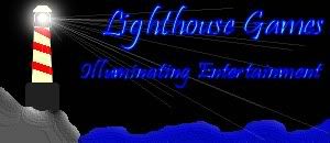 And my logo, using vector graphics and trying to keep it simple.  Tell me what you think, and which you like better! WERDNA |
| ||
| Use Pongo's logo. He's given you permission and its exactly how a logo should be. |
| ||
| I agree. If I don't get much positive feedback on my logos above, I will use Pongo's. Thank you very much Pongo. That is exceedingly generous of you. If you would like payment I would be perfectly willing to do so because you deserve something . If not, then perhaps I can help you out with coding, research, etc if you are ever in need of it :D Thanks! WERDNA |
| ||
| Tell me what you think, and which you like better! Mustang, JustLuke's Pongo's, & Nillium's -- they're not even in the same ballpark. Your last posting: The fonts are unreadable in the first one. IN the second one the fonts themselves would be OK, but the white outline around the cyan lettering one absolutely kill their legibility... both of them have a very high ms-paint level: it's little things like the lighthouse banding, rock and water shapes that are obviously drawn freehand, but without a very steady hand. Don't get me wrong, I know that making quality images is very hard and definitely a skill, but all in all it just comes across as... I don't know, too sloppy. There is not enough *consistency* in the graphics style. For example, if you'd chop up your images in four parts (tower, light, water, rock), there would be absolutely no indication that they belonged together. Nillium's and JustLuke's, on the other hand, feel much better in that respect: not a single part of those logos feel like it doesn't fit in with the rest. the image flows much better, and that makes it feel 'right' and a lot more pleasing to the eye. |
| ||
| Another hopefully helpful offering: Consider whether your 'logo' is a"picture"., a "design", or more of a "symbolic representation". I think the majority of logos are symbolic and therefore, even less complex. (McDonalds, Atari, Pepsi) I recommend too (also referring to my earlier post) that these symbolic logos are more effective, as well as easier to draw and (someone mentioned about vector art) can be reproduced and scaled where necessary much simpler and without fear of losing much detail. In Your last image above, my critical attention is drawn to the text and the 'beach'/'waves' The text is not clearly legible, the cyan colour doesn't go too well with the yellow. Also, the disparate angle of the text can be a little off-putting. (The "Lighthouse Games" text isn't even centred within the 'cone' of the light) A darker outline around the lettering would improve them considerably. With the waves, they are too 'hand-drawn' in appearance. Without coy and paste, I doubt you could reproduce them. Perhaps a more symbolic smooth sine curve would be better? Okay, I may be getting over-critical, but you have gotten tthe aspects of primary colours and simplicity down, so I'm concentrating on more attention to detail. Yahfree, Nilium and Pongo have some excellent examples/suggestions I would think any of their ideas would be much better suited. |
| ||
| What do you think of my new logo? I like it, simple.. to the point... non-intrusive. |
| ||
| Pongo's is great. |
| ||
| can i have lukes scaled to bout 12" ditch the boat and beam, some quazi japanese text and printed on a pastel tshirt please :D |
| ||
| Well I'm continuing to improve at least. I have simplicity down for the most part, and now need to work on making it cohesive and less sloppy looking. I agree that a lot of it does look too 'free hand' and should have sharper, cleaner lines. Also I still have text problems, lol. I will continue my attempts at a logo, although if Mustang, JustLuke Pongo, or Nillium are willing to sell or give theirs to me, then I would be happy to accept them as my new logo. so Mustang, JustLuke, Pongo, or Nillium, if you could get back to me on what you might want in return for the use of your logo's, we can begin figuring something out ^_^ Thanks again, and Fantastic logo's guys! WERDNA |
| ||
| You can have the one I made for free,... I won't ask (or accept) anything else. I'd like to Find a font the works with it though, so let me look through things this evening, and I can post you an .ai (Illustrator) or .SVG (Inkscape) file tomorrow. |
| ||
| Did you get the masses of fonts on the Blitz3D disk? |
| ||
| Did you get the masses of fonts on the Blitz3D disk? don't know if that was aimed at me or not,... I have plenty of fonts though,... the biggest "problem" is going through them to find the right one for the job! I make my living as an animator/designer, so I have a pretty big arsenal of stuff for this. |
| ||
| AH, yeah it was kinda aimed vaguely towards your or WERDNA's direction - I guess you're pretty well stocked then by the sounds of it :) |
| ||
| Thanks Pongo! That is extremely generous of you :) I really appreciate it. Its easy to tell that you make your living as a designer from your logo ^_^ And as to Malice, I have a mass of fonts from paintshop pro. Thats been part of the problem with my, 'logos' is trying to decide which one to use, lol. Thanks again everyone, WERDNA |
| ||
| WERDNA, it's the colours that are letting you down again. Design is much better though. |
| ||
| Update: I haven't forgotten about you,... just had some family stuff get in the way. I hope to send you something soon. |
| ||
| Thanks Pongo! Take your time. I'm in no rush ^_^ WERDNA |
| ||
| Ive been reading this off an one for a few days, but Werdna the main thing you'll notice about yours compared to the professionally done ones, is the crispness of lines (among colors but thats been mentioned). Your using a paintbrush/pencil in whatever art program I'm assuming. Try using vectors to create nice crisp lines. You can do this in Illustrator, Photoshop also has some support for it. If you don't have or cant afford those apps Aviary.com has free ones online capable of this. Anyway nice attempts just figured I would point out what I noticed. For more info head over to vectortuts.com youll see the art style your looking for in some of the tutorials I'm sure. And Pongo those are very nice logos. |
| ||
| Almost there,... my PC power supply decided to die so I've been down for the last day and a half. Everything's back now though, so I hope to finish it up soon. |
| ||
| Thanks Loktar! Thats what I've gathered, is that I need to use vectors. I have InkScape, which is suppose to be pretty good for vectors, so I'll practice some with that. And thanks Pongo! Please don't rush, just take as long as you need to and finish it only when convenient for you ^_^ I really appreciate it. WERDNA |
| ||
| $20 and I'll do it for you. lol. |
| ||
| Thanks for the offer Demiurge, your price really is pretty good! But Pongo's already working on one for me :) Although I'll keep you in mind if I ever need any other graphical work. (What kind of graphics do you do besides logos?) WERDNA |
| ||
| Just change the text. |
| ||
| Oi ! |
| ||
| Just for reference because I know Puki thinks he's being hilarious, but if you haven't seen the other thread, you won't know what the "joke" is and I don't want to get you into trouble with other people (indirectly) because of me. (A) Brucey added the lighthouse, and you'll need his permission. (B) I did a lot of it and you need my permission. (Actually, I'd probably let you use it - except for the text - but see C for a very important caveat to this.) (C) I used a few copyrighted images as references for the moon and sky. I licensed them because I wanted to be 100% safe, and I would recommend anyone else do the same if they wanted to use them. I can dig out the sites I licensed them from, but you might find it cheaper to have someone make you one from scratch. |
| ||
| Oh crap,... I forgot all about this! Sorry Werdna, it's been done for a while now, I just forgot to send you the file. It's on my laptop, so I'll send it a bit later when I boot that up. |
| ||
| lol, ty Pongo. I was starting to worry there for a moment :) Brucey\Gabriel I think your image is pretty darn cool! Thanks again everyone! WERDNA *Cuffs Puki on the head for stealing media again.* "Bad Puki! BAD! Go sit in your room" |
| ||
| Some of you skilled at logo design should post some "rough" prices and post examples. You "might" get a few takers. |
| ||
How about something like this... |
| ||
| Finally quiet in here.....so glad that's over. How painful! |
| ||
| You brought this thread back from the dead to tell it that you were glad it was dead?! How odd! |
| ||
| Yeah....was a little bored. Had a real laugh reading this though. |
| ||
| I like Arowx's |
| ||
| I like Arowx's I think it's too busy. (or maybe it's the green + orange) |
| ||
| I think it's too busy. (or maybe it's the green + orange) I think its biggest problem is that it's blurry, and hard for your eyes to focus on. A good logo needs to be crisp and simple so you can instantly recognize what it's trying to convey. Blurryness interferes with that process. |
| ||
| You've successfully brought this thread back from the dead :) Had a real laugh reading this though. He he. I agree with you there. It was pretty funny :) Although I'm still not a very good artist, I did have a lot of fun trying to make some acceptable logo's. as to ArowX I think its pretty cool. A bit fuzzy, but pretty good nonetheless. Reading old threads is fun sometimes. THANKS AGAIN PONGO FOR THE LOGO! IF YOU EVER NEED ANYTHING JUST LET ME KNOW :) W E R D N A |
| ||
| @Werdna, blender deserves a :) in your sig, although I must confess I've given up to concentrate on stuff. |
| ||
| lol, good point. I am enjoying blender quite a bit :) |
   |