WIP, but would like some critique
Community Forums/Graphic Chat/WIP, but would like some critique
| ||
| This is 1/4 of the city wall that I am building so far it has :- Vert : 1048 Fac : 1101 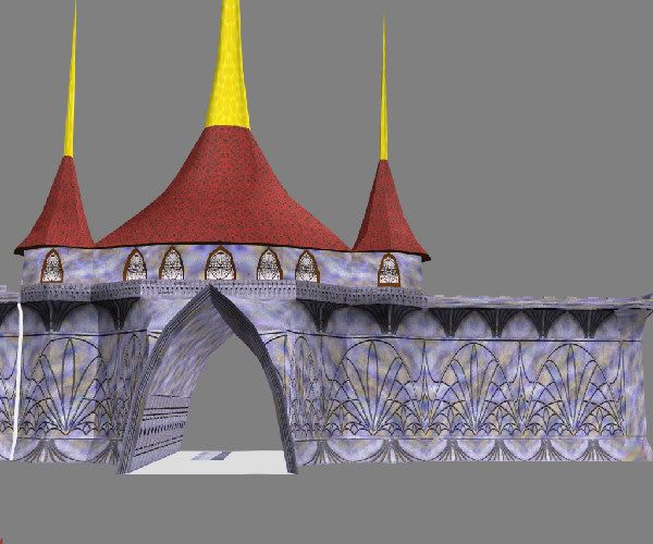 |
| ||
| Geometry wise, I like it. The textures look like they could do with scaling though - smaller for the walls, larger for the roof. I'm not a modeller though, so this is a layman's opinion. |
| ||
| The designs on the wall was intentionally left at that size. Other then that, I am not really sure what you actually mean. |
| ||
| I don't mean the stencilling effect, I mean the underlying stone texture, which I think looks a little too low res. Maybe closer to the wall it looks better. |
| ||
| Oh.. you mean the blurry blue,oragne,yellow,white color thingy under the stencil ? If thats what you are refering to, it is just the "blurry, blue,orange, yellow, white" color thingy. Even if you could look at it real close, its just those color blending into each other. |
| ||
| I think the colouring makes it look less 'real'. Even if it was painted like that, pain fades, cracks and peels etc. I know it's like overdoing it maybe, but thats the only critiism I can give because apart from that it's good! |
| ||
| Its a model for a game, and its not supposed to be real. Its not supposed to be paint either. Its supposed to be a magically created stone, the "stencil" is supposed to be carved/embossed into the stone. Granted its trying to fake the carved/emboss effect. Its actually a flat wall. How about the poly/vertex count. Is it too high for just being 1/4 of a city wall ? |
| ||
| The upper section with the windows look as if they need shading as there's no depth and doesn't follow the curve of the spire. Unless, of course, it's a magical upper section :) |
| ||
| I think the red like texture on the spiral roof tiles too much, and i don't think the yellow part goes well. Nice geom tho :o) |
| ||
| @ tonyg Hmmm... I don't think I quite understand you. Did you mean the windows don't look recessed enough or don't look like they are protruding enough ? Or did you mean the part where the wall meets the roof needs a little shading for the shadow of the roof ? @ Ross C well... I kinda like the red roof tiles, so I think it'll stay, but I might remove the pointy things ontop of the roofs. You just got me thinking that there might just be too much pointy things on the roof (with what I have planned for the inner part as well) if the city wall entrance has them too. I'll have to think about how finish the roof if I remove the pointy things.(or whatever you might call it) |
| ||
| Your choice of colors are too contrasting. |
| ||
| IF you want a magical ambience, you'd rather use some pastel colors for all the builting parts, including the roof. The colors should fit together and exclude complemetary colors (like blue/yellow), instead use complemetary colors only as little color contrast points, like a little fire somewhere, or the sun in the background etc. |
| ||
| a good idea is to block stuff out with solid colour in your 3d app before you even start texturing I liek the idea for the wall, but it jsut looks like lines drawn on rather than an etched or carved pattern you could try drawing the shapes with the pen tool in pshop then use them as selection to bevel the base texture. |
| ||
| Thank you for all the feedback all. It is greatly appreciated, I have learnt lots from them. @jfk and Wolron .. I really had my reasons for choosing those colors. I had experimented with colors that blend into each other better. I like this blend best for the effects that I had envisioned, after the model goes in together with the scenery and lighting. @Ruz.. The picture above doesn't do justice to how it looks like up close. I used the black and white pattern for embossing over the colored texture. It really looks like its embossed when you look at it straight on closer to the wall (if you can ignore the pixilation). However, if you look at it from the side.. thats a different story. :-) |
| ||
| I don't mean to be rude here, but i think wolron and jfk have valid points, as to it looking good. The colours are definetly slightly constrasting too much. You haven't really taken anyone's crits and tried to change anything. Give it a shot first ;) |
| ||
| My suggestion is the archway is too high, there isn't enough `concrete` above it to support people who would be moving around up there, so detracts from being convincing. Maybe lower the peak a bit? |
| ||
| @ Ross C I know they are valid comments. But like I said, I had my reasons for choosing those colors in this particular model. For starters, it is not a Human structure. I needed the structure to stick out of the background "like a sore thumb" (in a manner of speaking). I wanted alot of bluish tint to it, and needed some contrasting color to bring the whole thing out. Actually, initially, I wanted to make the texture animate alittle, but decided that it might be too CPU and GPU intensive for something that huge. I needed the colors to go well with some bluish (or purplish) tinted fog (and blue lighting as well), over a lush green background of a forest like setting. The setting will consist mostly of cool colors, thus I needed some warm colors to catch the eye. Also, so far I haven't made any changes, I am taking in the feedback to look at what needs improving mostly. Its also for input into future model designs. I guess maybe I should have explained a little what the model was for in the beginning. But suffice to say it is suppose to be an "alien" structure with heavy references to earthian architechural style. Not that I am brushing all the comments off coz I know it sounds like it. Isn't critique all about feedback, then you listen to the feedback to decide if changes should be made ? Like I mentioned before, the materials (with the exception of the roof) was intended to be stone in that color (like marble), tough stone that withstands the weather and time coz its "magical" (this was where I thought having the texture move would be nice). Neither algae or moss will grow on it, unlike the roof (yes, there is moss growing on that roof in the "cracks"). At this stage, I am removing the yellow pointy thing on the roof. Then ponder if I should just leave it as that before I finish the whole model. In order to finish the model; I need to attach the other side of the wall and reflect the other half of the model. (2 entrances to the city gates.) |
| ||
| @ tonyg Hmmm... I don't think I quite understand you. Did you mean the windows don't look recessed enough or don't look like they are protruding enough ? Or did you mean the part where the wall meets the roof needs a little shading for the shadow of the roof ? Where the walls meets the roof needs shading but also, the towers look round but the wall beneath them looks flat. The walls of the towers need shading to make them look round. I agree the archway doesn't leave enough concrete at the top as well. |
| ||
| @tonyg Ahh... ok.. I understand. I was assuming that lightmapping the model in a software like giles will fix that shading, or am I making too big of an assumption here ? I was hoping that I would not have to make more different textures to fix this problem. All the textures that look the same are tiled. |
| ||
| I don't think it's just shading though. Under the towers/spires/steeples (whatever) the wall joins the next in a straight line. It *could* happen this like but the wall would normally be curved to support the roof. Hard to describe and I have no way to show it visually. Maybe you should carry on and see whether it gets resolved anyway. |
| ||
| i like the building itself, but round the archway. i would iron out the uvs around the mouth of it, as the squashed texture looks bad. Also i would re-think the stone colours and replace with a sandstone or brick texture, and have the patern engraved on it. Other than that, i like it. The spires almost look thai wat-ish :) |
| ||
| "I had my reasons for choosing those colors in this particular model" Well it is not a good reason to leave it this way. It does not look good at all. The model is quite good, the designs on the walls are creative and look good, but you ruin all these with absolutely wrong colors. Red won't look good with purple-orange. It simple won't. And it is so blurry that I absolutely agree with the resize recommender reply. |
| ||
| Hmm.. grey out the background colours a bit.. and you have SpiroEsque :D |
   |