Learning to Draw
Community Forums/Graphic Chat/Learning to Draw
| ||
| Hi folks, In the last week I've started taking art classes after work one day a week (been to two so far). I'm really enjoying learning to draw and have started drawing some of my own pictures (from references of course). I'm thinking of writing my own game in the coming year which uses my own hand drawn graphics - a 2d dungeon crawl most likely - kind of first person perspective but step based movement - not like dungeon master, more like - show a map, pick a location, show first person perspective of location and creatures (sprites) - fight them, get treasure, go to town and spend on equipment etc and return to the dungeon(s). Anyway here are some samples of my artwork after one week of drawing...I'm improving which is nice..   The second image is from a tabletop wargame I used to play that I loved called AT-43. |
| ||
| Nice! (The dragon looks slightly odd, which I think is due to the front legs -- typically she shoulder joint would be lower on the body, plus I think you have an extra joint. But don't take it the wrong way, anatomy is really hard to do well) |
| ||
| Nah no problems...I fully expect after only a week of practice to have lots of errors and problems...perfectly comfortable with criticism....not expecting the Mona Lisa from myself just yet. Thanks. |
| ||
| That's good stuff Matty. I used to be able to do this. Sadly for me, it was not like "riding a bike". I lost the ability to draw or even write legibly some time ago. Luckily, for now, I can still pound out code and even push pixels :) |
| ||
| nice pic's, I am not convinced you can 'teach' someone how to draw some people can just have the gift to see an image in their head and whack it down on paper others not so well. I am 'well gel' when a top notch pixel pusher comes out with a game they've coded (that can be taught) and made art for..... ITS NOT FAIR! WHAAAA! WHAAA! |
| ||
| This looks convincing enough. Well done :) There is a missing leg for the dragon, and the leg at the back (behind) is a bit weird, but else it is ok. After i bought my tablet computer (with a pen specificaly designed to draw), i tried to draw some things, and my approach was to draw the shapes approximately in black, then to color each shape in the appropriate material color, then to decide where the light was coming from in the scene, then to add lighting and shading (lighter color and darker color) on different sides of each shape. The result was quite good. If you want inspiration, i suggest to take a look at the illustrations of magic the gathering, each edition is on a new world with different environments, creatures, machines, things. |
| ||
Another one...always learning. |
| ||
| Good for you... It's very rewarding. Practice, practice, practice. Here's a quick simple look at anatomy (for the terrified) which might help you. http://design.tutsplus.com/articles/human-anatomy-fundamentals-basic-body-proportions--vector-18254 |
| ||
| Thanks Adam. Yeah I'm practicing every day. It's something I enjoy and in almost two weeks I've come a long way already but know I still have a long way to go. Thats a good article on human proportions. Ive got a whole bunch of books in addition to taking a class once a week that are helping. I'm hoping to use my new skill in my next game and do my own art, largely, as a way to put it to good use. |
| ||
| Thanks for the link @ Adam ... Think it is way easier than my big "Burne Hogarth's Zeichenschule"-book (a collection of the various drawing books of Burne Hogarth) ... they were a bit too advanced for me when I got it as a present some years ago. Without "basic knowledge" such books might demotivate one ;-) @ Adam I think you are really enjoying simulating "light and shadow" (the gradients on the armor or the light parts on the blaze of the horse head) to create depth (the 3d-ish look). But instead of this, try concentrating on a bit more accurate look when it comes to "symmetrical things" (left and right chest). Maybe it is more something with perspective ? (the left side - in POV - is "bigger" than the right side - should be the opposite). To add something to anatomy/structure: - lance is a bit hm odd (handle is not centered to rest of the lance) - the human seems to have no hip (chest-armor ends and the horses back starts...) - chest looks a bit too "bulgy" (just look how his "thin" neck comes out of the armors opening) -> the shoulders are incorrect because of this and his arms are "off". If parts of the arms are hidden under the shoulder plate (possible) the knight would be not really enjoying to lift his arms more than 10cm ;-D (so it is the fault of the armory blacksmith) - harness of the horse is a bit too "wide" for a warriors/knights horse - maybe add some details there to make it look "massive" (like hardened leather) - for now it looks like simple "cloth material" What I really like is the background: simplistic but exposing enough to make the viewers fantasy accept it as a "wide and open country" . There your strokes are places well for a "sketch". To improve you might do what "Bob Ross" always did: add one or more trees in the front to save on drawing these little things in the background. It also offers a new hint in the perspective: it makes it more apparent that there is a "hill" or "higher ground" on which the knight is standing with his horse. @ Pencils Which kind of pencil are you using? Looking at the knights nose you have a very "sharp" one... but the outlines seem to be done with some kind of coal pencil. Need to learn that "gradient building"/shading once I find the time ... I like that but always tended to just "smear" the portions shaded with a soft pencil. Generally: If you want to use your paintings in a game: do you want to digitize them in an old-fashioned way? (scanning them in, redoing the outlines, painting the inners) Or do you think you now practice "drawing itself" and then move on to draw with a tablet and a digitizer? or ... ? A decade ago I used the "scanner"-approach to create avatars for my website (which explains their "blue/orange" outfits) 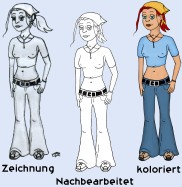 Result in big 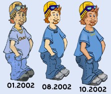 Result in big And yes... the anatomy is not the best there too. I personally think that drawing "complete scenes" is a really tedious and time consuming job ... as all these little details need your attention. Doing them in the computer allows to have some "copy paste" portions (copying a tree to multiple scenes... having a trunk in one scene, the left portion peeking into the pictiure on the next ...and so on). @ AT-43 looks good regarding proportions: maybe this is your way to go first: trying to "rip" others arts so you get a feeling of how things work when portions are invisible. bye Ron |
| ||
Here are some more sample pictures...attempting to learn how to draw faces....in order of learning/drawing (chronological)   I know they are far from perfect but I'm gradually getting there.... Thanks Adam for the human body reference you sent...I've been using that as well in other drawings. |
| ||
| You will learn faster if you worry about the fundamentals first. A human head is a complex object with many different forms. Can you draw a box, a sphere or a cone and make it look good? If you can't, then it's less likely that you'll be successful drawing a head. I know it's boring to draw geometric primitives, but if you look at someone drawing a head, they start with a sphere and define the scale and directions, even the pro illustrators. Maybe these are useful: http://drawingbooks.org/index.html Stay awesome |
| ||
 Getting better. Rest of body not so good. Yeah I practice spheres and solids...fruit...but I enjoy practicing faces...gets better each time. Gradually. |
| ||
| Nice one. |
| ||
| Nice job, Matty. When drawing heads, the nose is always the hardest part. Master shading or just do a light outline of one side the the nose. I found a good drawing of a nose:  I used to draw a lot when I was a little kid until I graduated HS. Once I learned perspective drawing and shading, I finally felt like an artist. Like many things, I gave up once I understood how it worked. Jason |
| ||
| Last thing. If you plan on doing any shading, I recommend using pastels. Or water color paints. Jason |
| ||
| One technique that i have used in the past to model/texelcolor humans faces was to find the face of a celebrity (front side, left or right side), then use this as a guide to model/texelcolor it. After a few faces you see what is the logic of the shape of a human face, what are the basic parts and their colors and how the lighting/shading behaves. |
| ||
| To be ably to draw confortably, all you need to master is the dark vs bright areas. If you can understand how to get this on your model, then the rest will come with practice (I mean : better and better shapes, better and better lines) You can make nice stuff with solid lighting and very bad shapes and/or perspective, while you'll almost always end with something hard to appreciate if the model is correct but the lighting is poor or wrong. ps : the last one is pretty good actually. |
| ||
| Just seen this Love pencil art shows the artistic talent. Well done Matty. |
| ||
Improving still. |
| ||
 Drawing of me and my partner. Did this morning. |
| ||
| nice pic's, I am not convinced you can 'teach' someone how to draw some people can just have the gift to see an image in their head and whack it down on paper others not so well. I am 'well gel' when a top notch pixel pusher comes out with a game they've coded (that can be taught) and made art for..... ITS NOT FAIR! WHAAAA! WHAAA! Nah, natural talent is overrated. Learning the fundamentals and practicing them *a lot* is what gets you there. Looking good so far Matty, your faces have good expressiveness to them, which a lot of artists often struggle with. I do get the feeling you might have been skimming some lessons on perspective and anatomy tho. Luckily, you don't need to go through an entire body of writings on those subjects to get rolling (though the deeper you dig the more beneficial obviously). I like this tutorial a lot. It's not a step-by-step deal, more like an overview and explanation of some of the most important concepts. Definitely recommend reading through the entire thing, it's great stuff :) |
| ||
| looking good Matty. Have a good look here: https://design.tutsplus.com/tutorials/how-to-digitally-paint-faces-with-incredible-likeness--cms-25764 takes you through drawing a male and female face   Goes into lots of detail about what a likeness is and shows you really good things like guides and what to avoid. It's for digital, but it holds true for drawing just as much ;) |
| ||
| a useful approach imo is to start by drawing approximate shapes and points to have the appropriate scale/positions of each part, and then add the details. i have seen a similar method for poses of characters where the artist first draws joints/bones with the appropriate joints positions orientations and appropriate bones lengths, and then add the approximate shapes of the body parts, and then add the details. and then add the colors. and then add the lighting/shading. |
| ||
My parents bought me a wacom tablet for Christmas which I have just set up about an hour ago and had a play with.....it takes some geting used to but I'm enjoying playing around with it. My intention is to make a low res cartoony style game of some sort using my hand drawn graphics - not intending to take the world by storm with my brilliant graphics just want to do something without using purchased assets for a change....and with a personal touch to it......    |
| ||
| The problem with "small" images is - that you still need to have these little "fake details" (you know - some white with a blue pixel equals to a complete eye with iris, a white pixel on a red stroke is the single tooth of a babies mouth ...). So while your examples have a good distinguishable "shape", they miss all the little details (buttons on the cloth, eyes, a light reflection on the sword). I would suggest to use your drawings for a first "sketch" - but then refine them digitally. I do not know what wacom you have but: maybe draw the outlines / shape on a smaller zoom than your details (so you can still draw "1:1" to your screen). Then zoom in to draw all the little things. No worry, only the big portions of an element need to get drawn then. So a button does need the outline but might even be recognizeable without the 2/4 holes for the twist). At the end you might scale it down - but when scaling, play with the scaling algorithm - just to avoid what your big screen exposes: too much anti-aliasing. Up to 25% of your images "non-transparent pixels" are antialiased ones. Lowres sprites _love_ crispyness (as the players brain does the most work ;-)). By the way: I do not like these drawing tablets ...never achieved a good coordination. Bought an HP Elitebook just to have a good digitizer to paint directly on the screen - is way cheaper (but also worse in quality) than the expensive wacom boards (or a MS surface). Aside of that: it is a good idea to have everything "drawn" by you - this might not lead to the best overall graphic wonders, but lead surely to something with a unique style - your drawing style. A good idea might be to use this "its a personal drawing style" approach also in your game. So eg. draw things in black / white, in color ... and tell the story of a hero whose dreams turn alive - and he is continuing to write a story (with your hand written glyphs/letters then !) to defeat the worst of the worst, the diabolo of all devils, the weaver of all fates. PS: good skin color choice for the "android" (last pic) - also the glasses are having a good cartoon glasses-color. bye Ron |
| ||
| also, you can probably deactivate the filtering/blurryedges/antialiasing which allows to draw sharp images, then it is easier to work with the magicwand/fill tools... (because the pixels you draw have the exact same color that the color you chose)... Practice practice practice, you will become better... |
| ||
It's quite a lot of fun just drawing for the sake of it....  |
| ||
 |
| ||
 |
| ||
| Is there a reason for his right eye (left from our POV) has less contours than the other one? It shouldn't fade out that heavy already (same for the wrinkles of the mouth). Shading is improving I think - at least for the face/head. The cloth needs a bit on the neck (looks a bit flat). Color choice reminds me on "PRC's most famous heroes/villains/fuhrer" :-) Keep on painting ...and when doing it with your wacom: use layers, this eases the pain of finishing it up digitally (shading is way easier on the computer - with undo/redo ;-)). bye Ron |
| ||
| Thanks Derron. Re first question...simple skill error on my part.... |
| ||
 coloured in....  might use in a game or something similar....wouldn't mind making 'space gun' all over again (old taito first person shooter released for arcade in the mid 90s) |
| ||
| some critics/suggestions : the perspective is incorrect, the nearest sides should be bigger than the farest sides (if the containers are supposed to be "cubical"). (try to create a cube in Blitz3d, you will see) the color palette is ok, imo one color per material is enough to illustrate what is going on in the scene. the lighting/shading is incoherent (we can't guess where the lightsources are), try to draw your shapes, then to color each shape with one color per material (and maybe one color for the outline (along the edges)), then add the lightsources, (which do not necessarily need to be in the view (like a sunlight/moonlight in this case), then add the lighting/shading on some faces depending on the lightsource position and the orientation of each face (1 or 2 color(s) for lighting, 1 or 2 color(s) for shading/shadows). |
| ||
| Thanks RemiD....yeah I can see those things...however I'm still pleased with my progress. I have to work on it.... here's another:  |
| ||
| What is good in your colored drawing in post #33 is that there are almost no remaining black lines, only colored ones, which looks better imo. (you can always mark the edges of a shape with a color slightly darker than the material color) |
| ||
| The difficulty with "faces" or "real world things" is: we know how it "should" look. So for your drawn female head you see the missing "base symmetry" of the chin-mouth-area. Also: her left eyebrow is longer than the right one (pov: switched). Teeth: I think the teeth are "too big" - therefore it looks a bit like a horse's mouth. Nose: this is the hardest part (imho - i never got that right ;-)) Think with the right "shading/lighting" it could look way better (without the need to paint her nostrils that dark) Shading: the shading of her right cheek area (pov: left side) even enforces the "assymetry" look. The shading of the chin (dunno if intended) really looks good - it looks "sculpted" (in the sense of "3d"). To emphasize it: scroll the page down so only the "mouth and below" is visible. The chin-area (and the neck shadow) then look really really good - until it reaches the area of the "pearls". And of course: ignore the "hair" ;-) these strands are way to dark ... it just looks as if you watercolored on a pencil sketch - while all other parts are done in an extra step. bye Ron |
| ||
| All good criticisms. Thanks for the compliments too. I think the main thing that will allow for improvement is practice. A well known sports commentator in Aus says you need at least 10k hrs to be good at something.....so in another 30 years I should be good at this....have spent about 50-80 hours on drawing since June. |
| ||
An orc....not happy with the colours...needs some shininess in my opinion |
| ||
| They look great! :) I love out like that! ;) I found I could wield a pencil too a couple of years back... My gee gee (Tiny URL'd due to it being rather large):- http://tinyurl.com/j36fyp2 Keep up the good work fella! :) Dabz |
| ||
| Thats a great horse dabhand. Very good. |
| ||
And in the dungeons of Ilmioria the Yellow King had quested Garet and Barak Colthane to bring to him the first living thing he found in the caverns beneath the tower on the barren heights.....  ....it would not be easy.... |
| ||
| I please you to work on body proportions and symmetry. Imho this is what disturbs the most on the images. You might improve your shading (I like the upper part of the nose of "quad titty lizard-witch") but the missing symmetry of the base shapes (head and "beard/hair" of beardy-man, body of the "knight") makes it look way more amateurish/childish than your current skill would be. Also: please stand up now! let your hands hang as if you were powerless. Now look how long your arms are. Normally your hand wrist should be a bit below the hip bones. Next: Now put your hand in front of your face. place the thenar (bottom part of your hand) on your chin and your finger tips on your forehead (at least the middle finger should be able to reach it). Your arms in the drawing get smaller and smaller until they reach the "micro hands". I assume you have drawn the sword "after" you draw the arm and hand - so the sword does not look "dangerous" and "mighty" ... it has the wideness of a rapier ... it looks more like "needle" worn by Arya Stark (GoT). Left food of the beardy-man (pov: right one) looks as if it got no heel. It just looks as if that one would be called "disabled" nower days. Generic: - bricks are looking good - door (wood) looks good too - torch has wrong perspective (or it is "right oriented" [pov: left]) Generic tips: - there exist human body references (eg. puppets) google images for "human body drawing reference" and you will find enough - draw lighting/shadows according to lights in your scenario, not "randomly". - things like capes benefit from shading (as you make the cloth look less "flat"). Also the body will take away light from the cape so it would need to have darker areas. Re: lighting It seems beardy-man is affected by torchs light - at least I imagine it is intended. The knight has portions which fit to the light, but his right arm (pov: left) is shaded as if there is light coming from the right (pov: left) and shaded therfore on the opposite site. Or the arm is bend behind the back - so the body shadows it - but this would look odd as the shoulders are rotated in the opposite direction. While it isn't the best idea to do so (because of "practice" and outputting "dreams") I would suggest to redo that "dungeon entry" scene - but pay attention to proportions and symmetry this time. I assume - when properly sketched out before - these both dudes will look way more "don't talk to us or it will hurt" than now. BTW: if they are like "robbers/bandits" they would have "worn off weapons" (notches?!). Both: axe and sword should look way bigger to be "serious" weapons (I know, in reality weapons were not so big every time - because a morning star is dangerous enough with 2-3kg weight ;-)). Do not forget to give the knight a bigger shield. The size of this shield is the one of a "buckler" - which does not fit to the armory the knight wears. If sized that way, it was mostly "circular"/round. At least I cannot remember to have seen such things in the museums. Hope you don't mind the "bad review". bye Ron |
| ||
| Nahh bad reviews are fine..... I just uploaded all my drawings from 2016 since I started learning to draw to my webspace: Link You can see the progression in ability over that time....slow progress..... |
| ||
| About drawing a humanoid with a possible pose with appropriate body parts scale/orientation/perspective, a technique is to first learn about the humanoid skeleton and its joints/bones, and see for each joint, which orientations are possible. Then you first draw the skeleton with joints/bones (dots and lines) and then when the pose/jointsorientations/bonesscales seem correct, you draw the bodyparts depending on that. |
| ||
| Hi again, I thought I'd post one that I drew before work this morning. First up: I started it at 5:30am and had it finished by 6:45am. I can see some positive and negative criticisms that I'd expect to hear already for example: Something is wrong with the eyes. The nose is not symmetric. The lips came out bad. The chin is quite good in my view. The shading on the neck and shirt is okay although there are some unusual sports. The arms start off a little too narrow and end up with very tiny hands...hands should be bigger and forearms should be thicker. Hips don't get wide enough. Oh...I like the pixelation effect which I added.  |
| ||
| You forgot to mention breast size ... And that odd lines on the throusers (they draw the attention to the center...as if there is something to happen). Color choice looks pretty good. Maybe try to paint only portions? Like a hand in different variations (fist, middle finger, OK...) This helps to get used to draw things in the right order (things overlapping each other). It also might teach "wrinkles". I envy your motivation... I often plan to do things but then take the easier route. Bye Ron |
| ||
| she is ugly imo, but since you are a good lad, you can have her, ahahah :D an interesting exercise that you may want to try : search for photos of celebrities that you like, look at the face expressions and at the body poses that you like/findintriguing (it can be some passages in movies...), then close your eyes, and try to vizualize a generic face/body (like a shape of a humanoid (without colors)) and make him have the same face expression and the same body pose that those that you have seen, and after some practice you should be able to imagine any human and make him have the expression and the pose that you want. It could help you to draw more "realistic" shapes/expressions/poses |
| ||
| Thanks Derron and RemiD. RemiD - ha ha ha...yeah my partner comments that I don't paint pretty girls...unfortunatley the references I use are all pretty models and so on but my skill is such that they end up looking more than plain (my partner is a very good artist herself and can really capture the likeness of someone). Yeah...Derron - I was happier with the breast size - a lot smaller than the ones I draw regularly...at least I thought so (are you saying they are too large/too small...they are certainly more in proportion to what I normally draw...) yes I will try and draw/paint only portions...I will keep producing pictures - some of full people, some of faces, some of noses, eyes, hands as I keep learning...I can sense that I have a little bit of ability with this so I want to keep persevering with learning it until 10 years from now I can look back from on top of the mountain! However - I'm hoping that either by the end of this year or next year I might be able to find a style that suits me, a theme that I enjoy and find easy, and put together a calendar or a few pictures to exhibit somewhere. |
| ||
| I was talking about the breast seeming to have different sizes. While this is normal for a natural breast, the difference should not be that big. The right breast (pov: left) is bigger: bends more outward and that defining line on top is placed higher than for the other breast. Think it is normal for us dudes to draw bigger breasts...not by favor alone/at all but to make sure it is recognizeable good enough. Women think different about their breast which might explain that they do draw them less big. Also good curves are easier to sketch with some rapid and dynamic paint strokes ( Y ) Another idea is to sketch out a face...and then to draw the same face from a slightly rotated pov. So this might improve your skill on keeping an eye on symmetry and proportions. Bye Ron |
| ||
Another...happier with this one.....improvement... |
| ||
| Symmetry improves I think. In this image it seems as if it moves "downwards" the more right something is located. Do you hold the paper/tablet "rotated" while drawing? Somehow it looks as if your hand wrist is not moving "straight" or you are putting it on the desk while drawing - leading to a "rotation". Shading: nose is shaded better, that "pinched/bone-look" style might be her real nose, so I won't criticize that. Cheeks look - imho - a bit too much exahherated, but even this is possible (eg. the "wife" of hank moody in "Californication" has such a kind of cheeks) Head contours: is this a front portrait, or someting from "slightly above". Somehow the chin looks a bit too thin for my taste - but hey, these women exist, so it is of course possible too. Skin tone is good. Hair: dunno how to improve that, but these "strokes" makes the hair look lank/stringy, maybe it looks better with more "shades" or just some "sketched" hair-portions (like in cartoons, which have a stroke here and there to show the "flow"). @ hint from last time Maybe try to draw here from a differen angle next time? (same head, size, ... just different pov) bye Ron |
| ||
| Yeah....I'll try from a different perspective next time..... The rotation could be because I'm left handed maybe? I'd not noticed that before you pointed it out. |
| ||
   |
| ||
| 1st pic: nose tip and nostrils look good and shading shows a kind of "individual style". Her face seems to express "speechless reaction" If intented then good thing. 2nd one: hair looks flat (might be the haircut) but more natural because of the paint strokes instead of pencil hair emphasization. Eyes...think you know it already. 3rd one looks best. Because of the cleavage. No serious: her face looks a bit sad and lips are rather well shaped. Hair strains over the eyes look okay too. Shading on the chin is -imho- a bit too much. Shading below the chin and upper chest looks good. A pity she got that miss piggy nose (nostrils should be less high in that perspective if she does have an average nose). All three seem to improve on head symmetry. But of course there is space for improvement :-) All of them look better than the woman in #46 Bye Ron |
| ||
| As others have mentioned already, you could try improving your drawing process by starting out with a sketch or outline. This is good practice because it let you get basic anatomy/form down, find flaws, errors etc and correct them before you are too heavily invested in your drawing. If you have seen people just sit down and doodle out incredible drawings straight away with no problems, it is most likely because they have done this step so much that they can just do it mentally while drawing. I took the liberty to draw over your last one to show what I mean. (I havent drawn in years so dont take it as anything but a proof of principle). If I were to try and draw this image, this is how I would start out, and as you can see it exposes a lot of the symmetry issues that others have mentioned. (expired link) Hope it helps! |
| ||
| Thanks Derron and zzz. All very helpful. Much appreciated. Personally my favourite of the three is the first one. |
| ||
| If you have seen people just sit down and doodle out incredible drawings straight away with no problems, it is most likely because they have done this step so much that they can just do it mentally while drawing. zzz makes good points. Learn anatomy measurements. Study how to draw perspective, how different types of surfaces reflect light etc. If you really want to improve you need to dive in and practice the fundamentals, or you'll keep making the same mistakes over and over. |
| ||
| Thanks ErikT....yes I think I will have to find a class for something like that. edit here is another:   |
| ||
| For instance think of eyes as spheres with a hole at the front with a transparent layer over the top. Not sure whether its your stylistic choice but your eyes are very flat and cartoony looking. Light goes through the surface of the eye, shines off this a little, and hits the iris underneath so the eyes need depth. The highlight is not restricted to the pupil it can cover the iris too. Don't forget those little pink bits in the corners either ;) Do a google on "how to draw eyes" some great examples popup immediately. PS I like the middle picture from the three pictures of women post. Its odd but compelling. (sort of Mona Lisa'ish) |
| ||
| Thanks all. I'm going to take more lessons at a nearby art school in February. I'm sure I'll continue to improve as I get more knowledge and experience. |
| ||
| When drawing something that's "alive", the subject being a human or an animal, I think the eyes are the most important aspect to get right... If you dont get them correct, it automatically looks odd... A bit like how we make humanoid robots or wax works, they get them mostly correct but the lifelessness of the eyes automatically hit our senses and then it is just becomes uncomfortably weird to look at! Here's a tiger I was drawing:- http://tinyurl.com/hzmx5mj I never actually got to finish him as I used to take my pad and pencils away to work with me, and a bottle of shampoo leaked in my bag... I was gutted... But even through it's not finished, you can still see the "tigerness" in his eyes, until I got that working on them, I wouldnt start any other detail. The mono image of the girl above looks okay mind, the shading adds a little depth to her eyes, which make it more soft to look at rather then the colour version above her, but you still need that glint, once you have that, the picture will proper shine! :) Dabz |
| ||
| Hope you do not use the key on that image anylonger. Its never a good idea to post pictures of keys ;-). Tiger looks good but the inner of the eyes look odd a bit. Dunno what it is...but it looks a bit too big or so. The other parts look pretty well and far better with what I would be able to come up with. That is what I like on computers: undo functions. Bye Ron |
| ||
| I think the problem with what your seeing is that in that image, the head detail was unfinished, I did work on his ears and around the edges of his face and chin which, if you will, made the head seem a lot bigger, as it stands there, the detail is just smack bang in the middle mostly. He looked really good, I was really enjoying drawing him until a bottle of Aussie shampoo wrecked him... honestly, for 2 days or so after I felt like someone had died! :D lol Dabz |
| ||
| @Matty That is a pretty big improvement, nice work :) practice the fundamentals What Erik said. This really cant be repeated enough times. The fundamentals would be your basic skills and understanding. This in turn is what you use to do a good drawing. Ill elaborate a bit on that. 1. Do you have good eye-hand coordination? Can you draw a straight line where you want it, a circle, box etc? This is very important, because it doesnt matter how much you understand a subject (like a human face) if you cant put it on paper. 2. Do you understand perspective and shapes? Can you draw a basic box in 2d or 3d? Other shapes? Can you draw a room full of boxes in 3d, and have it look convincing? I am still talking about just drawing lines here, no coloring in any way. 3. The shapes are important, because they are used to build up more complex objects. Can you draw (still just lines) a complete house? A house with garden, playground, porch etc? You can use perspective and the basic shapes from (2) to construct pretty much everything. 4. Light and values. Go back to your basic shapes and start shading them. Can you draw a box with a simple light source and make it look good? A sphere? Do you understand how light works? This enables you to choose proper values (aka how light or dark something is). Can you draw that room with boxes with a light source, and still make it look convincing? Do you understand how the values you draw work together to make it look convincing? 5. Materials and light. Can you draw a properly shaded sphere? Can you make it a wooden ball and still make it look convincing? Put some varnish on it? Draw a metal ball instead? Glass? Skin? Do you understand how lighting affects color? Do you understand why a sphere far away on earth looks different from one on the moon? There are basic "rules" that decides how the light and color changes in all these examples. You need to learn and understand them. Suddenly you can draw your complex shapes from (3) fully shaded, and they will work together, and everyone will be very impressed by everything you do. Because you got your fundamentals down. ;) Dont forget to sit down and just draw for fun. But the above is what I personally would suggest as the fundamentals of drawing. I excluded human anatomy and such, because its more related to understanding and constructing those complex objects then anything else. If you can do the above things, you can sit down and figure out how to break down any subject. |
| ||
| Mate, you can draw people as well as I can 3D Model - get some classes. Mucking about on your own is not going to improve things :) |
| ||
| I see the smiley face so im not taking too seriously but the pictures in this thread speak for themselves of my improvement over 5 months.... ;-) |
| ||
| Yes, more like having a go at myself than you :) Practice makes perfect, so they say. |
| ||
 This one is a little unusual. I'm happier with it though. I know that it has a number of faults but I like it. |
| ||
| It looks nice enough, and its good that you like it. The important thing is to keep drawing and have a good balance between trying to improve and just do it for fun. There are signs of improvment in there, so just keep going. I am a bit unsure to how to help you with criticism. Its usually detrimental to someones motivation to have everything picked apart constantly, but also like ErikT said above, its not really good for you to get too used to doing things wrong either (assuming you want to improve). You inspired me to dig up my old pencils at least, so thats always something :p |
| ||
| I think you are right. Continual criticism does wear down motivation but at the same time I'm aiming to improve. My belief is that when I'm given a list of criticisms I'm likely to only apply one or two of them next time. Not because of deliberate obstructionism but more because that's how we learn-incrementally. Maybe I have some bad habits but with time and the classes I'm going to attend they will get ironed out. But there's no urgency. No deadline. I'm having fun and learning as I go. There is a tendency when people show off work of any sort to criticise but it doesn't have to be that way. |
| ||
Another one.....I like this drawing thing... |
| ||
 |
| ||
| I think you get better and better, but your basic is really wrong. You need to improve the base before going further -> some fundamentals rules that allows you to draw a human that actually looks like a human Before drawing, build the shapes with some geometries and symetries, else, you'll end up with eye not symmetrical or too low/high etc ... (or the mouth that is not good at all and does not look good either) In red, you'll see what's wrong in your shapes In black, a proposition of fix.  also, a "rule to rule them all" : When we draw (realistic stuff), she should never use a single line to show the shapes, because what make a shape visible is only the contrast between two geometries, so we see an abstract line between both. Then, lines are pretty and is a real part of the art-style, but when you start drawing, you'd better think about it so you know why you draw a line, and it will also allows you to see where contrast need to be applied 2 tips (for numeric drawings only ^^) : 1/ When you're applying colors, from time to time, switch the full thing in black and whyte, you'll notice if it looks good or not (because saturation always mislead us thinking the light is good, while it's not) 2/ Flip your drawing horizontally, you'll can force your eye to see the shapes with an other approach, because when we draw, our brain adapt to what we're doing and ends appreciating something that is distorted ... when you flip all, your brain is screwed and have to rethink the whole shapes, so you'll notice things that does not work and that you couldn't see before. ps : if at any moment it offends you in some way, let me know about it. |
| ||
| Thanks. I can see that now. Your red lines are helpful. |
| ||
| The red lines still might be wrong ... it depends on the other mistakes you did - or not did - in the picture. The woman might have their mouth area moved to her left side.. (maybe she is not believing something). If you then also shaded her nose the wrong way- the whole thing changes. The red center-line (splitting nose and mouth) would no longer be a straight line (or it would no longer split nose and mouth into halfs). The line would become a bit "curvy" - and therefore the line for the eyes might get a different angle. Nonetheless the basic idea Bobysait presented is very helpful. At least you will spot absolute "misalignments" very fast. And then, later on, you could willingly draw things offset (eg. when it comes to monsters with a "mutated eye"). Hmm ... just a small thought: you might use Blender or "MakeHuman" or whatever tool you like to have a free 3D view to human bodies ... so you could rotate them as you like to see how things "change", which portions increase their size in what amount when they come closer to the camera/pov. How shadows fall, how a nose covers an eye. PS: Is there a reason to fix yourself to "human drawings" ? Proportion training could be done by eg. some mechanical things too. Shadowing could be done by drawing various geometric shapes (I think you did that already) like cones, cubes ... And making cuts into these cubes (like cutting small other cubes here and there) will help "mesmerizing" how that shadow-light-thing works. PPS: I think you already come a long way and are yet better (and hmm "more brave") than many of us are. bye Ron |
| ||
I was certain something like this was linked already, but couldnt find one, so I made a quick one for you. Its not very good but shows the basic proportions. |
| ||
| Thanks zzz.....yeah I need to use these 'guidelines' more I think...I sometimes place dotted lines at or near where I think things should be before drawing them - and use those proportions mentioned on the image you showed...but sometimes I don't (and it shows). Thanks Derron as well...'brave'? - not sure what's brave about it - but re why human figures - i like drawing people, or at least I find them enjoyable to draw. I do draw other things as well but for some reason I always come back to people. I've got some 'non people' drawings I do (eg Link ) but people is what I focus on. |
| ||
| It comes down a bit to what material you are working with, but you should be able to draw as many faint lines as you need to get your portrait anatomy to work out, and then slowly erase them as you start to fill in detail. Try beforehand on identical paper to see what you can erase and what leaves marks etc :) |
| ||
| @ brave Not everybody is brave enough to share his "creations" with the world. Especially "early years" work is something people often try to hide (except you already started at "master level"). Also it is easier to write critics than receiving some (means publishing own work and receiving whatever-feedback). bye ron |
| ||
| Not everybody is brave enough to share his "creations" with the world. Especially "early years" work is something people often try to hide (except you already started at "master level"). I couldn't agree more with that. Wether or not when I started drawing was a time when digital scanner were more about sci-fi movie dreams and digital painting didn't really exist, I must admit I wouldn't have shown my first drawings, just like I don't really like reading myself when I started programming ( I was such an ass :D, always asking trivial questions and never understanding the answers ), but it's still a good thing to come back to this age, It makes me confortable knowing where I am now. |
| ||
 it's much easier when you don't have to draw eyes...h ah ah ha |
| ||
| Looking good, though lips are perhaps bit too outlined. I'm getting the terminator vibe. -Henri |
| ||
| This one is better. I still have some problems with the eyes, and the shading around the neck is wrong. The nose could be improved. The lips are an improvement. But I'm getting better all the time. If you looked at my 'Heaven or Hell dating app' on mobile you would see a host of images I drew very quickly - 20 minutes each - which even though they are rough are a massive improvement already.  |
| ||
| This one is better. I still have some problems with the eyes, and the shading around the neck is wrong. The nose could be improved. The lips are an improvement. But I'm getting better all the time. The biggest problem seems to be the placement of the parts of the face. When you draw a person, make sure that you *start* with the rough outline of the face/head itself, then the eyes on the midline of the face. (look at zzz's guideline image above) Even just starting with those two things will give you more natural looking faces. Without it, it's very easy to end up with a face that has a massive forehead and the eyes/nose/mouth all scrunched up at the bottom. Most humans have very similar proportions: an eye is approximately 1/5th the width of your face, top of the ear is the same level as your eye, etc. Since your brain is hardwired to detect faces of other humans, even small mistakes look really wrong, really fast. (Oh, another tip: If you haven't already tried, start with drawing a face based of a photo rather than a live person. that way you can take as long as you want, and people don't look away and change angles on you while you're working) |
| ||
| I actually do draw those guide lines on now...and it has improved my drawing skill but I've still got a long way to go....many of your later comments (such as xlsior) - I already do this...but I've just got much more practice and refining to do... eg  |
| ||
| Things are about where they should be on the last two ones, imo. You are however drawing all hair *on top* of the head. This might or might not be by choice though :) If I can suggest something it would be to try and take a closer look on individual features. Take a good look on how a eye is constructed, and see if you can improve on how to construct and detail it. Same with nose, mouth etc. |
| ||
| Liking the pencil strokes going the same direction in #84 very good |
| ||
| You're on a good way, it's really better :) |
| ||
Still getting there.....  Gradual improvement. I've done a bunch of pictures since the last one but this one was drawn this morning. |
| ||
I've done a bunch more...here is one... |
| ||
   |
| ||
Picture of my partner, drawn from a photo reference, traced then coloured. |
| ||
Enthuasiastically I drew this...not quite what I'd hoped but it has a certain style to it: |
| ||
 |
| ||
 |
| ||
| Much better proportions in those last couple. |
| ||
| Thanks xlsior. |
| ||
I like this one... |
| ||
| Instead of doing whole portraits I would focus on individual facial features for now as they currently lack any detail and most notably the shape of the eyes/mouth isn't right. Bear in mind there are bones behind the skin which help to form the face - it isn't just flat. The eyes for example are quite recessed below the eyebrows and bridge of the nose. Study the form of the head/face using reference photos from all angles - there are plenty online. Above all, keep going. But identify the mistakes and improve on them. |
| ||
| What I have done to learn more about drawing portrets was to take the newpapers and use a pencil to draw ontop of the pictures. This way I could learn where the lines on the face were ect. |
| ||
| These are some great sketches, Matty. Alas my skills are only pixular, if that's a word. :) |
| ||
 |
| ||
 |
   |