How to get small fonts looking good
BlitzMax Forums/BlitzMax Programming/How to get small fonts looking good
| ||
| I was encountering a problem today with drawing a font at 15 point. The font has sort of jagged edges as its cartoony. Problem is when I loaded it in at 15 point with SMOOTHFONT and drew it with ALPHABLEND, it looked rubbish. It was all lumpy and had jagged edges (yes they were anti-aliased it just looped crap). So I had a brainwave. I loaded the font in at 75 point then when I drew it I used SetScale 0.2,0.2. And it works brilliantly, much better smoothing and the fonts retain their shape better because the graphics card is using all that detail to scale down. Possibly it looks a little bit too anti-aliased but I'm not sure what to do about that. I guess the perfect solution would be to make a bitmapfont anim strip in a paint program and use that. [edit] Found a way to reduce the blur. I used a copy of the DrawText function and forced each letter to draw at an integer X coordinate with Floor(). Works well. I posted this because it's not obvious that loading a font in at 15 point will yield such rubbish results. To be honest I'm still a bit confused as to why the BlitzMax code doesn't "sample" the characters at 15 point using a better algorithm or am I missing something? Also can anyone see any problems with the method I'm using (apart from memory consumption) e.g. could results vary on different PCs? (I doubt it) |
| ||
| I guess the perfect solution would be to make a bitmapfont anim strip in a paint program and use that. Alternatively, use a font that was designed to look good in small print? |
| ||
| yep valid but this font looks good in small print in a paint package, just not in BlitzMax... |
| ||
| Couldn't you load the font in at 75 point, scale it down and draw it on your screen or what have you, grab that as a bitmap (the scaled one) to blit when you want and then free the original font? It would take slightly longer to do it this way initially (and take more memory), but the result would probably be worth it. Russell |
| ||
| An interesting idea. As long as you can grab with the alpha channel intact, which I'm pretty sure you can - I've just never done it. |
| ||
| Loading a font at 75pt when you only intend on ever drawing it at 15pt is a waste. It will use approximately 25x the resources of a 15pt equivalent. |
| ||
| Yeah but the 15pt looks like CRAP. I could load it at any multiple but I found 5x to be pretty good. It's really not that much memory anyway and it draws very quickly. |
| ||
| reduced blur, see edit at top of post. |
| ||
| Grey Alien I'll post later tonight about this, I've encountered something like this but it was only happening on an ATI card for me. |
| ||
| I have an ATI card. What was happening, the small fonts looking crap or the scaling down resulting in blurry text? The blurry text should occur on all cards as it's just due to text being drawn at floating point coords. |
| ||
| Here's what I mean Grey Alien, I spent a lot of time trying to figure out what was wrong but never found anything conclusive. Just that the fonts aren't at all blurry on my newer nvidia gfx card, and they're blurry on my old ATI 9700 pro mobility card. .exe is here if you wanna test it: http://kronholm.org/games/arkanoid_v0.66_win32.rar 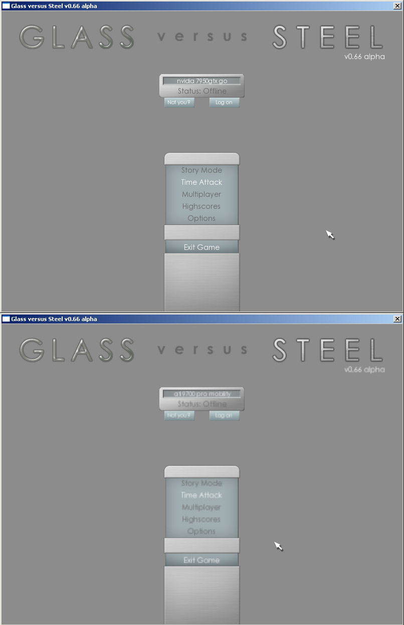 |
| ||
| Kronholm, I would look for a Texel Alignment or Texel offset setting which for some insane reason drivers let you modify / break in the dx/gl section of the video card Display Settings. |
| ||
| Wow that's bad, worse than mine but similar. Are you drawing that font at it's normal size or are you scaling it down? |
| ||
| Skidracer, I'm not really sure what you mean? Do you mean like the drawtext is having float coordinates? Grey Alien, several fonts are loaded and stored in types, and switched between for different sizes, so it's the normal size. (Custom setfontsize function) |
| ||
| That a font loaded with SMOOTHFONT and ALPHABLEND looks sharp-edged seems confusing to me... But I recommend this way to get rid of this unnecessary problem: Download the BitmapFont module by ChaosInteractive here: http://www.chaos-interactive.de/index.php?show=13&lang=eng and then get "Suco's FontExtractor" here: http://www.suco.colorflow.de/tools/SucosFontextractor2.0_Win.zip There's also a project page about it, but unfortunately only in german: http://www.blitzforum.de/forum/viewtopic.php?p=232382#232382 Now follow these steps: As you open the FontExtractor, it will search all the fonts you have installed on your system and display them in the list. Select the one you want to use. Then click on "Speichern" (save) and select a path by clicking on "Auswählen" (browse) in the window that has just shown up. You can change the font size of the exported bitmap font by changing the "Fontgröße". In the folder you have saved your font in, you will now find a .png and a .suc file which contain the information about the bitmap font and the image itself. If you want to, you can add shadow effects or other eye candy in GIMP or PS by working on the .png file. Then just put both files into your project folder and load your font like this: Local DummyFont:TImageFont = LoadSucoFont:TImageFont ("MyFont.png") (after you have imported the BitmapFont module) You will be able to handle the font just like a normal TImageFont. Have fun. |
| ||
| wow OK so normal fonts look rubbish. Well actually they looked poor on mine too, but more jagged. Only the scaled down ones (using Setscale 0.2,0.2 for example) looked blurry. |
| ||
| I faced the same problem (blurry fonts with ATI card) until today. I could remove it by changing the following option of the video drivers : >> Put the MipMap detail level at maximum. For me, totally solved the problem Hope it helps |
| ||
| Had a similar problem, solution was like another use said, just resample in a paint program to the size you need and use that in a bitmap font handler. Why rely on internal/external methods that don't provide 100% solution? |
| ||
| I don't think it's much of a waste loading a font at a higher resolution and drawing it scaled. However, you might try experimenting with getting the original size to be a multiple of the size you're scaling to, e.g. to get down to 15pt you might start with 60pt rather than 75 because then you're dealing with scaling the whole thing down by quartering the dimensions, rather than dividing by 5. Also whenever you scale something down, it has the effect of introducing a certain degree of blur due to approximation of pixels. After you scale you should apply a `sharpen` image-processing pass to crispen it back up again. |
| ||
| I use bitmap fonts now. They are preprepared in a paint program and also I don't draw them scaled. |
   |